Dining
Best new bars to try in Hong Kong right now!
[TAG1]
Sometimes we all have to do haphazard things to make our kitchen work for us temporarily when an immediate renovation is not in the cards. This was one such kitchen, with some cabinets that were green, some that were blue and some that were wood. Some were built-in and some were freestanding but none of them were unified. Some counters were white, others a pale butcher block. All paired with pink walls!

After photo (R) by Rebecca McAlpin.
Gone are all the disparate finishes. We unified all of the cabinetry with one extremely versatile color: Boothbay Grey from Benjamin Moore. Likewise, kitchen counters are all a warm walnut that adds warmth to the grey color and also picks up on the dark wood on the floor and butler’s pantry cabinet doors.
One feature we were excited to explore further was the brick peeking through the plaster next to the former sink. To our delight, the brick was able to be revealed during the renovation, adding tons of charm and character.

After photo (R) by Rebecca McAlpin.
This area is now where the oven lives. It makes much more sense to have an oven here because the tall wall gives us a great spot for a fume hood (which is now surrounded by gorgeous woodwork, complete with a shelf for Chinese pottery). And the sink, which was here previously, was relocated to just beneath the windows so that the homeowners can enjoy the view and the natural light while washing up.

The window before.

The window after. Photo by Rebecca McAlpin.
When original features of the home are in good shape, we always like to incorporate them into our design. Such was the case with the dark oak cupboards in the butler’s pantry. They still look great and store lots of stuff, but were in a somewhat neglected corner. We added a desk and shelves in the location of a former dumbwaiter (which sadly could not be brought back to use). Now this pantry corner is a regular workhorse!

Pantry before and after. After photo by Rebecca McAlpin.
The Boothbay Grey cabinet color continues into the laundry room where we had new cabinets built that add storage and a rod for drying clothes.

Laundry room before and after. After photo by Rebecca McAlpin.
Here are a few more images from this sweet, sweet project.

Photos by Rebecca McAlpin.

Photos by Rebecca McAlpin.
You can also read a little more about it at our portfolio page. Have you considered the potential of your own kitchen but never got around to taking the first step? Tell us more about your design goals by completing our Client Contact Form. We’d love to hear from you!
The post A Dramatic Kitchen and Laundry Reveal: Before and After appeared first on down2earth Interior Design.
]]>
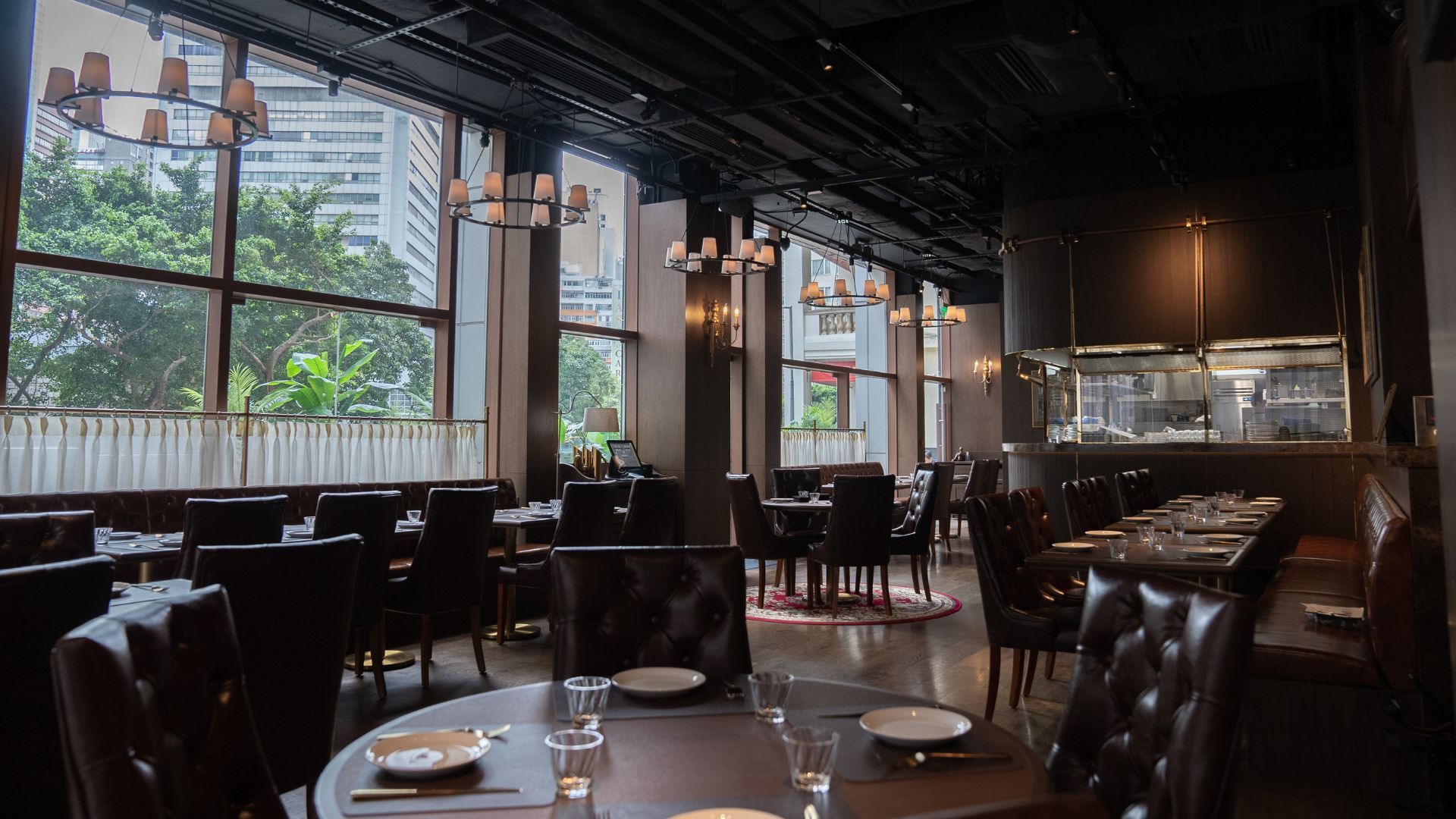
Looking for something different to try and tell all your friends you did? New restaurants are a dime a dozen in the city of gastronomes, Hong Kong. The relentless wave of restaurants making their grand debuts in Hong Kong every month can leave one breathless. So, we’ve gathered the best of them in this checklist of the “where?” and “why?” of Hong Kong’s hot-ticket tables.
From an Omakase restaurant with high polish and good vibrations to a ramen bar, we’ve picked out the best of the new bunch of restaurants in Hong Kong. The only question is: where should you book first?
Make sure you pin the tab as we refresh the page every month with what’s new and noteworthy in Hong Kong’s dining scene.

Aera, a contemporary restaurant specialising in New Nordic cuisine, opens its doors in Wan Chai. Its name means honour and era in Danish and pays homage to young, talented chefs in Hong Kong. The culinary team, led by head chef Chevalier Yau, takes inspiration from the New Nordic cuisine philosophy, which emphasises sustainability, ecological awareness, and ethical considerations in food production. As such, the team is committed to discovering local and natural ingredients and preparing them through Nordic cooking techniques. The best way to experience what Aera offers is through its ten-course Tasting Menu, available exclusively for dinner.
Address: G/F, 6 Stewart Road, Wan Chai, Hong Kong
Phone: +852 2389 9901
dolos
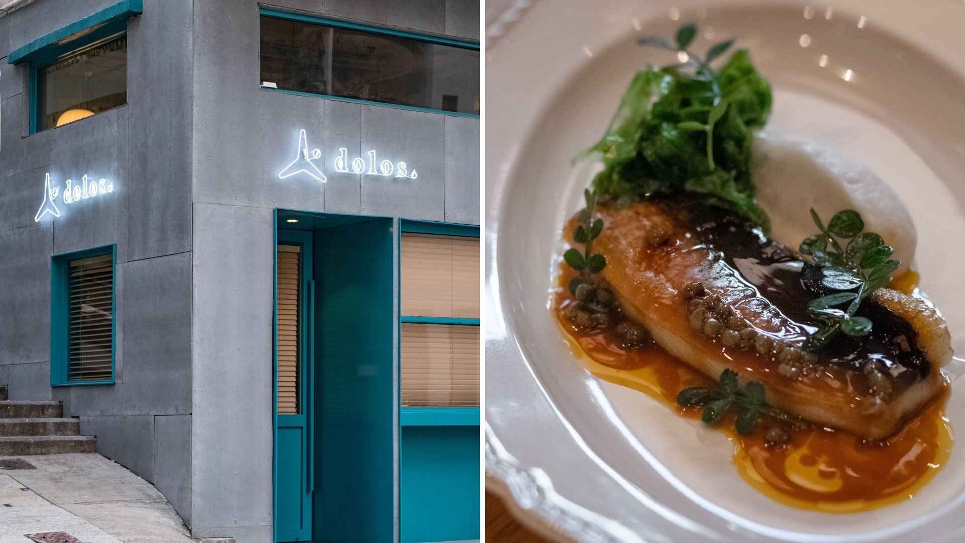
Twin entrepreneurs Joshua and Celeb Ng of Twins Kitch join hands with Chef Sean Yuen for a new French-Japanese seafood restaurant, dolos. The restaurant’s name is inspired by the interlocking pathways of “dolos”, the wave breakers that protect Hong Kong’s shares from the ocean’s force. True to its name, dolos reflects the city’s rich maritime history, the connection between the land and sea, and the pristine flavours of seasonal seafood worldwide. The twins also tap into their gastronomic ambitions of bringing together food, city, and people. Meanwhile, Chef Yuen matches the cosy, unpretentious place with a solid menu on which he has put his stamp. Don’t miss the rich, frothy Red Prawn Bisque and Crispy Grilled Eel. At the moment, dolos is only open for dinner from Tuesday to Saturday.
Address: G/F, 60 Staunton Street, Central, Hong Kong
Social media: instagram.com/dolos.hk

Longtail is a fun Thai eatery in the middle of Food Street in Fashion Walk, Causeway Bay. It serves all your Thai street food favourites in addition to innovative cocktails. You can dine in the cosy colourful dining room or spacious outdoor terrace. The menu features phad Thai, various house-made curries, refreshing pomelo salad, and deep-fried local sea bass, amongst many other choices. Before you tuck into the mains, though, try a few snacks like spicy Thai Pork Sausage, Fish Ball Skewers or Deep-fried Crispy Pork Belly. These are all perfect for your cocktails, like the Tom Yum Bloody Mary or the gin-based Purple Haze.
Address: Shop C, G/F, Towning Mansion, 50 Paterson Street, Causeway Bay, Hong Kong
Phone: +852 2838 0819
1st & Beaudry is the newest addition to Wong Chuk Hang’s (growing) culinary scene. The restaurant is owned by Westside Hospitality and led by Chef Esdras Ochoa, promising to transport diners to a corner of 1st Beaudry Avenue in Los Angeles. It’s the same place where Chef Ochoa started his culinary career 16 years ago! Come and experience the vibrant vibe of LA through the menu, which reflects the melting pot of cultures of the place. You’re spoiled for choice here: Mexican, Korean, Vietnamese, Middle Eastern, and more! The standouts include Chef Ochoa’s own take on famous brunch-style fare, Sunset Boulevard; warm and comforting M.B. Chowdah; and innovative taco creation, Roy Garcia. The LA experience isn’t complete without the classic off-menu Smash Burger, served on “In-N-Out” trays.
Address: 7/F, 43 Heung Yip Road, Wong Chuk Hang, Hong Kong
Social media: instagram.com/1st_and_beaudry
Vie Won Won’s relocation to the buzzing Shek Tong Tsui neighbourhood marks a refreshing chapter for the restaurant and residents. The new space takes an exciting turn but keeps the same experience of intimate fusion dining. Spearheaded by Chef Alfred Leung, the brand-new menu showcases seasonal dishes that draw inspiration from local and global comfort food. You can’t miss Chef Alfred’s signature Matcha Lamb Chops, which marries two unlikely ingredients together. The chef’s love for seafood manifests in the menu, where you’ll find coveted ingredients like sea bass, calms, and lobsters on various dishes.
Address: 8 South Lane, Shek Tong Tsui, Hong Kong
Phone: +852 5920 2838

What do you get when the beloved Japanese tonkatsu receives the star treatment? Tsukanto is the answer. The new restaurant specialises in tonkatsu, and while that might not sound like a lot, you’ll be pleased to know that its founder is Naotaka Ohashi. He boasts a solid culinary portfolio, including three Michelin-starred Quintessence in Paris. The tsukanto uses imported Rindo pork from Kumamoto Prefecture, known for its rich flavour. Meanwhile, a combination of French and cooking methods preserves the juiciness and tenderness of the meat. The dish may look simple, but it takes almost three hours to prepare! You’ll never see tonkatsu the same way again.
Address: 1002, 1/F, Fire Zone, Elements, 1 Austin Road West, Hong Kong
Phone: +852 2331 3822

Niras is the latest venture from the same team behind the award-winning restaurant Le Du in Bangkok. Helmed by chef Thitid “Ton” Tassanakajohn and business partner Rungroj “Tao” Ingudananda, Niras is their first outpost beyond Thailand. The name derives from an ancient Thai tradition in which poets travel around the world and chronicle their journey through poetry known as Niras. Drawing on the success of the Le Du brand, Niras offers a Thai fine dining experience with a menu that showcases the flavours, textures, and aromas of Thai cuisine. Relish the signature dishes like Duck with Potato in Massaman Curry, Banana Prawn with Seaweed and Spicy Beetroot, and Grouper with Thai Kale in Choo Chee Curry.
Address: Shop 704, 7/F, K11 Musea, Victoria Dockside, 11 Salisbury Road, Tsim Sha Tsui, Hong Kong
Phone: +852 3905 3022

Sukiyaki Isekuma presents an elevated take on the family-favourite sukiyaki, making it a gastronomic omakase-style dining experience. The new restaurant embraces the best of the subtler Kansai sukiyaki style and the stronger flavours that later evolved into the Kanto region of Japan. Paying homage to the history of sukiyaki, the restaurant is named after the country’s first sukiyaki eatery which opened in Yokohama in 1862. Sukiyaki Isekuma marks chef Koichi Kuga’s first foray abroad after leading five-star hotels in Yamaguchi and Nagasaki. Whether you opt for lunch or dinner, expect melt-in-your-mouth marble meat. The rice specialities are also a must try and of course, the two special egg dips using eggs from Yamaguchi.
Address: G13, Harbour Pinnacle, 8 Minden Avenue, Tsim Sha Tsui, Hong Kong
Phone: +852 2109 1155

The Praya is a new restaurant at the One-Eight-One Hotel in Shek Tong Tsui, offering refined Hong Kong dishes by marrying the old and the new. The name “Praya” in Portuguese means land reclaimed from the sea. It references the name of the waterfront promenade at Shek Tong Shui where the restaurant sits. But its more symbolic meaning is to seek inspiration from places near and far. As such, you can expect the restaurant to recreate traditional Cantonese delicacies in a modern style using fresh ingredients, a majority of which are sourced locally. Hong Kong-born and Australia-raised Chef Samuel Ng draws on his own multi-cultural background to blend Western and Asian cooking techniques with local ingredients. Among the exciting dishes to try are the Claypot Vegetable Rice with Chargrilled Stock Chicken, Grilled Three-finger Threadfin, and Sourdough Spring Onion Pancakes. Make sure to try some of the signature cocktails based on the five elements such as Flower of Life (earth), Dragon & Phoenix (wood), and more.
Address: Level 3, 181 Connaught Road West, Shek Tong Tsui, Hong Kong
Phone: +852 3181 1666
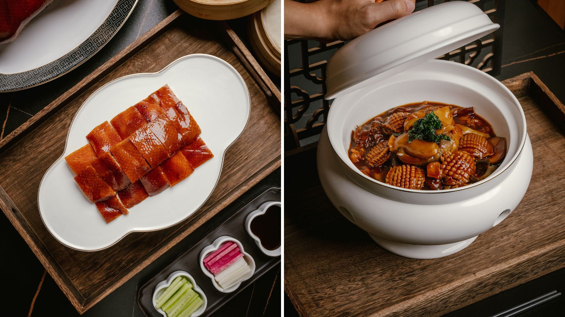
Moments Together showcases a mix of classic Shanghai and Huaiyang cuisines that are reiterated with a modern twist. Just as its name suggests, the restaurant champions providing an unforgettable dining experience. It starts with a relaxing ambience complete with upscale touches of earth tones. Chef Andy Lau prepares familiar ingredients like goose, duck, beef, and chicken with additions like pomfret, abalone, and sea cucumbers. Dig into innovative creations like Braised Pork Balls and Crab Coral with Dried Shrimp Roe, Mandarin Fish with Lobster in Sour Soup, and Crab Coral Stone Pot Rice.
Address: Shop 1103, Times Square, 1 Matheson Street, Causeway Bay, Hong Kong
Phone: +852 2321 6833
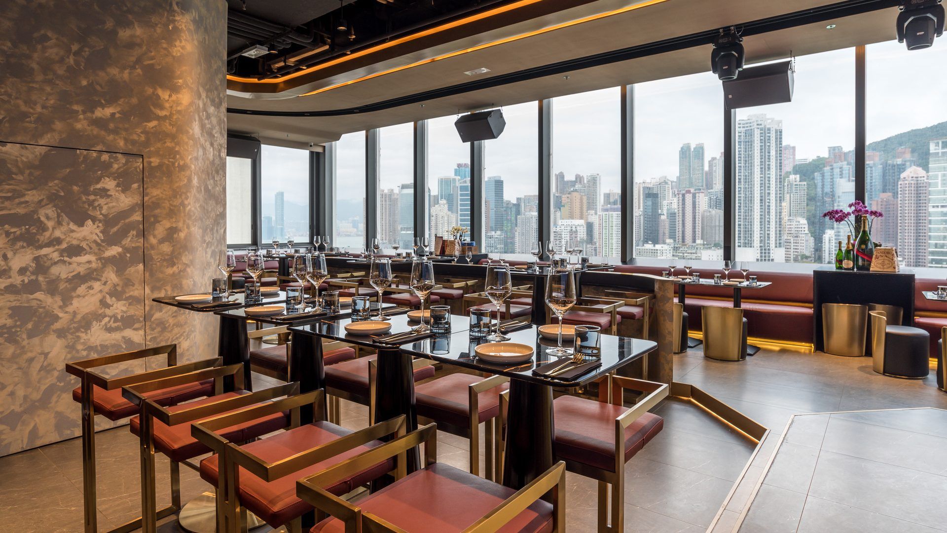
Kaen Teppanyaki is the latest opening at Forty-Five, the hottest new dining destination in town. Its name Kaen, means ‘flame’ or ‘blaze’ in Japanese and as such, the steakhouse features both teppan and binchotan cooking in an open setting. Match that with stunning views of the city for a complete dining experience. Under the hands of Chef Yoshiyuki Sato, expect high-quality ingredients, traditional cooking techniques, with a bonus of his intricate knife skills. The dishes use a wide selection of wagyu sourced directly from farmers and auctions—with all cuts of meat traceable to the farm and the slaughter. Meanwhile, seasonal seafood and vegetables are hand-selected and flown in daily from Japan and Europe.
Address: 43-45/F, Gloucester Tower, The Landmark, 15 Queen’s Road Central, Central, Hong Kong
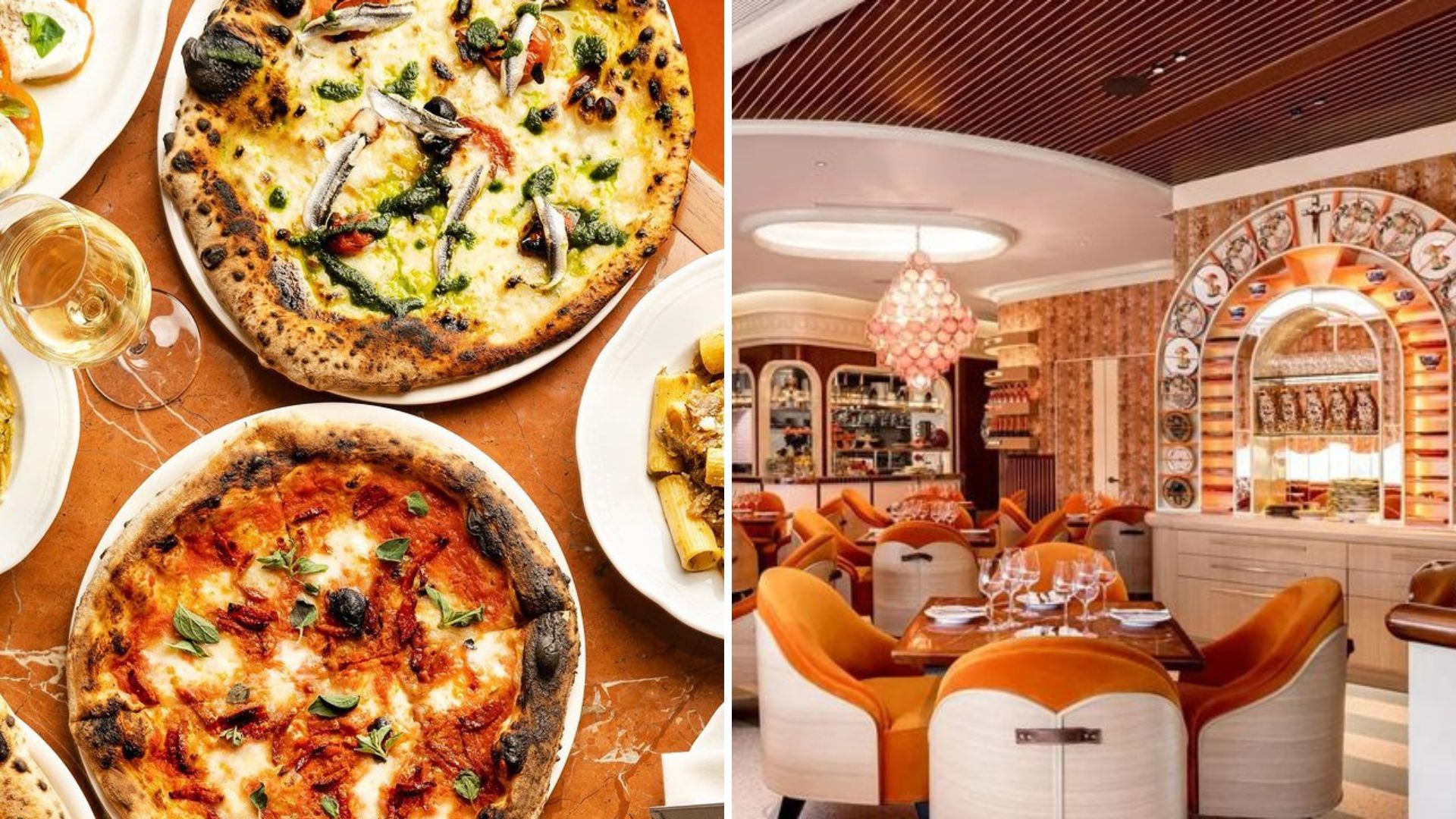
Calling all pizza lovers—Black Sheep Restaurants’ (BSR) Falcone is opening this month. The pizzeria is inspired by the chaos and beauty of travelling through Napoli, Italy. As with most BSR ventures, Falcone also comes with a story. It is a deep dive into the “frenetic energy, animated streets, and simple food” made in Campania’s capital. So, what you get is a colourful, energetic, and flamboyant restaurant, with an uncomplicated menu exploring the culinary traditions of the Campania region. Think pasta and neo-Neapolitan style of pizza—yum!
Address: Atrium, ifc Mall, 8 Finance Street, Central, Hong Kong
Website: https://www.pizzeriafalcone.com/
This new restaurant is pushing boundaries to bring high-quality vegetable dishes to the dining table. Feuille, which means ‘foliage’ in French, is a collaboration between ZS Hospitality Group, French chef David Toutain, and chef Joris Rousseau. The vegetable-driven menu celebrates seasonality and fully explores the possibilities of local ingredients. It also highlights Toutain’s attention to detail and French cooking techniques. The entire team is passionate about sourcing sustainably grown local ingredients and supporting Hong Kong farmers.
Address: 5/F, 198 Wellington Street, Central, Hong Kong
Email: info@feuille.hk

Cafe Roma might not be new, but the Italian restaurant just completed a major renovation project! What’s special about this al fresco destination is that it’s located near the beachfront in Ma Wan. The concept takes inspiration from food and family gatherings, which are integral parts of Italian culture. You can see that reflected in the design concept, which uses warm colours, natural materials, and rustic elements that feel like you have been transported to Italy. Indulge in a variety of pasta dishes, crispy-crust pizzas, and hearty main courses, all prepared with traditional Italian techniques and flavours.
Address: L1, Shop 7 & 8, Beach Commercial Complex, Park Island, New Territories, Hong Kong
Phone: +852 3446 1226

Sink your teeth into the finest and most succulent beef steaks from all over the world, courtesy of Carver. The new contemporary steakhouse at Crowne Plaza Hong Kong serves steaks from the US, Australia, and Japan complete with fascinating sauces and sides for the ultimate steakhouse experience. The new gourmet destination boasts a showpiece bespoke cabinet for beef dry-ageing right by the entrance. And from there, leads to an oasis of spacious and refined dining. Hong Kong beef aficionados will love the 20-Day House Dry-Aged Us Striploin with Coffee Grounds or the Bavette M9 from Australia. Yes, you read that right! They have coffee-infused steaks!
Address: 1/F, Crowne Plaza Hong Kong, 8 Leighton Road, Causeway Bay, Hong Kong
Phone: +852 5978 5971

Match 2 is welcoming hungry Hongkongers to relive the magic of Taiwanese dishes. The restaurant doesn’t just serve comfort food-style food, it also comes with added visual flair and creativity. The menu leaves you nostalgic with the food found in Taiwan’s night markets, including small dishes bursting with flavours, spices, and colours. Dig into the tantalising assortment of braised beef noodles, gua bao, hotpots, and popcorn chicken. You’ll also love the fact that the hotpot selection includes ingredients such as stinky tofu, Taiwanese sausage, quail eggs, and more. When it comes to drinks, Taiwan is known for its rich, milky, and creamy refreshers! You’ll get the same quintessential flavours of bubble milk tea, as well as ice teas, and cheese milk tea!
Address: B226-227, K11 Art Mall, Tsim Sha Tsui, Hong Kong
Phone: +852 2321 2881

The Merchants is among the first restaurants to open at the new food and hospitality destination in Hong Kong, Forty-Five. It serves classic dishes from Shanghai and the surrounding provinces of Jiangsu and Zhejiang. Diners can expect traditional flavours with a contemporary touch. Besides the gastronomic delights, the restaurant also offers sweeping views of Victoria Harbour.
Head chef Chen Tian Long of Jade de Jardin spearheads the Merchants. He brings classic recipes from Shanghai, reinterpreted with a modern flair. The design is a collaborative effort between Sean Dix and Victoria Tang-Own. It pays homage to belle époque Shanghai, highlighting elegant features with custom cherrywood banquettes and vibrant jade onyx detailing.
Address: 45/F, Gloucester Tower, Landmark Atrium, 15 Queen’s Road Central, Central, Hong Kong
Phone: +852 2155 4141
Cafe Bau is the brand-new farm-to-table concept from renowned chef, Alvin Leung. Its name, Bau, pays homage to the Bauhinia flower, a rare hybrid plant that is native to Hong Kong. It’s also the iconic symbol of the city. The new restaurant opens in the former location of Leung’s two-Michelin-starred restaurant, Bo Innovation. As a farm-to-table dining concept, the restaurant uses local ingredients and serves a smorgasbord of bold, creative dishes with a local spin.
During the initial phase, Cafe Bau will be open for dinner, offering three-course and seven-course tasting menus. Kicking off the appetisers is the refreshing Salt Roasted Beetroot with Pat Chun Vinaigrette, Candied Walnuts and Charred Corn. Also, indulge in the Slow-cooked Oxen Brisket before digging into the desserts. The palate-cleansing Sugarcane Juice Jelly with Seasonal Fruit is exclusive to the tasting menu.
Address: Shop 8, Podium 1/F, J Residence, 60 Johnston Road, Wan Chai, Hong Kong
Phone: +852 2126 7212

The team behind FRANCIS—restaurateur James Ward, chef Asher Goldstein, and sommelier Simone Sammuri—is opening another outlet in Soho, FRANCIS west. The new restaurant is bringing fragrant species and smoky flavours of the Maghreb to Central. They offer cuisines from North African countries including Algeria, Tunisia, Libya, and Morocco, Maghreb. Here the chef marries the culinary heritage with Mediterranean and African flavours.
Goldstein, who hails from Tel Aviv, draws whips up contemporary Middle Eastern cuisine. The menu highlights include Mashwiya (Tunisian grilled salad), Stoned Baked Frena (Moroccan flatbread), and Lamb Merguez. You can also expect a quality selection of wines, exclusively sourced from coastal regions of the Mediterranean.
Address: Felicity Building, 42 & 44 Peel Street, Central
Email: info@francis.com.hk

Chef Ken Lau who is behind Pano in West Kowloon and Palco in Ocean Terminal, is at the helm of PLEKA. The new Italian restaurant is designed to extend Pano and Palco’s concept of a ‘chef’s table’ by showcasing the cooking process right in front of guests. The floor-to-ceiling windows accentuate the overall dining experience, complete with a panoramic sea view, and an outdoor al fresco area.
The eight-course tasting menu is the highlight here as it’s inspired by chef Ken’s travels around the world. Embark on a gastronomic adventure starting with the amuse-bouche, then handmade pasta, juicy meat, and lip-smacking desserts. The dishes use fine ingredients from Japan and Europe, filled with rich and decadent flavours.
Address: Shop 4010, 4/F, IFC Mall, 8 Finance Street, Central, Hong Kong
Phone: +852 2889 3839

For a change of scenery in Hong Kong Island’s bustling new restaurants, head over to Bino N’ Booze. This hotpot eatery in Sham Shui Po pays homage to traditional Hong Kong flavours with a creative touch (think alcohol-infused soup bases). The boozy dining experience is rooted in flavour, friendship, and fun and offers exclusive items like hand-wrapped dumplings and fresh hand-cut steer meats.
The four signature soup bases highlight quintessential local flavours. While the Signature Red Wine Oxtail and Tomato Soup is a blend between beef broth soup and classic borscht, the BnB Seafood Soup is infused with Japanese Nanshan Sake, bringing out an umami flavour. Other soup bases are the Hua Diao Chinese Herbal Soup and Pig Tripe and Chicken in Beer Soup. Finally, those not keen on the alcohol-infused soup, can still opt for the Vegetarian Mushroom Soup.
Address: Shop A, G/F and 1/F, 205 Hai Tan Street, Sham Shui Po, Hong Kong
Phone: +852 6353 5519

Bistro Hoi An opens its doors in Tuen Mun, bringing fresh flavours of Vietnam to the seaside neighbourhood. The new restaurant at Gold Coast Piazza is adorned with vibrant ceiling lanterns and photos, reminiscent of old Vietnam. Fish sauce or nuoc cham takes centre stage at Bistro Hoi An. It’s often described as the national essence of Vietnamese food. Guests can try three types of sauces, all made in-house to bring unique flavours to the dishes they’re paired with.
Highly recommended on the menu is Sauteed Frog Leg, a rarity at many Vietnamese restaurants in Hong Kong. Also, don’t miss the Chargrilled Pork Belly, Vietnamese-style Sauteed King Prawns, and Hoi An Suckling Pig. They also offer some classic cocktails like gin-based Blossom, vodka-based Amy’s Martini, and Negroni.
Address: Shop 1A, Gold Coast Piazza, 1 Castle Peak Road, Tuen Mun, Hong Kong
Phone: +852 3421 0060

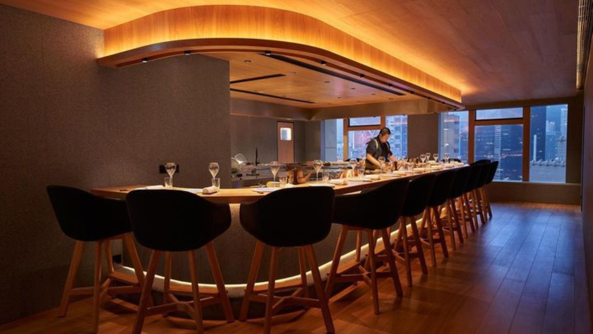
Enishi is the newest teppanyaki restaurant in town and is helmed by three Japanese chefs: Shun Sato, Toru Takano, and Ami Hamasaki. The restaurant’s name means ‘fate’ in Japanese, which reflects the bond between people who are destined to meet, much like the three chefs who met while working in Australia. Their dream of bringing Japanese cuisine to the world culminates in Enishi’s 23-seating with two distinct dining experiences: teppanyaki (11 seats) or à la carte (12 seats).
Diners can enjoy a “home away from home” teppanyaki experience. Treat yourself to dishes like Oyster Sanbaizu, a nod to chef Shun’s hometown, with fresh oysters from Miyagi Prefecture. For the Market Sashimi course, you’ll be reminded of a Tsukiji-like dining experience. Other highlights include Ezo Awabi and Wagyu Tenderloin.
Address: G/F, 49 Bonham Strand, Sheung Wan, Hong Kong
Phone: +852 2997 7009

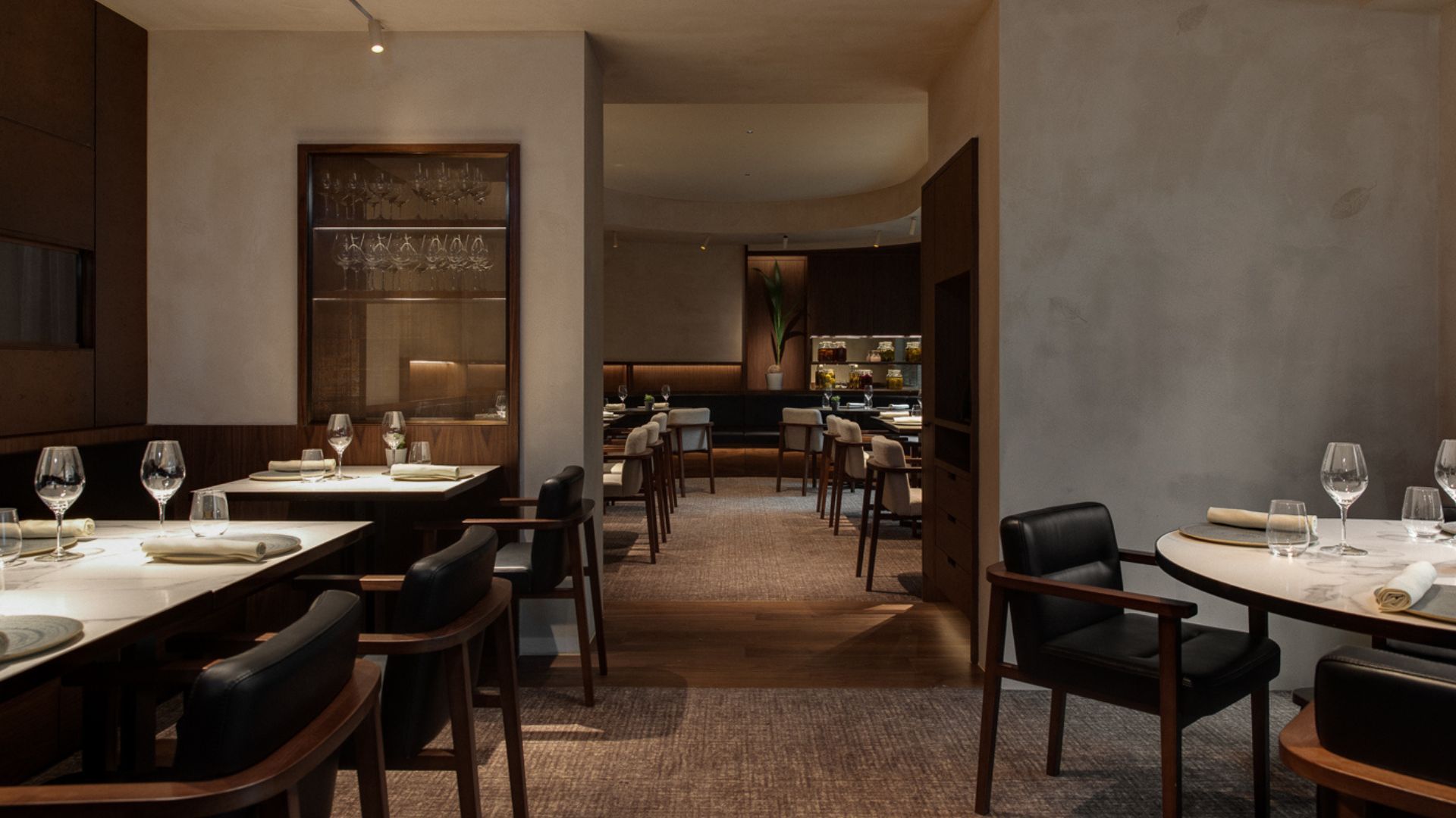
Italian restaurant Lucale is reopening under the ownership of chef duo Alessandro Angelini and Luca De Berardinis. The re-launch sees the beloved Sai Ying Pun ristorante with a revitalised menu of new dishes. The chefs are focusing on exquisite seafood dishes that celebrate the best of the Italian coast. Expect creative plates like thinly-sliced Warm Baby Cuttlefish or Green Cappelletti filled with Sea Bass for the starters.
Over at the mains, the pan-fried Seabass Fillet or hand-cut Tagliolini Pasta with Lobster, Prawn, and Scallop Ragout will fill you up. In addition to the menu, the interiors also get a fresh look with soft blue and grey tones, punctuated with warm hues. It creates an environment where diners can sit back and relax, just like a little Italian holiday.
Address: Shop A, 100 Third Street, Sai Ying Pun, Hong Kong
Phone: +852 3611 1842

Founded by prominent Huaiyang (Shanghainese) cuisine figure Chiang Biu, Snow Garden is the latest addition to Hung Hom’s culinary scene. It’s the newest outpost of Snow Garden, which follows the footsteps of the original North Point branch which closed doors in 2009. Chiang is working together with his disciple of many years, chef Long Chi Fai, to bring back the brand’s nostalgic flavours to a new generation of foodies.
Some of the signature dishes include the pan-fried Pork Buns and the double-boiled Jinhua Ham Soup with Chicken and Tientsin Cabbage, which may take some diners on a trip down memory lane. Must-try dishes at the Hung Hom branch are the Yangzhou Crispy Bean Curd Skin Rolls, Shangsong Style Spring Chicken, and Ox Tongue Marinated with Rice Wine Sauce.
Address: Shop 101, 1/F, Y83, 83 Wuhu Street, Hung Hom, Hong Kong
Phone: +852 3897 9686
This restaurant’s name means “to be alive” in Italian and that’s exactly what it sets out to be. Vivere opens its doors in the bustling Causeway Bay with elevated Italian food and mesmerising views. Indulge in a ravishing menu filled with Italian specialities. The flavourful seafood dishes and the succulent meat-based plates will transport you to the coasts of Italy. Take advantage of the monthly promotions here including the 2-for-1 cocktails on Tuesdays, 2-for-1 main courses on Wednesdays, or the HKD 200 free-flow for two hours on Thursdays.
What’s more, the DJ plays hit tracks every Friday and Saturday. Also, do not miss the exclusive Sunday brunch with a drag show where the drag queens of Hong Kong take over the stage.
Address: 11/F, Sugar+, 25-31 Sugar Street, Causeway Bay, Hong Kong
Phone: +852 2186 6404
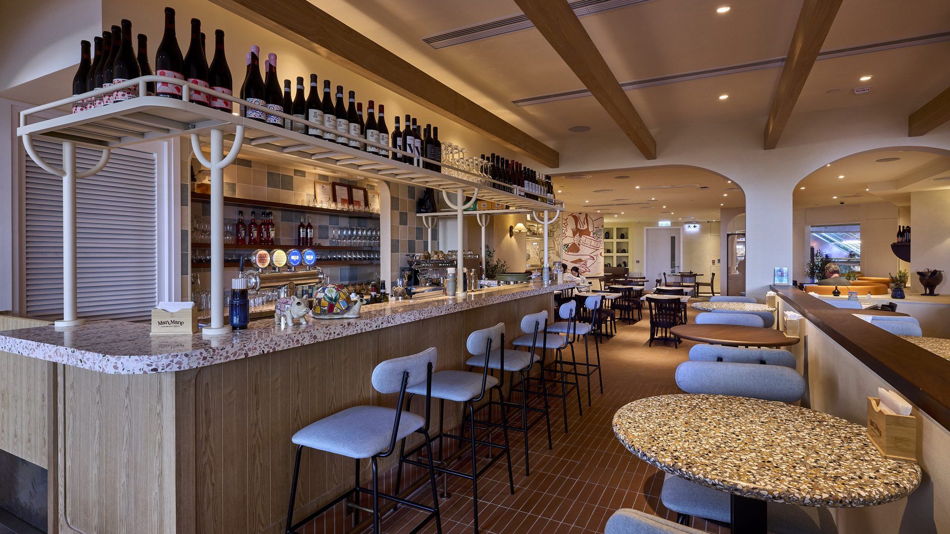
The slew of new Italian restaurant openings continues with Man Mono by Wolly Pig Hong Kong. With an outlet in Tung Chung, the restaurant takes inspiration from a traditional Italian family kitchen where everything is made from scratch. As a result, diners can expect a menu filled with house-made artisan pasta. The 4,000 square-foot space is dressed in pastel and soft earthy tones, complete with Italian countryside courtyard-inspired decor in rustic stone and brick. However, the showstopper is the pasta-making counter, where the culinary team puts on a theatrical touch on hand-rolled pasta. So, keep your eyes peeled and your stomachs ready for the Pappardelle, Maccheroni, and Risotto.
Address: Unit 418, Citygate Outlets, 18-20 Tat Tung Road, Tung Chung
Phone: +852 3500 5885

From the minds behind meat and seafood purveyors Steak King, comes this new Italian steak restaurant. Macelle, inspired by the Italian word for ‘macelleria’ which means butcher, entices diners with its counter-to-plate steak offering. The 50-seat trattoria-style dining has both indoor and alfresco options. Sink your teeth into their signature items like the Angus Fiorentina Steak or Iberico Pork Chops. Also on the menu are seasonal meat and fish items cooked in Macelle’s wood-fired grill for extra flavour with every bite.
Address: LG, Sharma Soho, 9–11 Staunton Street, Central, Hong Kong
Phone: 5607 4860

This is the newest addition to Hong Kong’s growing number of Filipino restaurants. Barkada, which means a group of close friends in Tagalog, is helmed by food influencer and cookbook author Jen Balisi of Indulgent Eats. Championing bold flavours through contemporary Filipino cuisine, the menu celebrates the savoury, sour, sweet, and spicy palette that characterises the Philippines. Diners can expect modern takes on the classics such as the Adobo Popcorn Chicken and Brown Butter Pancit Canton. A vegetarian version of the Sizzling Sisig is available with other plant-based options. Be sure to pair the food with cocktails created by the award-winning bartender, Gagan Gurung. His creations fuse Filipino and Southeast Asian flavours.
Address: UG, FOCO, 46–48 Cochrane Street, Central, Hong Kong
Phone: 2663 0238
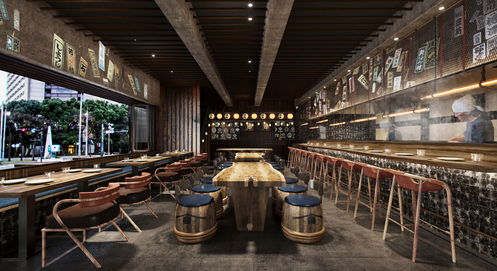
Yurakucho is bringing the timeless energy of Japan’s izakaya water-hole culture to Hong Kong. Expect sake, a live robatayaki open-kitchen grill, Japanese highballs, Japanese-style bites, and DJ-spinning soundtracks. Head chef Vicky Mau and chef Matthew Chan are bringing to life dishes that represent the hidden streets of Yurakucho. Indulge in small plate offerings such as the Katsu Sandos, Garlic Butter Edamame, and Chicken Kaarage, all created fresh from the open kitchen.
Address: G/F, Yu Yuet Lai Building, 43–55 Wyndham Street, Central, Hong Kong
Phone: 2663 0068

With roots in Tokyo, Kushitei marks the kushiage eatery’s first outpost in Hong Kong. The omakase-style restaurant offers the well-loved exponents of deep-fried, skewered-led cuisine. The wood-clad interior has a nine-counter seating with surrounding tables accommodating another 12 for an intimate dining experience. The farm-to-table skewers are freshly cooked, made with free-range Kurosatsuma chicken from Kagoshima, purse sunflower oil, and a special kneading powder. To complement crispy specialities, make room for the tempting selection of Japanese sake and fruit wines.
Address: Shop G04–05, G/F, Grand Centre, 8 Humphreys Avenue, Tsim Sha Tsui, Hong Kong
Phone: 2688 6150
Harbourside is one of the four new restaurants at Regent Hong Kong. Perfect for picky eaters and those with a big appetite, Harbourside offers a vibrant dining experience complete with stunning views of Victoria Harbour. With a focus on Asian and Western cuisine, let yourself be transported to various food destinations across the globe. The menu changes every week to provide new experiences each time. Be sure to catch different exclusive items which are available at different time slots. Some of the must-haves include different varieties of pizzas, bread, pastries, and sushi.
Address: G/F, Regent Hong Kong, 18 Salisbury Road, Tsim Sha Tsui, Hong Kong
Phone: 2313 2313
This new space is inspired by Spain’s historic Madrid de Los Austria’s neighbourhood, Calle Ocho. Encompassing over 2,500 square feet, the tapas bar and restaurant overlooks Victoria Park and Fashion Walk. The menu travels the length and breadth of Spain, from the humble Pan con Tomate to the playful Uni-Cone featuring tuna tartar. Their selection of indulgent Charcuterie with traditional cold cuts and cheeses is particularly enticing. Don’t forget to try the slightly salty Candela Manchego Cheesecake before calling for the cheque.
Address: Fashion Walk, 8 Cleveland Street, Causeway Bay, Hong Kong
Phone: 2638 8895

Love ramen? Gogyo, the Japanese ramen gastropub, is back in town after it shut its doors in 2019. With a traditional Japanese izakaya and a bar, Gogyo offers the best of both worlds. Everyone’s favourite Kogashi Miso Ramen and yakitori dishes are making a comeback. Additionally, the selection of craft beer and drinks will spoil you for choice.
Address: B1/F, Alexandra House, 16-20 Chater Road, Central
Phone: 3568 5833

Overseen by Culinary Director Danielle Giambattista, the diverse menu promises a taste of British homestay classics, comfort foods, and an occasional local twist. Signature dishes include Crispy Haggis Balls, the sinfully juicy Jervois Burger, Charred Broccoli Rabe, crispy Chicken Schnitzel, oozy 69 Macaroni and Cheese, and a nostalgic Baked Apple Crumble. This brand-new venue also comes with a speakeasy bar curated for intimate get-togethers. The So Hong Sinner, The GoDown and Fragrant Nullah are just a few tipples you must try here.
Address: 69 Jervois Street, Sheung Wan, Hong Kong
Phone: 9752 6715
Hiru Omakase is a Japanese concept inspired by the tranquillity of the day. The zen space features bright, all-white walls with muted tones. Executive Chef Ronald Liang, who is at the restaurant’s helm, promises an exclusive gastronomic expedition with Omakase courses featuring excellent seafood and fine ingredients. Omakase lovers have great things to say about their Monkfish Liver from Hokkaido and Wild Tuna from Hachinohe-shi. For a premium dining experience, take advantage of the Hiru Omakase premium tailor-made experience.
Address: G/F, No. 21 Lan Fang Road, Causeway Bay, Hong Kong,
Phone: 9017 9352

Based on the Japanese concept of night, Yoru Teppanyaki welcomes you with a warm, welcoming ambience that feels authentic in every way. Here, Teppanyaki techniques using Sakura Wood and Bincho Charcoal create perfect harmony, texture, and flavour. In addition, Yoru Teppanyaki’s unique ‘colourful sauces’ enhance the taste. The restaurant reinvents the teppanyaki cuisine with modern sensibilities with fresh and seasonal ingredients. You can book the VIP rooms to enjoy a private, higher and more comfortable experience.
Address: G/F, No. 17-19 Forest Road, Tsim Sha Tsui, Hong Kong
Phone: 5331 3978
We hope you’re hungry, Hong Kong.
The post Best new restaurants in Hong Kong right now appeared first on Lifestyle Asia Hong Kong.
]]>We may earn revenue from the products available on this page and participate in affiliate programs.
If you’ve ever found yourself rummaging through a mountain of mismatched food storage containers, you’ll agree that Tupperware sets are like the socks of a kitchen. You somehow always have too many, and yet never any perfect pairs. And instead of going MIA in the dryer, they disappear into the depths of your corner cabinets. We’re happy to let you know that your days spent searching for elusive plastic lids are over. Here, pro organizers and interior designers share their best Tupperware storage ideas to manage the mayhem for good.
Nothing beats the satisfaction of having four or five separate sets neatly stacked inside of each other in size order. You keep your cupboards looking decluttered without having to compromise on the amount of Tupperware you have. —Laura Price, founder, The Home Organisation
Since these are typically everyday items, we recommend storing them in easy-to-access lower cabinets. There’s nothing worse than having to rifle overhead for what you need or risk a waterfall of containers falling on your head. If you’re storing in a drawer, use little boxes or drawer dividers to separate your lids and bases. If you’re using shelves, consider installing a glider insert so you don’t have to dig in the back. —Jennifer Verruto, founder and CEO, Blythe Interiors
The golden rule of storing Tupperware is to never put a container back in the cupboard without a top on it. It’s nature’s great mystery as to how they manage to lose their lids, but they do. A lot. Store them as a complete set so you never have to worry about mismatched pieces clogging up your cupboards. —Laura Price
One of the easiest ways to keep containers organized is to store them stacked in a drawer or cabinet with the lids on, but if you don’t have the room to stack, nest the containers inside one another, and line up the corresponding lids right next to the bottoms. If you’re really tight on space, I recommend getting a nesting set with lids like this. —Amy Berryhill, founder, Spiffy Chicks
Store smaller pieces, particularly sauce and dressing containers, in a small basket at the front [of the cabinet]. This way you never run the risk of losing the little ones in the abyss of the cupboard. —Laura Price
Inevitably, a lid will get separated from its bottom, but that doesn’t mean you have to toss it! Tupperware bases become great bath toys, craft storage, or under-the-counter toiletry organizers. One of our favorite uses for extra lids is as furniture movers. Place them underneath the leg of something that needs to be moved to prevent the legs from scratching your floors. —Jennifer Verruto
The post 6 Clever Tupperware Storage Ideas to Keep Your Cabinets in Check appeared first on domino.
]]>
Outpatients at St James’ Hospital feel better even before they see the doctor – thanks to a new note in hospital design. ‘Comfort while you wait’ is the new policy, and that means an informal atmosphere, extra comfy chairs, concealed lighting, heated cork floors, and an ultra-modern design throughout. No shades of depressing institutions here.
You might think this description comes from the glossy marketing material for one of today’s cutting-edge private hospitals. In fact, it’s from a 1954 Pathé News clip celebrating one of the earliest buildings designed for Britain’s fledgling National Health Service (NHS) – launched six years earlier on July 5, 1948.
What St James’ Hospital in Balham, south London, lacked in size, it made up for in ambition. The new central complex embodied the stated ideals of the NHS, to provide an equitable service for all citizens, free of charge and of the highest standard. The new buildings contained consulting rooms, staff offices and waiting rooms, and a children’s room that was lauded by the Pathé commentator:
In the children’s room, the longer the youngsters have to wait, the better they like it. They can play as loudly as they like, for in their own room their chatter and high spirits can’t worry other patients … It’s no wonder that in this hospital, some of the children and their parents come a little early for their appointments on purpose!
As we take stock of the NHS on the occasion of its 75th anniversary, most attention is focused on staff pay demands, lengthy waiting lists for treatment, and the intolerable pressures on staff during and beyond the pandemic. But the design and upkeep of NHS hospital buildings, and the impact these can have on the patients and staff who inhabit them, is another pressing, if less widely publicised, issue.

To mark the 75th anniversary of the launch of the NHS, we’ve commissioned a series of articles addressing the biggest challenges the service now faces. We want to understand not only what needs to change, but the knock-on effects on other parts of this extraordinarily complex health system.
I believe we can find answers to at least some of today’s health service problems by looking at the history of these buildings, and the shifting design priorities they reflect.
The story of St James’ Hospital is a case in point. Less than 40 years on from the proud launch of its new central complex, the entire hospital stood empty and ruinous – a symbol, perhaps, of the failed ambitions of the early NHS. The buildings were demolished in 1992, and the site was redeveloped for housing.
Another south London hospital was in the news recently. “Patient safety at risk in crumbling hospital Boris Johnson promised to replace,” read a headline in the Observer, describing conditions in St Helier Hospital, Carshalton.
St Helier was built just before the outbreak of the second world war, constructed on reinforced concrete foundations with a steel-frame and brick infill, faced in white-painted cement render. At the time, it was regarded as the last word in up-to-date modernist design, with “accommodation of the highest class in any part of the world”.
Now, parts of this hospital are sinking. The basement floods, wards are sometimes forced to close, and the hospital has become “dilapidated and unpleasant”, according to Ruth Charlton, chief medical officer of Epsom & St Helier University Hospitals NHS Trust. In a recent commentary, she wrote:
Our ageing estate looked awful even when I joined, and over the years it’s decayed further before my eyes. Healthcare standards are getting higher while our hospitals are sliding into even more disrepair … Only last week we had to close one of our wards because the lift wasn’t working.
Nor is this an isolated case. In April, a tweet by palliative care doctor and author Rachel Clarke showed “an actual interior corridor of a major NHS hospital”. The photograph looks like the bowels of a particularly unsavoury multi-storey carpark, yet the reflection in the mirror clearly shows it is an internal space. The paint is peeling, the damp so bad that a streak of green algae is running down the corner of the room.
Along with such images of decay and dereliction, we have also seen images of egregious overcrowding over the past few years, as COVID-19 put extreme demands on NHS facilities that were already creaking badly. Accounts of patients being treated in corridors and even in hospital car parks continued last winter, even when the COVID threat had receded somewhat.
In January 2023, Alice Kenny, a junior sister at Queen’s Hospital in Romford, east London, who had been redesignated as a “corridor nurse”, told the BBC:
We don’t train to give care in corridors. It is really not nice and if we were in [our patients’] shoes, we’d be really upset as well. We’re supposed to look after patients like we do our own family, and we’re not able to do that.
As the architectural history of the NHS is such a huge subject, I have mainly focused on Scotland where I live and can access the official records – some of which have only become available to researchers in recent years. This has provided fresh insights into the ideas and ideals behind the design of the first purpose-built hospitals built by the NHS.
The problems back then were not dissimilar to those faced today: old worn-out buildings, staff shortages, rising costs and economic austerity. Take Old Monkland Home in Coatbridge, to the east of Glasgow – one of the 3,000-or-so hospitals that were transferred to state ownership when the NHS came into being in July 1948. A review of this former poorhouse’s facilities, published in a national hospital survey before the end of the second world war, was damning:
Old Monkland Home occupies a depressing site in Coatbridge. The hospital part now contains 69 beds, and there is also an asylum for milder types of lunatic … The impression is one of general neglect. The dining-room is very gloomy, the hospital is very little better than the main house, and the asylum block is totally unsuitable for patients of any kind. We are of the opinion that this institution is quite unsuitable for the care of the sick, and should be abandoned.
The NHS had inherited a patchwork of hospitals, predominantly over half-a-century old, that had been built to meet the medical needs of the time: sanatoria for tuberculosis, isolation hospitals for once-common infectious diseases such as measles and diphtheria, and cottage hospitals run by country GPs who carried out routine surgery, delivered local babies, set bones and treated wounds from accidents.

This article is part of Conversation Insights
The Insights team generates long-form journalism derived from interdisciplinary research. The team is working with academics from different backgrounds who have been engaged in projects aimed at tackling societal and scientific challenges.
There were also large urban workhouse infirmaries full of chronically ill elderly patients, huge mental hospitals, teaching hospitals, and convalescent homes. Funding to build and run them came from a wide range of sources, including public donations, church collections, the rates, government loans, and work-placed insurance schemes.
These buildings had been “built to last” 100 years or more (brick or stone buildings that were expensive to construct were only economically viable if they had a long lifespan). But they suffered from a lack of structural maintenance and redecoration during the war, and afterwards from the severe shortages of labour and materials.
The UK-wide survey of hospitals had been intended to inform post-war reconstruction and the development of a “national hospital service”, which aimed to “ensure that every patient requiring hospital treatment could obtain it without delay in the hospital most suited to their needs”. In reality, it painted a picture of uneven distribution and poor facilities, with the worst of the buildings being the old workhouses:
Wigtownshire Home, Stranraer, has not undergone any appreciable change since it was built about 1850. The building is worn out and dreary … This is a very poor place, and is quite unsuitable for housing the sick or aged, or indeed for any other purpose.
In the immediate post-war years, new housing was the most urgent requirement throughout Britain, along with new schools after the Butler Act of 1944 raised the school-leaving age to 15 (with a post-war baby boom to follow). Yet there was also a widespread consensus among the public that the current level of healthcare provision was no longer acceptable. A new type of hospital facility was needed to reflect the scientific advances of medicine and the aspirations of post-war Britain.
These aspirations found physical form in the first new general hospital built in Britain for the NHS, which opened in Scotland in 1955 at Vale of Leven to the north-west of Glasgow. One of its most striking features were the wards, which were dramatically different from the traditional “Nightingale-style” open wards that offered no privacy to patients.
At Vale of Leven, the beds were grouped in bays separated by glazed screens. Ceiling heights were lower to create a more homely feel. The day room was furnished like a domestic sitting room, with comfortably upholstered armchairs. Windows were set low enough in the walls for patients to be able to see the grounds while lying in bed – and they also provided natural ventilation, allowing fresh air and the sound of birdsong to enter each ward.
Facilities for staff were an important consideration, as the Architect & Building News explained:
A nurse’s station is an L-shaped counter containing knee space, drawers, filing cabinets etc, with a dwarf glass screen to cut off draughts, record board and shaded reading light, and small cupboards behind in the storage wall. The station is raised on a low step so that, when sitting, the nurse has a view of her 13 beds and, in fact, is only 25 feet away from her farthest patient and is quickly conscious of any movement or disturbance. Signal lights from beds are placed so that they can be seen from either of two nurse’s stations in case one is temporarily unoccupied.
The subject of hospital design was now a hot topic among architects, health professionals and administrators alike – with an emphasis on the collaborative planning processes and research-led design that had evolved in more progressive architecture schools before the war. Schools such as the Architectural Association in London and Liverpool had developed a belief in social theory and managerial efficiency. Architects sought specialist advice on every aspect of the hospital, from the wards to catering and even laundries. As the regional architect for the South Eastern Regional Hospital Board wrote in 1951 about his new building schemes:
It would be futile for medical science to progress and leave in its wake a dull, unimaginative architecture.
Another reason for the extra care being taken over these new buildings was that, in the period of full employment in the 1950s and ‘60s, it was often proving difficult to attract enough hospital staff. The shortage of nurses, traditionally a female role, was especially acute because the rate of pay was lower than for many office jobs in the private sector – jobs that also offered shorter hours and fewer pressures than nursing.
To entice new recruits and enhance retainment levels, local management boards pushed hard to get well-appointed nurses’ homes built and to provide generous staff social and recreational facilities – from tennis courts to swimming pools, coffee bars to halls for cinema shows and dances.
At this time, the opening of a new hospital was a newsworthy event, featured in the architectural and medical press, national and local newspapers, and in newsreels. The opening of the new High Wycombe General Hospital in the mid-1960s was met with another gushing tribute from the Pathé News team:
The spaciousness of the entrance and reception hall will give patients confidence that here they are meeting medical science 1967-style, equipped as it should be. Gone is the old atmosphere of healing on the cheap, gone too is the belief that staff of the hospitals should put up with third-rate food and bad quarters. The menus in the nurses’ dining room are varied and make eating a pleasure deserved by women whose devoted service goes far beyond the minimum they could get away with.
I remember this hospital (more commonly known as Wycombe General) from not long after the film was released. It was where I had a tonsillectomy – then a routine operation – at the age of seven. I recall the hospital being shiny and modern, with toilets that were spotlessly clean and, unlike our loo at home, heated!
I remember the children’s ward being a bright sunny room with about eight beds, and a small dayroom where we had breakfast that was made rather cramped by an enormous toy cupboard, where a kind nurse hid my bowl of porridge which I could not eat. I had no trouble with the ice cream we were allowed to have in bed after our operations, though.
Our parents only visited for a short time during the day, but we didn’t seem to mind or feel anxious about it – perhaps in part because of the atmosphere in the hospital, where modern architecture conveyed, even to a young child, confidence in medical science. As the Pathé commentator concluded:
There is a good reason for High Wycombe General being called a five-star luxury hospital. It’s part of the new approach to the art and science of getting sick people well.
Fast-forward just over half a century, however, and Wycombe General is now “approaching its end of life” and in “dire need of replacement”, according to the NHS trust that runs it. While confirming to the BBC that the hospital is still “safe”, the hospital’s ongoing repairs and maintenance now cost the trust around £2 million a year.
Wycombe General was built following a period when funding for hospital building had increased by over 50%. In 1962, the UK government had published its Hospital Plan, which promised that 90 new hospitals would be commenced in England and Wales by 1971. The plan was to provide a network of new district general hospitals evenly distributed around the country, so that everyone would be in easy reach of all the main hospital services, with just a few of the more unusual specialities based at a regional centre.
However, it did not take long for this ambitious plan to come off the rails. Not enough money had been pledged by the government to fund all the schemes that were proposed, the process of planning and design took a long time, costs escalated, and by 1964, comprehensive revisions had to be made. In successive years, the plans were scaled back.
By the mid-1960s, relatively little had been achieved and the policy of concentrating on district general hospitals was questioned. The 1966 revision of the Hospital Plan refocused the building programme towards creating units for the elderly and mentally ill. Start dates for new hospitals were postponed and, to try to combat rising costs, stricter financial controls were introduced.
Despite this, there was still a belief in producing good quality buildings designed to meet the needs of modern medicine in attractive surroundings. As the Architects’ Journal put it when discussing the new staff restaurant and stores building at Kingston Hospital in Surrey:
The matter of nurses’ meals is almost a household topic and, along with spectacles and false teeth, has been giving the health ministry a bad press.
At Falkirk Royal Infirmary in Scotland’s central belt, meanwhile, an experimental surgical ward unit was designed around new ways of organising nursing on the lines of progressive patient care, while also making the nurses’ routines easier and reducing the amount of walking they would have to do. Hospital infection and resistance to antibiotics were already a concern in the 1960s, and engineers designed more sophisticated heating and ventilation systems to control the movement of airborne infections and prevent cross infection.
Unfortunately, such considerations cost more than the government was willing to spend, and no health minister of either political persuasion was able to convince the cabinet or the Treasury to provide the amount of money that the rebuilding programme was going to cost.
The 1970s was a period of devaluation of sterling, strikes and war in the Middle East that caused an oil crisis. There was a three-day week, petrol rationing and power cuts. This led to public spending cuts that only worsened the position for the hospital building programme. At the same time, there was widespread criticism of the amount of time it was taking to build each hospital, and concern that a number of recently completed hospitals had been found to have structural defects.
A case in point is the saga of Inverclyde Royal Hospital in Greenock, west Scotland – one of the new district general hospitals promised in the original Hospital Plan. After a provisional cost limit of just over £4 million was approved in 1964, a design team was appointed the following year. However, the UK government halted the project for nearly two years due to a shortage of funds – a time when lots of large national projects were being halted. At the same time, the design brief had to be revised to keep up-to-date with technical guidance.
Amid new tenders, spiralling budgets and a further cost reduction exercise, work finally started on site in 1970, but the official contract completion date of March 1976 was missed, and the fabric of the building was eventually completed in November 1977 – only for the ventilation systems to be found to be defective.
It was not until the very end of 1979 that Inverclyde Royal Hospital was finally completed, at a cost of over £13m – more than three times the original cost limit. There was no single reason for the vastly increased cost, but the era’s high inflation rates were a significant factor. Each delay led to the cost going up, cancelling out the cost reduction exercise. Time and again on new hospital schemes, such exercise led to the use of poorer-quality materials and inferior heating and ventilation systems, which would cause problems with the building later on.
But more fundamentally, the new hospitals being built were now anticipated to last only between 40 and 50 years at the most. The reasons why this changed from the Victorian era when hospitals were built to last for a century or more, are many and complex. The main reason was the increasingly rapid advances being made in medical science, which led to a widespread view that the buildings would become obsolete as medical needs evolved.
But 40 is no age to be consigned to the scrap heap. We do not expect our homes to expire after such a short timespan – but equally, we understand that we need to invest in maintenance to keep them in good condition.
As the NHS celebrates its 75th anniversary, many of its hospitals built in the 1960s, ‘70s and early ‘80s have reached the end of their anticipated lifespan. As a result, the UK is now having to tackle the problem of large numbers of hospitals that have reached the end of their predicted lives.
Part of Johnson’s 2019 general election manifesto promised that 40 new hospitals would be built by 2030. There was talk of “levelling up our NHS” and a determination “to build back better”. However, this plan was later exposed as something of a numbers trick or “mirage”, with many of the “new” hospitals turning out to be extensions or refurbishments. In February 2023, the Observer reported that only ten of the projects had secured full planning permission, with one NHS trust leader warning that: “Some hospitals are literally falling down.”
Search for King’s Lynn’s Queen Elizabeth Hospital online, and you are likely to find multiple news items about its dilapidated condition, demands to hasten its replacement, and images of ceilings being held up by acrow props.
“Isn’t it lovely,” the Duchess of Kent had told the Lynn Advertiser when she first entered the new hospital in July 1980. According to the same newspaper, the public had been similarly impressed when given guided tours of the newly completed building:
Guides pointed out bright wards … most with outlooks over landscaped gardens. Mouths dropped as guides said patients would be able to choose the main course of their meals from a menu offering 17 options – and every three weeks, that menu would be changed.
Yet, just 43 years later, the Queen Elizabeth has been described as “Britain’s most dilapidated hospital”. According to a report on the Norfolk Live website:
Patients lie in bed looking up at the [roof] supports … Regular checks take place every day to make sure the roof is not at more risk of collapse through holes in the concrete described as being ‘like an Aero chocolate bar’.
The Aero bar analogy refers to the reinforced, autoclaved aerated concrete (RAAC) used in the hospital roof’s construction, and in many other public buildings. In 2018, the roof of a primary school in Kent collapsed only a day after “signs of structural stress” had appeared in the staffroom ceiling. It transpired that the roof had been constructed of RAAC, which has an estimated shelf-life of just 30 years.
An initial investigation into the use of RAAC in schools has recently been extended to look at public buildings more widely – including hospitals. In May, a report on the Conservative government’s promise to build 40 new hospitals suggested that just five – those that had used RAAC in their construction – were now being prioritised.
The Queen Elizabeth was one of the so-called “best buy” hospitals designed by the Department of Health & Social Security (DHSS) as a complete package. These were introduced in 1967 to remedy the problems of drawn-out design processes and escalating costs that had been derailing the NHS hospital building programme. It was a budget version of the district general hospital envisaged in the 1962 Hospital Plan, providing fewer beds per head of population in more confined spaces using simpler construction methods.
Standardisation and prefabrication were the principles of this design process, which was intended to provide an “adequate” rather than “ideal” hospital amid the country’s deep financial challenges of the 1970s. Hospital design was pared back to its essentials – a policy that has largely continued ever since.
The “nucleus” hospitals that followed from the mid-1970s were designed to limit new developments and major extensions to a nucleus of departments costing no more than £6 million (at 1975 prices). Every possible means of economising space and services was explored by the Hospital Building Division within the DHSS.
Crucially, a lower complement of beds per hospital was provided, based on the justification that earlier patient discharges would create a more intensive use of diagnostic and treatment facilities. In other words, Britain’s hospitals were now becoming high-turnover factory lines.

As hospitals at the end of their lifespan struggle to deal with patient overcrowding amid crumbling facilities, have decades of cost-cutting exercises when it comes to hospital design and construction turned out to be a false economy? Can a price be put on the damaging effects of poor hospital design on staff morale or patient health?
While we can put a figure on the cost of buying in agency staff to cover staff shortages or even major building repairs, less quantifiable is the impact on health and wellbeing of the buildings themselves.
But we know that good design can be life-enhancing. Within the NHS, Maggie’s centres are a network of cancer drop-in centres unified by a groundbreaking commitment to pushing architectural boundaries, with their multi-award-winning buildings having been designed by some of the world’s leading architects such as Frank Gehry and Zaha Hadid.
These centres, located throughout the UK and also in Hong Kong, offer “unique physical environments” created on the basis of a wide body of evidence that shows how aspects of physical space affect us.
The impact of design on inpatient wellbeing has been a growing focus of research for many years, highlighting the importance of obvious elements such as access to nature, attractive surroundings, artworks on walls, single rooms for patients. There is, for example, evidence for the therapeutic benefits of “healing gardens”, and gardening or outdoor exercise is sometimes prescribed by GPs.
More recently, consideration of therapeutic spaces has broadened to include hospital staff as well as patients, in order to tackle the high levels of sickness absence, distress and burnout among healthcare professionals – levels that are higher in this sector than any other. Yet most solutions so far offered have been short-term interventions, rather than a fundamental reassessment of how the workplace should be designed with staff wellbeing placed on the same footing as patient wellbeing.
Designing a hospital in which it is a pleasure both to work and be a patient is surely a goal worth achieving, and one which it is possible to justify on economic grounds. Spending more now on hospital buildings can save having to rebuild, at higher costs, in 20 or 30 years’ time. If done in such a way as to attract new staff, it can reduce the amount spent on agency fees.
Good design does not have to mean a new hospital, even if that is what people believe they want. Promising to build new hospitals is good publicity for any government, but it can also lead to damning headlines about wildly increased costs and failed promises further down the line.
Good design can also be achieved through retrofitting, by altering and adapting existing buildings. It is a more sustainable route and ideally would be the first option considered in the face of the present climate emergency. It is a complex issue, and retrofitting may be impossible in some cases – and very probably more expensive than a new-build in almost every other case. However, it addresses the issues of the embodied carbon in existing buildings.
Political pressures to win public votes favours the quick fix. We need a new way of thinking about building, adapting and retrofitting hospitals that can deliver comfortable environments in a sustainable way for the long term, and to understand that cost-cutting today often leads to greater expense in the future.
In 2021, the Wolfson Economics Prize set as its challenge the planning and design of the hospital of the future, specifically with a view to “radically” improving patient experiences, clinical outcomes, staff wellbeing and integration with wider health and social care.
The designers of British hospitals in the 1950s and ‘60s – in the early years after the launch of the bold new NHS – might be surprised to find we are still asking the same questions they set out to solve all those years ago.

For you: more from our Insights series:
To hear about new Insights articles, join the hundreds of thousands of people who value The Conversation’s evidence-based news. Subscribe to our newsletter.
Harriet Richardson Blakeman receives funding from AHRC for doctoral research.
]]>Shows like Designated Survivor sit on the opposite end of the mindlessness spectrum to And Just Like That, the Sex and the City reboot from Max (formerly HBO Max) that’s now back for a second season. I’ve watched the first seven episodes—each a fugue-state-inducing 45 minutes—and it’s almost awe-inspiring how little actually happens. In the first episode, Carrie learns, via YouTube, how to poach an egg. In the second, Miranda loses her phone on the beach. In the third, Carrie pretends she has COVID to get out of recording her own audiobook. The stories are breathtakingly small, as though the original show has been shrunk down into a vivid maquette. A substantial portion of the fifth episode is dedicated to Charlotte and Harry dressing up as Philip and Elizabeth Jennings from The Americans for Halloween and getting frustrated that no one gets the reference. “It was on FX for seven seasons!” Harry argues (incorrectly). “It won countless Emmys. And a Peabody!” (No one around him cares, which makes it funny that the writers thought we would.)
[Read: ‘And Just Like That’ is a far cry from ‘Sex and the City’]
Is this defiant lack of creativity the logical conclusion to a fictional universe so constrained by its fear of being conventional that middle age—especially as it pertains to the lives of women—is literally unimaginable? Or is it something else? Because here’s the thing: As listless as the show is, as mortifying as the jokes are (“I’m not trying to have currylingus later,” Miranda’s lover says to her as she struggles with her spicy entree), I hurtled through each episode, cringing as I went. And Just Like That is, to be clear, not good. But every now and then it contains flashes of what made Sex and the City so absorbing. The reboot evokes much the same feeling you get when idly scrolling through Instagram: beauty, color, familiar faces, the thrill of a space where infinite possibility feels like it could be lurking just around the corner.
Our current glut of revivals, a New York Times essay recently theorized, faces “a clear creative bind. The reboot that changes nothing will be uncanny and lifeless; the one that thinks itself more clever than its predecessor will turn out cynical and sour.” The first season of And Just Like That was inarguably the latter—an extended penance for the show’s perceived ills that turned its characters into joyless, clumsy Karens long past the point of social relevance. Carrie, formerly the sexual correspondent of her generation, was now the token uptight prude on a podcast called X, Y, and Me. Miranda, the skeptical, pragmatic adult in the room, developed a drinking problem during the pandemic, made racist assumptions about the professor of her human-rights-law class, and then impetuously left her longtime husband, Steve, for a “queer nonbinary Mexican Irish diva” comedian named Che Diaz. Charlotte fretted over the fact that she had only one Black friend. Samantha, when Kim Cattrall refused to sign on for the show, was reduced to a sassy text message or two. As if to atone for Sex and the City’s improbable whiteness over the years, the reboot paired each woman with a new character of color—a move that felt uncomfortably like tokenism but was redeemed by the new slate of actors that appeared: Nicole Ari Parker as Lisa, a documentary filmmaker with a closet to rival Carrie’s; Karen Pittman as Nya, Miranda’s unhappily married law professor; Sarita Choudhury as Seema, a real-estate agent whose yen for fur coats and fast men seemed designed to compensate for Samantha’s marked absence.
[Read: We need to talk about Miranda]
In its second season, And Just Like That thankfully stops apologizing for its existence. Unfortunately, this only illuminates the show’s lack of purpose; it is indeed uncanny and lifeless. The first episode opens with all of the characters except Nya strutting theatrically toward their partner in nightwear, as if to say that sex (like low-cut jeans and extreme thinness) is back. It’s a thrilling opening montage, audacious and fun, that sputters out as soon as Carrie and her partner, her podcast producer, Franklyn, start making pillow talk about why he likes watching cooking shows in bed. (“No idea,” Franklyn says.) The dialogue is so bad, so devoid of art or spirit, that it threatens to topple the whole project. When a caller on Carrie’s podcast asks how to get her lover to more of a “relationship place,” Carrie quips, “First of all, ‘Relationship Place’ is a great name for a restaurant.” (What?) When a handsome man approaches Nya at a bar and observes that her book seems absorbing, she replies, “Well, Skip Gates always is, but since I’m on my second glass of Malbec, I’m having a hard time concentrating.”
By the second episode, when Carrie’s major storyline is her struggle to record an ad for a vaginal-wellness product—“I think my vagina has to write its own monologue,” she tells Franklyn—I felt slightly stoned, as though the show’s unsettling emptiness was my fault. Errant details waft around like dandelion burrs in a breeze. Che’s new sitcom, we learn, is called Che Pasa. Charlotte’s youngest child, Rock, is discovered by a modeling agent and cast in a Ralph Lauren ad campaign, a plot point that becomes useless when Rock decides they don’t want to model. Harry loses his ability not to orgasm but to ejaculate, which leads Carrie to regrettably utter the words “Casper the friendly cum.”
Didn’t these women used to have jobs? Wasn’t there a purpose to their nonsexual meanderings? Is this what not needing money anymore does to you? I almost missed the show’s insistent flaunting of its woke bona fides when Anthony blithely announces that he has to hire a new Hotfella for his bread business because “Kevin has Hep C”; when Carrie tells Charlotte that she doesn’t use condoms because she doesn’t have an STD; and when one character goes home with a sexy academic only to be disgusted by their unanticipated poverty—the cat-litter tray in the kitchen, the unlaundered bed. Not all of us bought Brooklyn brownstones 20 years ago or married into private equity, okay? There were so many times when I wanted not to be watching this wraith of a once truly era-defining show. To be more like my colleague who refuses to, on the grounds that “it’s like watching your favorite bar burn down.” And yet this is the curse of our age of reboots: You watch because it’s easy. You watch because the cost of entry is so low. You watch because, despite a surplus of shows out there, it’s consistently hard to find much that’s accessible, artful, and inspiring. And just like that, I capitulated.

In the living room, the eye is drawn magnetically to a flamboyant red faux fur couch. It’s not your average sofa, but it communicates a deep and welcoming comfort and is incredibly fun. See more inspiration for a red couch living room.
The modern sofa is given space to shine by removing any unnecessary furniture from the peripheral. There are no end tables here and the coffee table has an understated clean, white finish. A tall, built-in cabinet with curved corners keeps clutter at bay. A small shelf extends through it and onward behind the sofa, creating a handy yet almost undetectable ledge.
The modern coffee table is cut with a visually interesting asymmetrical shape. Its stark black base pours out from underneath it like molten rock, flowing darkly across the pale area rug.
A piece of quirky wall art complements the unusual sofa with an equally intriguing subject and rosy color palette.
The living room stands open to a hallway and the kitchen diner, creating a spacious and airy feel.
The curved decor motif is not unique to this home interior, but it is conveyed in a bold and exciting way. A deeply rounded arch curls around a covered balcony area, making a dramatic frame around the city view. A curved TV mount forms a perfect, fluid link from the arched balcony frame to the main focal wall.
A white and fluffy faux fur lounge chair makes a wild contradiction to the hard concrete city that looms outside the apartment window. It stands alone as a single reading chair, bathed in natural light from the huge window.
The TV screen is set inside the curved mount to achieve a streamlined look. A bespoke media console unit fits into the piece with a perfectly rounded corner. The curves in the room are complemented by a unique acrylic table lamp, which finds an unusual home on the coffee table.
The sleek white kitchen installation takes a backseat to the quirkier elements of the living room sitting area. However, a curvaceous kitchen peninsula does strike a bold outline with a smoothly molded dining table extension. Recessed ceiling lighting extends the rounded theme with a precisely curved track.
Above the rounded dining peninsula, a linear suspension light features an elegantly curved shade.
In the master bedroom, a black upholstered bed makes a striking contradiction to the light and creamy wall decor.
Unique bedroom pendant lights fall at each side of the headboard, giving out focussed reading light.
A vertical light strip burns within the headboard wall, where it threads behind an unusual nightstand with an acrylic top.
On the opposite side of the bed, a floating nightstand is tailored around the shallow alcove.
Black pillows and a matching black bed runner make bold contrast with a basic beige bed set.
Fitted wardrobes line the wall at the foot of the bed. Leather handle pulls punctuate their warm white finish.
A display shelf is included at the window end of the wardrobe installation, where it forms a brief decorative moment and a stripe of warm natural wood tone. A flower vase is showcased inside the niche, illuminated by a recessed spotlight.
The bedroom is split into two areas: The sleeping zone and clothes storage space are combined at one side, while an open-plan vanity area occupies the other. A change in flooring defines the zoning and a cantilevered bathroom vanity unit builds a brief physical barrier.
The vanity unit draws around the ensuite in an L-shape, making plenty of space underneath it for a wicker laundry basket. See more ideas for unique laundry baskets.
A black vanity mirror is anchored between the countertop and ceiling. Its placement emphasizes the room division.
Concrete blocks and mood lighting build a feature wall that brightly marks the transition between the sleep space and the ensuite vanity area. A decorative vase brings in a splash of nature and a flash of red.
At the back of the room, there is a custom makeup table and a uniquely sculptural vanity chair.
The kid’s room is brightened with fun wall prints and bright perimeter lighting. The LED strips crisply highlight an attractive, pitched ceiling.
A custom-made bed and desk are amalgamated into one piece. The wood-effect headboard runs the full width of the room, forming a solid backdrop behind the child’s workspace.
The bespoke desk ends in a deep curve, leaving no sharp edges beside the kid’s bed. A shelving tower is built into the end of the wardrobe run, where it provides convenient storage beside the desk. LED strips line the bookshelves and the top of the headboard to fashion a soft and restful lighting scheme.
Recommended Reading: Creative Apartment Interior With Unique Decor Style
For more regular updates from Home Designing, join us on Facebook.
[TAG25]
If you are reading this through e-mail, please consider forwarding this mail to a few of your friends who are into interior design. Come on, you know who they are!
Related Posts:
]]>Do you ever sit around and think, “man I’d love to tackle some DIY home projects this weekend but I’m not sure where to start”? Because I do. Sometimes I’m in the mood to DIY but I just don’t have the inspiration. It can be hard to know where to get started when the entire world of possibilities is open to you!
I’m here to help. I’m rounding up sixty simple, affordable, and accessible DIY home decor and home improvement projects that you can tackle this weekend. They’re all beginner-friendly, and they’re all a TON of fun!
I’m organizing the list by room, but of course most of the these can be done in any room! Just browse around and see if any of these DIY home projects speak to you, then do it in whatever room you want.
You can get supplies for pretty much all of these DIY home decor projects at the hardware store, and you can find step by step instructions at the links below.
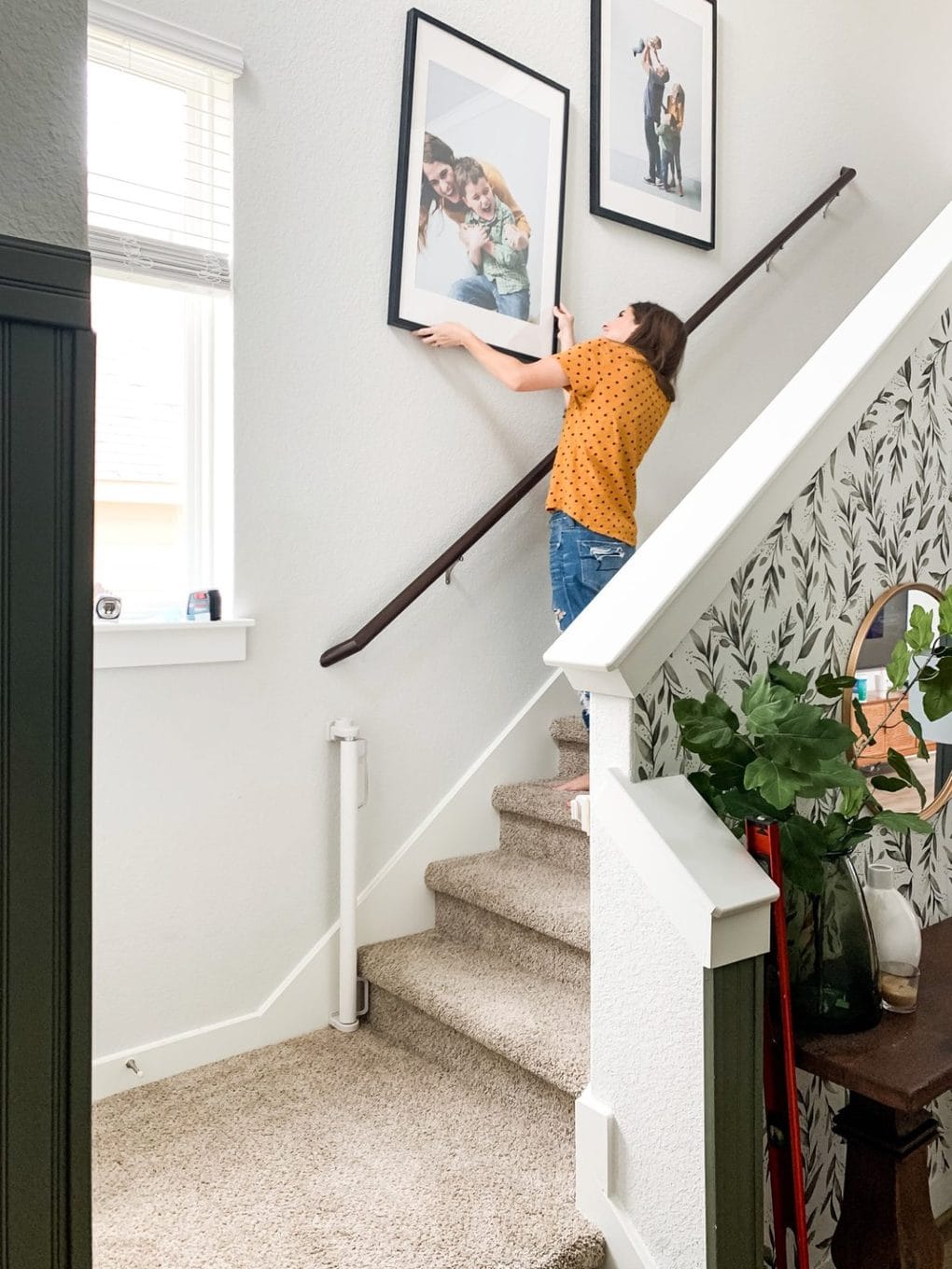


And there you have it. SIXTY simple, affordable DIY home decor and home improvement projects that you can tackle this weekend. Can’t wait to hear what you try first – you should have plenty of inspiration to get you started with all these step by step tutorials!
The post 60 DIY Home Decor Projects You Can Tackle This Weekend appeared first on Love & Renovations.
]]>
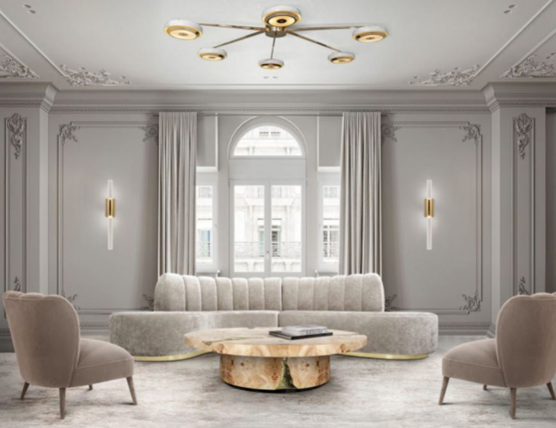
(Image via Architecture art designs)
Lighting has the ability to shape the mood, functionality, and overall aesthetic of a room. Whether you’re looking to create a cozy and intimate ambiance in your living room or a bright and energizing atmosphere in your workspace, strategic lighting design is key. By harnessing the power of lighting, you can breathe life into every corner of your home and unlock its full potential.
Unlock your living environment’s full potential with practical tips and inspiring ideas.
Start by considering the various types of lighting available. Ambient lighting provides a general illumination to the room and sets the overall tone. It can be achieved through ceiling-mounted fixtures, such as chandeliers or pendant lights, or even wall sconces. Task lighting, on the other hand, is focused and directed, providing ample illumination for specific activities like reading, cooking, or working. Desk lamps, under-cabinet lighting, or adjustable floor lamps are great options for task lighting. Lastly, accent lighting adds a touch of drama and highlights specific features or objects, such as artwork, architectural details, or decorative elements. Track lighting, spotlights, or picture lights are excellent choices for accent lighting.
(Image via Delightful)
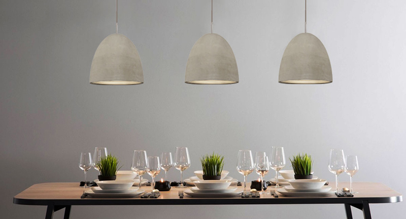
Once you have a clear understanding of the different types of lighting, it’s time to consider the fixtures themselves.The world of lighting fixtures offers a diverse range of styles, materials, and designs. Whether you prefer a sleek and modern look or are drawn to vintage and ornate designs, there is a lighting fixture that perfectly matches your taste and complements your interior style. Pendant lights have the ability to become captivating centerpieces, drawing attention above dining tables or kitchen islands, while recessed lighting can create a sleek and minimalist aesthetic. Floor lamps offer a blend of style and practicality, while table lamps bring a touch of sophistication to bedside tables or sideboards.
When planning your lighting design, don’t forget about the importance of layering. Layering involves combining multiple sources of light to create depth and dimension in a room. By incorporating a combination of ambient, task, and accent lighting, you can achieve a well-balanced and visually appealing environment. Dimmers are also an essential tool in lighting design, allowing you to control the intensity and mood of the lighting according to your needs and preferences.
In addition to choosing the right fixtures and layering the lighting, consider the role of natural light in your interior. Natural light not only enhances the overall ambiance but also contributes to a healthier and more inviting living environment. Maximize the amount of natural light entering your space by keeping windows clear of obstructions and using light-colored window treatments. Mirrors can also help reflect and amplify natural light, making your interior feel brighter and more spacious.
(Image via Zest Lighting)
Remember, lighting is not just about functionality; it’s about creating an experience. It has the power to evoke emotions, transform spaces, and showcase your unique style. So, whether you’re aiming for a cozy retreat, a vibrant and energetic workspace, or an elegant entertaining area, let the brilliance of lighting guide you.
To sum up, lighting is a transformative element that can elevate your interior design to new heights. By thoughtfully selecting fixtures, considering different types of lighting, and embracing natural light, you can create an environment that is both functional and visually stunning. So, take control of your space and unleash the power of lighting to illuminate brilliance in every corner of your home.
The post Elevate Your Interior with the Power of Lighting appeared first on DesignRulz.
]]>The ship does not have a buffet or a cavernous banquet-style dining room. Kids are not welcome, but the adults-only ship gives grownups plenty of opportunities to play in both childlike and mature ways. Cruise fares include all meals, soda, basic Wi-Fi and crew gratuities, but it’s not a luxury product filled with opulent decor, sedate travelers and a stuffy vibe. Onboard entertainment will include sexual innuendos, F-bombs and queer themes.
Scarlet Lady is not for everyone. But if you, like me, are tired of (or turned off by) the same-old cruise ship formula, this ship might just offer the cruise vacation you didn’t know you were looking for.
For cruise news, reviews and tips, sign up for TPG’s cruise newsletter.
The 110,000-ton ship features 1,330 cabins and 78 suites and can carry 2,770 passengers at maximum capacity. That’s a lot smaller than the newest ships from lines like Royal Caribbean, Carnival Cruise Line and Norwegian Cruise Line. The balance works well; the ship does not feel oppressively crowded, but there are plenty of restaurants, bars and attractions on board to keep you entertained at sea.
Scarlet Lady defies categorization when it comes to pricing, as well. Its cruise fares are more inclusive than your typical mass-market ship, and therefore more expensive than other mainstream lines. But it doesn’t have the same vibe as luxury cruise ships that tend to cater to a retired, wealthy clientele, who are less active and not into dance parties or cutting-edge entertainment.
The minimum age to sail Virgin is 18 years old, and the ship embraces its adults-only status. You won’t find kids on board, yet you will find board games, an arcade, swings and unlimited pizza and ice cream.

A common concern I’ve heard is that Scarlet Lady is only for the young and the hip. As a completely non-hip, mid-40-something, I can assure you that isn’t true. The target demographic for this ship is more about mindset than age.
If you’re someone who likes to go out – to dinner, a show, a bar or a party – this social ship will be for you. Many restaurants have communal tables designed to bring people together, such as Gunbae, where tables exclusively seat six and you’re encouraged to join in a drinking game with your newly-met tablemates. The entertainment is top notch, but it’s more experimental and modern than the traditional song-and-dance cruise ship shows. Scarlet Lady is not a “read in your cabin” type of cruise ship.
It’s also a ship for travelers with open minds, who embrace differences and aren’t easily shocked or insulted. Onboard comedians will push boundaries with their jokes. You’ll find crew, from entertainers to waiters, who may be gender-fluid, tattooed, pierced or openly gay. While the sex-themed cabaret is gone, the shows do not shy away from sexual or R-rated themes.
I loved this about the ship. Others may not.

It might seem minor, but the hammock on my cabin’s balcony made my cruise.
I often feel that balconies are wasted space. They’re great for checking the weather, drying swimsuits and eating room service breakfast – but I rarely spend much time hanging out on them. Usually that’s because the chairs are upright and made of metal (or metal and plastic mesh) and the veranda is small, and you can’t get comfortable.
Not so with a hammock. I’m 6 feet tall and can fully recline in one of Scarlet Lady’s bright red, ethically sourced hammocks. The rocking of the hammock combined with the rocking of the ship at sea, especially early in the morning when the sun was low and the temperature perfect, was incredibly soothing. I found myself plotting how to get more hammock time – rather than simply forgetting I had a balcony as I busied myself around the ship.
Scarlet Lady succeeds in creating intimate spaces onboard a big ship, and I loved all the inviting nooks I found on board. Sometimes, those nooks were tucked-away bars, like the Dock House Bar, just slightly off the main thoroughfare. Or, perhaps they were cute seating areas, like the curtained-off tables at the Sip bar or day beds on the open-air decks.
The public spaces on the ship invite you to grab a friend, a drink and chill for a while. I wished I had time to sample them all.

I’m a Broadway buff, and I always go to the cruise ship shows. Unless they’re a real Broadway show (found on the likes of NCL or Royal Caribbean), I’m usually walking out or picking them apart before they end.
Scarlet Lady’s entertainment impressed me with its innovation and its quality. The dancers were incredible; they moved about the stage like they were performing on “So You Think You Can Dance” (or other TV dance competition), not in your kid’s high school dance recital. “Dual Reality,” the Romeo-and-Juliet-themed show, was the first cruise-ship acrobatic performance I’ve seen that had a compelling plot; so many cruise lines throw dancers on hoops or silks in the air simply because they can. The way the staging and performer interaction engaged the audience was original and brilliant.
The drag show was a hoot, and the DanceShowPartyThing was different than any cruise ship show I’ve ever seen and a lighthearted fun time. The late-night jazz band at the On the Rocks bar kept the crowds engaged, and the crew knew how to keep the party going on the dance floor at The Manor – whether that was dancing on the stage wings or covering the crowd with a large parachute.
Related: Here’s why Virgin Voyages’ entertainment is now the best on any cruise
I’m not a cruiser who adores the main dining room. I prefer specialty restaurants with their individual menus, decor and vibe. But I also hate paying extra for meals when food is already included. In this way, Virgin’s restaurant concept speaks perfectly to me.
Scarlet Lady has no main dining room and no buffet. Instead, you can make dinner reservations at one of its six restaurants, or make a more casual meal from the pizza parlor, food hall, snack bar (featuring wings and hot dogs) or the Dock and Dock House lounge with their mezze menu. I loved that every night I ate someplace different – one night filet mignon at the classy, upscale The Wake, the next experimental dishes at Test Kitchen or communal Korean BBQ at Gunbae.
Food ranged from edible to excellent, but meals were always fun. I felt like I was eating out in a city, rather than at a hotel conference center, and that night-out vibe set the mood for the entire evening.
Scarlet Lady is a ship for independent travelers who don’t need their hands held or want to be told what to do by a cruise director (there isn’t one). While I loved the lack of announcements over the intercom system or at the end of shows, I did feel like it was easy to miss out on things on board.
No one tells you how the ship works, even though it’s nontraditional for the cruise industry. If you don’t know to get on board and immediately make reservations for all the restaurants, shows and fitness classes you want, you will find yourself locked out of meals and events you were looking forward to.
The ship has a decided lack of signage; no deck maps or wayfinder screens by the elevator banks, not even the name of bars by their entrances. The layout of the ship is such that certain bars or venues are tucked away off the high-traffic corridors and can be difficult to find. If you do find them, they’re usually in a dead end, leaving you to retrace your steps to figure out a way across a deck.
Perhaps if the app were more intuitive, some of these issues could be mitigated. But I, who have successfully employed numerous cruise ship apps, had to ask a crew member to show me where to find deck plans in the Sailor App. In-app room service ordering was glitchy, but my cabin attendant hadn’t left me a printout of the menu, so I never tried in-room dining.
I can see first-time and older cruisers being especially confounded by the lack of guidance on board. While more announcements aren’t the answer, I’m sure Virgin Voyages could figure out unobtrusive ways to give sailors a helping hand.

I am generally not a fan of cruise ship buffets, but a five-night cruise on Scarlet Lady gave me new appreciation for them.
Virgin Voyages is decidedly anti-self-serve. Neither its ships nor its private beach club on Bimini in the Bahamas offers a buffet. The buffet replacement on Scarlet Lady is The Galley, a food hall with several themed stations. Instead of ordering at the counter, you find a seat, flag down a waiter and put in your order, which will be brought to you when ready.
This concept works well when you have time to kill or the venue is empty. But when The Galley is packed, such as in the morning on a port day, it can take forever to catch the attention of a server and longer than you’d expect to receive your meal. You can find grab-and-go boxes in several locations on board, but the food selection is limited.
I had the same experience at The Dock after a late excursion; several of us waited far too long for a waiter to appear and take our order – even though a server had escorted me outside five minutes prior. As much as I’m not a fan of buffets, sometimes I just want to eat quickly and get on with my day.
Related: 11 things I loved on Virgin Voyages — and 6 I kind of hated

Scarlet Lady offers the usual cruise ship mix of windowless inside cabins, ocean-view rooms with large windows that don’t open, cabins with private balconies and large suites. Cruise rooms sleep one to four guests, with twin beds that can be combined into queens and upper bunks. That’s basically where the similarity ends.
My room was a Sea Terrace, a.k.a. a standard balcony room. The IKEA-inspired furnishings and mod décor made the room resemble a trendy micro hotel. For example, the bed is modular. On the cabin’s long wall, there was a cloth headboard and a narrow white platform with one thick armrest.
Twin beds can be arrayed in various configurations along the platform. I had two pushed together into a queen with one-third of the platform as a bedside table, but a triple could have a third bed jutting out perpendicular from the other two. Or, if you plan on hosting an event in your cabin, or don’t like reading on a bed, you can ask your room attendant to strip the sheets and arrange two daybed mattresses into an L-shaped sectional couch.
While practically no one uses the daybed layout, the arrangement means you’re sleeping on a couch cushion rather than a plush mattress. My bed on Scarlet Lady was not the comfiest I’ve had on a cruise, but the sheets and duvet were fine and I slept well.


My room didn’t have a sofa as other cruise ships might have. It had one upright chair in the corner and a vegan leather stool under the table that doubled as desk and vanity. The table is next to a unit housing the mini-fridge and two small shelves, but there is no additional storage. Here, you’ll also find a touch-screen pad where you can adjust the lighting and temperature of your room.
The only storage is in the closet area, and as in a micro hotel, your clothes won’t exactly be hanging behind closed doors. One tall cabinet with a door houses four not-that-deep drawers and shelves, many of which house the safe, life jackets and extra towels. But your clothes will hang from a rack behind a curtain that you likely won’t bother to close. In one corner is a luggage stand with two shelves, each with a wicker basket.
The bathroom is tiny and also lacking in storage. You can use the one long shelf beneath the sink or place your items in the small space next to the sink – there are no other drawers or shelves. I kept placing my toilet bag under the elevated soap dish and realizing the soap would drip on it.
The shower has a rain head and a wand and one meager shelf. If you’re happy with Red Flower toiletries, you can use the provided dispensers of shampoo, conditioner and body wash, and not have to worry about cramming all your travel-sized bottles onto the tiny surface area.
I didn’t find my cabin on Scarlet Lady to be overly inviting or cozy, and I was glad I didn’t have to fight for storage space with a travel partner. What saved the cabin was its balcony, or terrace as Virgin calls it.
The 45-square-foot terrace is furnished with two uninviting metal upright chairs and a round drinks table. I wouldn’t even bother to sit out there – except for the striking red hammock hung from hooks bolted into the bottom of the balcony above. That hammock was everything. At 6 feet tall, I could stretch out completely and rock with the waves as the ship made its way through the Caribbean. Its presence made a forgettable, utilitarian room desirable and memorable.
If you really want to live it up, you can book RockStar Quarters or Mega RockStar Quarters, Virgin’s two categories of suites. These extra-large rooms come with attractions like music rooms, turntables, peekaboo showers with windows to the sea, fully-stocked bars and large balconies. Perks include exclusive access to the Richard’s Rooftop sun deck, access to a RockStar Agent (i.e. concierge), priority reservations for dining, onboard events and shore excursions and complimentary access to the spa’s thermal suite.

Scarlet Lady is peppered with restaurants and bars, and it’s possible you won’t be able to try them all in one sailing. Do your research in advance because some venues are easy to miss if you’re not looking for them. Dining and drinking are highlights of your time on board, so you’ll want to visit as many bars and restaurants as you can.
The ship takes an unconventional approach to cruise ship dining, with no main dining room, no buffet and no extra-fee restaurants. In this way, your onboard dining experience will feel like a land-based trip, but with fewer Yelp reviews to read. You’ll likely eat in a new venue every night, most with an attached bar for pre-dinner drinks, and need to make reservations in advance or take your chance as a walk-in, either early or late. I loved both the food and the variety of options.
You’ll want to make your dinner reservations as soon as you get on board. One thing that surprised me was the ship requests you also make reservations for breakfast, brunch or lunch at sit-down restaurants, such as The Wake and Razzle Dazzle. Walk-ins are welcome at less busy times (such as right when the venue opens for breakfast), but I was lightly scolded for not booking in advance. Plan accordingly.
The most highly sought after reservation on the ship is Gunbae, Scarlet Lady’s Korean BBQ restaurant. Be prepared to make friends – all tables seat six, and your smaller party will be seated with strangers. That’s OK because the communal dining and drinking games (you don’t get the full experience if you don’t play) aren’t as much fun without a group.
Your server will bring the most popular of the appetizer, seafood, meat and dessert courses, though your table can turn down any option, ask for more of a favorite or request the alternatives (mostly vegetarian dishes). All the seafood (shrimp, octopus, etc.) is cooked together in the table’s central grilling station, followed by the meat – without a thorough cleaning of the grill. If this bothers you due to allergies or dietary restrictions, make sure you inform the server.
Favorites at our table were the dakgangjeong (crispy chicken), octopus, kalbi marinated beef short ribs and macha tea – black sesame twist ice cream with mini marshmallows and black sesame granola.


Razzle Dazzle is a vegetarian-forward restaurant (with several, no-longer-secret meat entrees) open for brunch and dinner. At brunch, the spicy avocado toast gets high marks, and the cucumber-melon salad was a refreshing starter. Oddly, the restaurant had no jam for my British-style chocolate-chip scone and I had to make do with butter.
Indulge your inner child and order the coconut milk fairy toast with sprinkles and the loaded cookies mudslide, or take her to the adjacent Red Bar for a popcorn old-fashioned, served in a cup designed to look like the traditional red-and-white striped popcorn bags.
The only negative is that service here can be slow and inattentive.
On the opposite side of Sailor Services from Razzle Dazzle, Pink Agave is the fancier alternative to the Let’s Taco Bout It outlet in The Galley. The so-called “elevated Mexican” dishes come in small, medium and large plates, and you can mix and match them and share with your tablemates. If you’re feeling adventurous, order the mezcal cocktail topped with crunchy crickets.
I did not have the normal dinner experience at Extra Virgin, the ship’s Italian restaurant, due to the themed sailing I was on, but I still got to try some of the venue’s popular dishes. Previous cruisers tell me Extra Virgin is a surprise favorite because Italian restaurants are so ubiquitous, but Virgin’s version delivers with fabulous dishes. Everyone raves about the meatballs, the pappardelle pasta and the ricotta bomboloni (like Italian donut holes).
The most fun dinner I had was at Test Kitchen. If you like surprises, and you’re willing to turn control over your dinner to a chef, you will like this experimental restaurant as much as I did. The menu reads like this:
That’s it. You can make adjustments for dietary restrictions, but your waiter will bring out dishes with each of those items starring in it in an unusual way and will announce what you’re eating after the plate is set in front of you. The drink pairings are worth the extra fee; you can choose from cocktail, wine, beer or alcohol-free pairings, and they’re all superb.

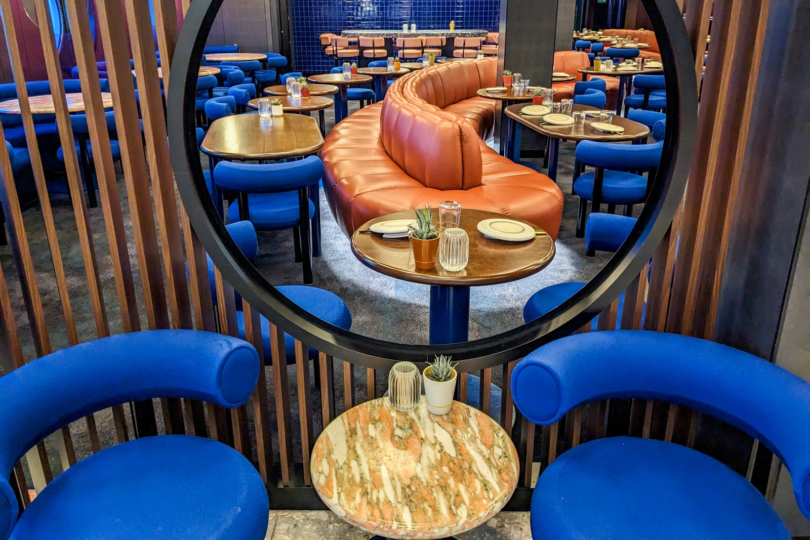
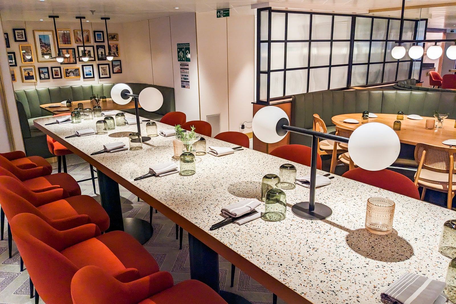
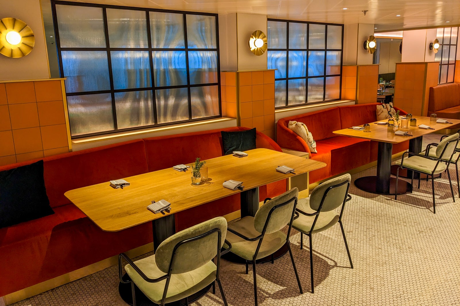
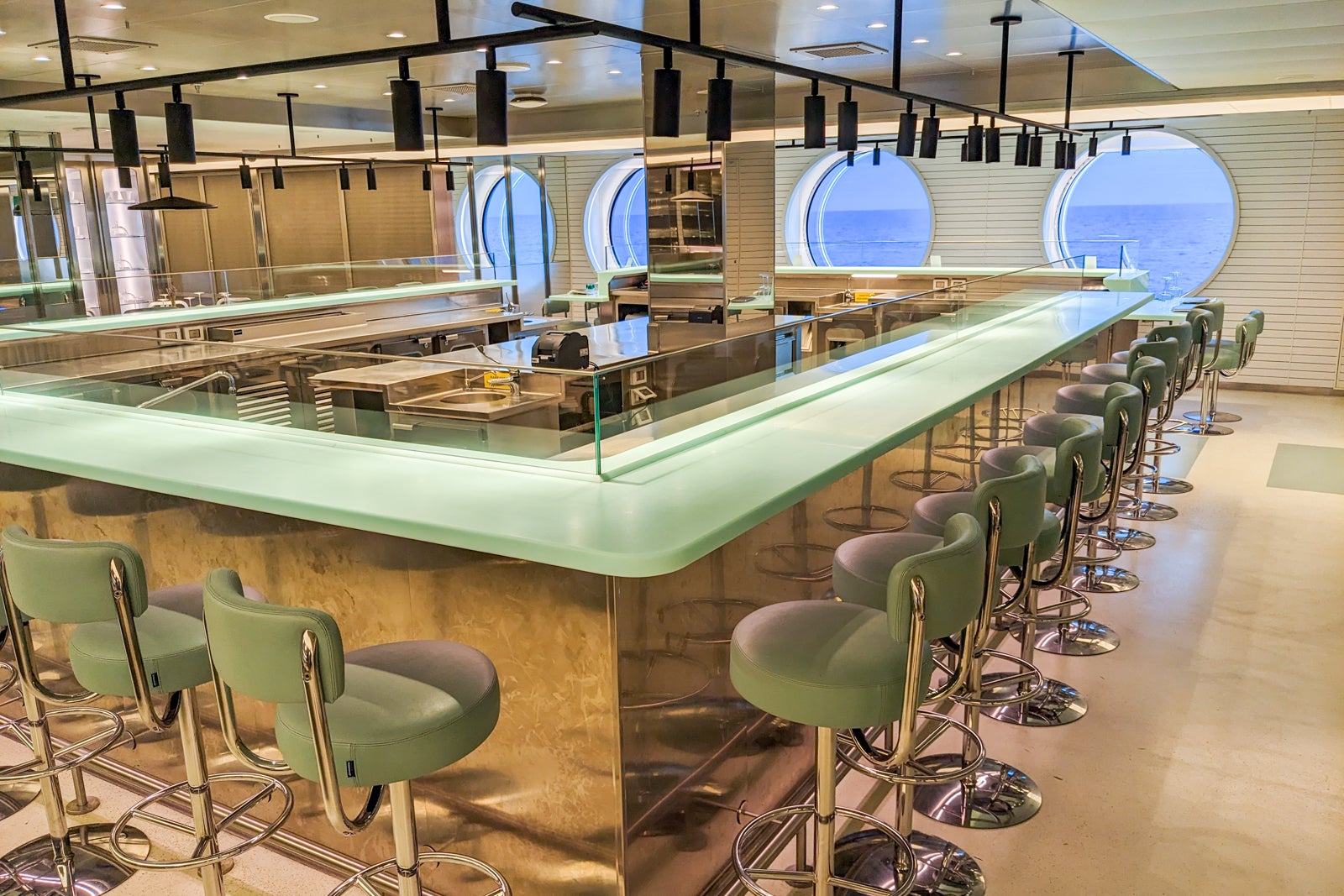

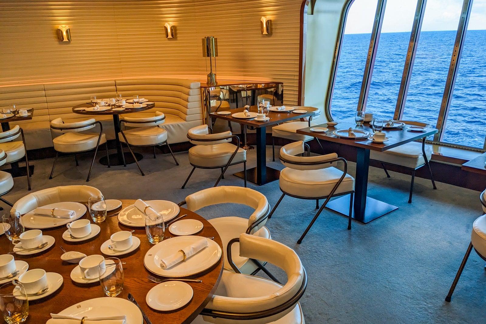
The Wake is the most traditional of Scarlet Lady’s restaurants. It’s your “get dolled up and eat steak” venue, with a glam vibe and large windows overlooking what else but the ship’s wake. Toast yourself with a glass of bubbly while you dine like a king on clam chowder, roasted bone marrow, filet mignon and lamp chops. Seafood lovers should splurge on the extra-fee towers of lobster, oysters, shrimp, clams, mussels and crab. The Wake chocolate mousse dessert was the winner at our table.
The Wake also serves brunch and lunch, but I wouldn’t recommend it for breakfast. The menu is tiny and fancy, mostly variants of eggs Benedict, a decadent brioche French toast, steak and eggs and a vegan dish. No fruit, no bacon, no oats. The waiter came around with a tray of off-menu pastries halfway through our meal, rather than when he served our coffee and tea. In addition, the restaurant’s position low on the ship and above the engines means you feel and hear the vibration of the ship a lot and all the cups and saucers were rattling.
Scarlet Lady also has a supper club experience called It’s a Ship Show, which takes place in The Manor. Virgin describes the experience as a mashup of an old-school variety show and a late-night talk show, with dinner, comedy and music.
The Dock and The Dock House are twin restaurants rocking the Mediterranean resort vibe. The Dock House is an indoor lounge where you and your sweetie can sip cocktails flavored with figs and anise while nibbling on mezze, like beet hummus and watermelon and feta salad, and pretending you’re in Ibiza.
The Dock is the outdoor extension, with the same menu; recline on day beds or enjoy a tete-a-tete at low wooden seating areas while you enjoy grilled shrimp and falafel accompanied by cold-pressed juices or energy shots loaded with turmeric and ginger. The food was enjoyable, but it took forever to get served mid-afternoon after a tour.
The ultimate in casual dining, The Galley is Scarlet Lady’s answer to the cruise ship buffet. It’s more of a food hall with multiple themed stations (noodles, tacos, soup and salad, burgers, etc.) where you order by flagging down a waiter. It can get confusing because you do have to order in person from the dessert and breakfast bakery/yogurt counter and from the popsicle cart, and there are grab-and-go bento boxes, salads, wraps and snacks, which you can eat in conjunction with your sit-down meal or take with you.
The Galley’s concept could use some refining, so be prepared. It works well when the venue is relatively quiet; you don’t have to queue for food or worry about food sitting around or contaminated tongs. On the other hand, when it’s busy and you just want a quick meal before your tour, it can be hard to flag down a server and your food can take 20 minutes to arrive. Plus, there’s no option for hot food that you plate yourself and take back to your room if there are no seats because you have to have a table to order food at The Galley. Sometimes you just need those steam-tray eggs, grabbable bagels and premade pancakes, and you don’t want a waiter-served meal.


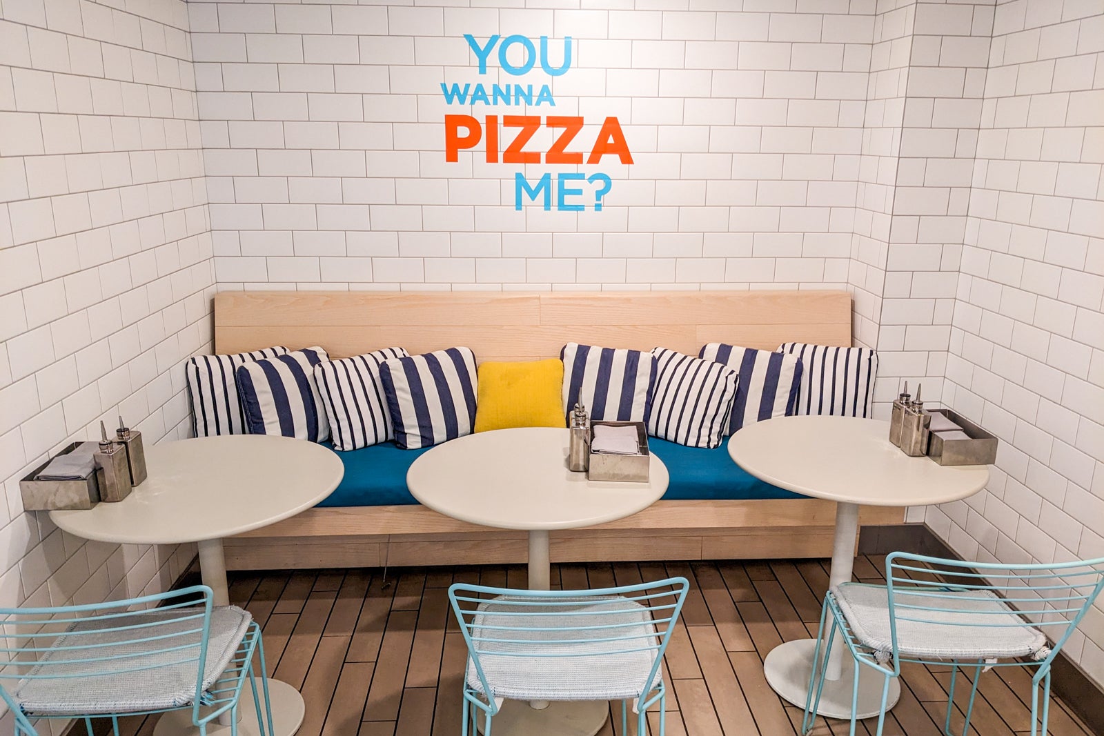
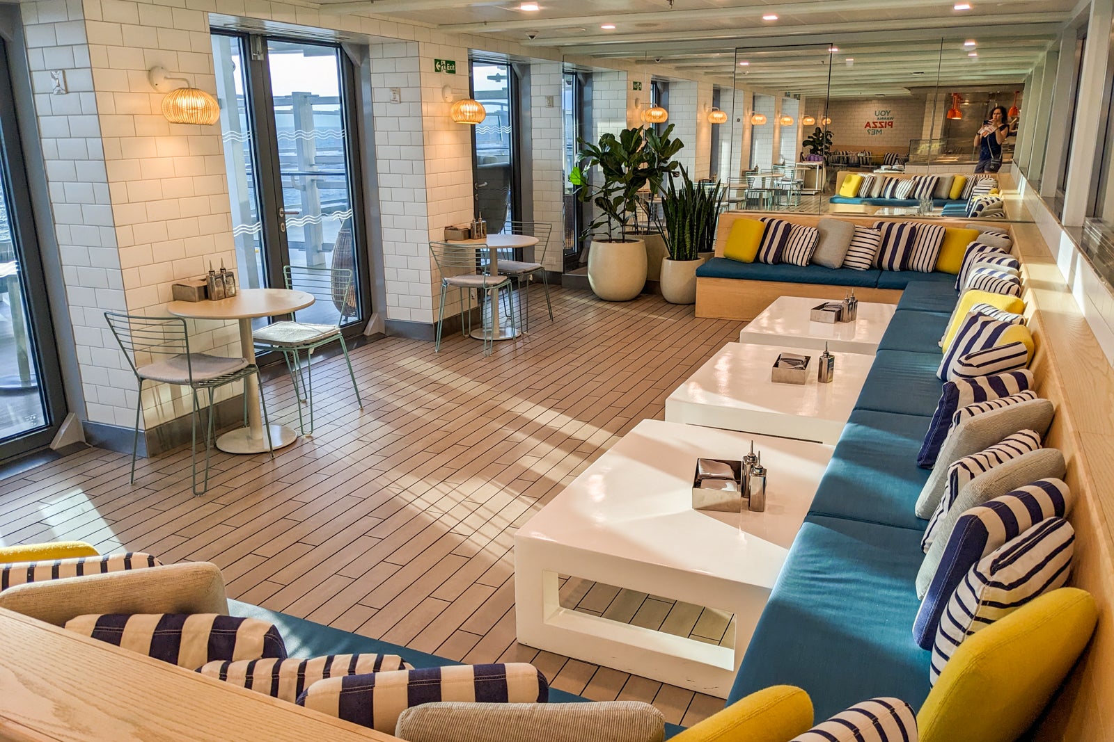


If you’re catching some rays and don’t want to give up your spot in the sun for lunch, The Sun Club Café is an easy pool deck grab-and-go option for anyone who likes poke bowls.
But the real casual-dining winner is The Pizza Place, churning out oven-fresh pizzas day and night in a light and airy space. I was a fan of the white truffle and egg pizza; the amusingly named “pretty fly for a white pie” also had staunch supporters. Grab a premade salad and take your pie out to the adjacent open-air patio to enjoy it in the Caribbean sunshine.
The pizzeria is located on Deck 7, where all the fun food is. Right next door is the Lick Me Till Ice Cream outpost where you can choose from a changing roster of hand-scooped ice cream and cone flavors. My favorite was the key lime pie ice cream. Down the hall is The Social Club Diner satisfying all your bar food cravings with hot dogs (including vegan ones), chicken wings and soft pretzels. You can also order sweets like cake pops and steal candy out of a jar (except it’s not stealing if it’s free and meant for you to take).
One of my favorite traditions on land or sea is afternoon tea, and Scarlet Lady offers a surprisingly impressive one at its Sip Lounge. I shouldn’t be surprised, given Virgin’s British origins, but I figured tea was not hip enough for the line. Tea service does cost extra – more if you want Champagne with your goodies – and I suggest you make it your lunch because it’s way too much food for a snack. You get a full three-tiered tray with scones, finger sandwiches and too many sweets for one person to consume in one sitting.
The menu of JoJo loose leaf teas offers a nice selection of caffeinated and herbal teas. (I’ve been on fancier cruise lines that offered tea bags rather than loose leaf tea.) However, my tea oversteeped as the waiter forgot to leave the chain of the tea ball outside the pot and I couldn’t get it out until I drank enough to reach in without burning my fingers.
Scarlet Lady does offer room service for a fee. You can order via the Sailor App. Unfortunately for me, I could not get the room service option to function properly on my phone, so I could neither see the menu nor order in-cabin dining.

Virgin Voyages does not sell drink packages as typical cruise lines do. Instead, you can purchase a Bar Tab in advance, which is onboard credit you can only spend on drinks on the ship and at Virgin’s Bimini Beach Club in the Bahamas. Look for booking promotions that include a free Bar Tab of a certain amount or give you bonus money on top of what you prepay.
You will certainly have many opportunities to spend your Bar Tab on board, whether that’s wine with dinner, a morning latte or a cocktail at On the Rocks while you listen to live music. Drinking is a key component of Scarlet Lady’s nightlife, but as far as I saw, most people embraced the fun but drank responsibly.
Scarlet Lady’s Happenings Cast (ie, the entertainment team) lead Grog Walks around the ship that are a mix of pub crawl and icebreaker games so you can meet your shipmates. They do incur an extra fee to cover drinks, but they’re insanely popular and sell out quickly. Try to book the one early in the cruise to meet people and get the lay of the lounge landscape.


The two most popular bars on board each night are Sip, the Champagne bar (which also serves wine and cocktails), and On The Rocks, which is central to everything and usually has live music. If you want to get a buzz at a venue that’s buzzing, choose one of these for your nightcap.
I loved the tucked-away Dock House Bar for a pre-dinner drink and its outside extension, The Dock, for day drinking while lounging on a sun bed. The Grounds Club is Virgin’s nod to Starbucks, with all the caffeine and baked-good carbs you crave.
Restaurant bars of note are Pink Agave, with an enormous tequila and mezcal menu and some excellent margaritas, and the Red Bar at Razzle Dazzle with its crazy concoctions, such as the Popcorn Old-Fashioned (topped with actual popcorn). The Social Club Bar lets you embrace your inner child – if said child could drink alcohol – with alcoholic milkshakes and floats topped with candy and cookies.
Scarlet Lady has all the requisite poolside and sun deck bars, including ones offering smoothies and juices after your indoor or outdoor workout.
Related: We tried every bar on Virgin Voyages and ranked them from best to worst

Scarlet Lady doesn’t overwhelm you with scheduled activities when the vessel is at sea. Instead, the ship becomes your playground for you to enjoy however you like.
The top decks (15 – 17) are the places to head for fitness, fun in the sun or a combination of both. The Deck 15 Aquatic Club is where you’ll find a standard pool and a well-being pool (essentially a large whirlpool), surrounded by day beds and lounge chairs. Additional sun-worshipping space can be found one deck up, including at the Athletic Club Bar at the back of the ship where you can perch on circular sunbeds or a suspended catamaran net with views to the wake below.
If you want to feel like a rockstar, you can rent one of the private cabanas on Deck 16. Each costs $250 for a full day and can be reserved at Sailor Services on Deck 5. Inside, you’ll find daybeds for lounging and a drinks cooler prepped with fresh-pressed welcome juices. Your dedicated cabana attendant can bring you towels and food.
On the other hand, if working out is core to your vacation ideals, Scarlet Lady offers plenty of options, but the fitness areas aren’t connected the way you think they might be, so look at a deck plan before you throw on your sneakers.
The Deck 15 B-Complex fitness center is divided into two halves: Burn + Bike portside, with a cycling studio and cardio machines, and Build + Balance starboard, with resistance machines and a studio for yoga, meditation and bungee classes. Take the stairs up to the Training Camp group fitness space, where you’ll find HIIT classes.
Those are just the indoor options. Outside Training camp is a boxing ring, props for alfresco body weight exercises, a sports court for basketball and an adult playground with swings and a seesaw. Above on Deck 17 is a jogging track and a space for outdoor yoga. Back on Deck 15 by the wellness pool is another open-air workout space – especially good for show-offs since everyone lounging in that area can watch you sweat.
Virgin Voyages is known for its creative fitness classes, such as an ‘80s-themed workout where crew and guests don legwarmers and neon leotards to set the mood. As with the Grog Walk and prime dining times, group workouts also book up quickly, so reserve them as soon as you can. Also unlike the classes you may have tried on other cruise lines, Virgin’s are aimed at active, younger adults, not seniors. You will work hard, and you will be sore the next day.


Scarlet Lady’s Redemption Spa is also broken up and scattered around the ship. The main venue is tucked away on Deck 5 on the other side of the elevator bank from Sailor Services, Pink Agave and Razzle Dazzle. You’ll find treatment rooms for massages here, as well as the thermal suite.
I highly recommend booking a three-hour pass to the suite and enjoying the sauna, steam room, salt room, mud room and more. There’s nothing like taking a cup of mud (which looks like a chocolate milkshake) and rubbing it all over your body (or your partner’s – this is Virgin after all) in the company of strangers. You won’t need three hours, so consider showing up a bit late to avoid the rush at the beginning of each session.
On Deck 6, men can get a shave at Stubble and Groom, while women can get blowouts for Scarlet Night at Dry Dock. Also here is Virgin Voyages’ groundbreaking tattoo parlor, Squid Ink, where you can pay inflated rates for the bragging rights of having gotten a tattoo at sea. For your other bodily needs, The Tune Up offers medispa treatments, manicures and pedicures by the pool on Deck 15.
The Deck 6 casino is a hopping place at night, partly because it’s located between The Red Room performance space and On the Rocks Bar, with the entrance to the Manor nightclub just opposite. Beginners and high rollers alike can sign up for gaming lessons or poker tournaments at the WPT at Sea Poker Room in partnership with the World Poker Tour. However, hands down the most fun you’ll have gambling on the ship is at Bingo With The Diva, Scarlet Lady’s resident drag queen.
Other activities on board include trivia and solo traveler meetups. You can also hit the High Street shops for sundries, logo wear, hammocks, MAC cosmetics, designer clothes and purses, hair and skincare products and alcohol.

Scarlet Lady hits it out of the park when it comes to entertainment, both performances and parties. On many cruise ships, I’ll go to a show, sit in the back and leave after 10 minutes. On Virgin, I was fully captivated for the length of the performance and often came out raving about the experience. I appreciate how the line has hired diverse performers in terms of race, size and gender expression, and how its shows do not shy away from mature language and sexual themes (both gay and straight).
I was also impressed how the cruise line creates parties and events that everyone shows up for and gets into. On other cruise lines, a deck party might attract a couple hundred guests, but on Virgin’s Scarlet Night, pretty much everyone turns out.
Most main performances take place in the multipurpose, rearrangeable Red Room, but more intimate shows take over The Manor nightclub.
Here are some of the entertainment highlights of my five-night Caribbean cruise.
Ships in the Night: The first show I saw on Virgin was my least favorite. To be fair, I only was able to catch a portion of the show. The dancers were killing it, but the one singer couldn’t carry the show.
Duel Reality: This engaging acrobatic performance is possibly the best show I’ve seen at sea, and if it’s not, it’s in the top three. You will be rooting not only for your team, but for love to conquer all in this original take on “Romeo and Juliet.”
DanceShowPartyThing: The show’s name says it all. You’ll interact with the performers and join them in the Macarena, the stage will move around the room and you might not know what’s going on, but it will be fun. If you despise Celine Dion’s Titanic “My Heart Will Go On,” you’ll have a new appreciation after this performance.

Around the World in 90 Minutes: I thought The Diva’s drag show in The Manor was under-promoted, but perhaps that’s on purpose because the small space was packed with the lucky folks who flagged it on their schedule. I reluctantly left after intermission, but if you want to laugh yourself silly and aren’t afraid of being called out by The Diva, you don’t want to miss this one.
Scarlet Lady also brings guest comedians and performers on board, and the ones I saw were top notch, including a young Latina pop group called Bella Dose.
Pretty much every night there’s a themed party in The Manor or out on deck, but the ones you need to pack for are the PJ Party and Scarlet Night. Scarlet Lady’s first-night pajama party is optional, but if you do want to get your Virgin vibe going on day one, pack a pair of party PJs and head to the Athletic Club bar on the first night.

But the event to end all events is Scarlet night. If nothing else, you will want to wear red – whether that’s a red cocktail dress or jumper, shirt, accessories or bathing suit. Some folks go all out formal, while others keep it casual. As long as you’ve got the right color, it’s all good. The Roundabout is the place to be after dinner; look out for flash performances and crew members with invitations to secret parties. The entire ship will be out in force.
The actual Scarlet Night party takes place on the pool deck, and many revelers end up in the pool, so plan your wardrobe accordingly. It rained on our Scarlet Night so the entire event was moved into the Red Room, where it basically became a large nightclub with thudding base and not that interesting. The after party moves to The Manor, but I actually preferred hanging out at On The Rocks, listening to the killer band and watching all the outfits go by.

Scarlet Lady is currently based out of Miami, where the ship sails four itineraries to the Bahamas and the Caribbean. Each of the four- and five-night cruises spends a day at Virgin’s private beach club in Bimini, Bahamas. Other ports of call may include Key West; Cozumel/Playa del Carmen or Costa Maya, Mexico; or Puerto Plata, Dominican Republic.
In April 2024, the ship will sail an epic 14-night transatlantic cruise to Barcelona, which will be Scarlet Lady’s homebase at least through October 2024. From Spain, it will sail seven-night itineraries to ports in Italy, Spain and the French Riviera, all with overnights on the party island of Ibiza.
Fares start at $1,426 per cabin for a windowless Insider cabin on a four-night Fire & Sunset Soirees cruise to Key West and Bimini. Sea Terraces with private balconies start at $1,996 per cabin. The price is valid whether you have one or two travelers sharing the room, and does not include taxes and fees. You’ll pay extra for the third or fourth person sharing your cabin.

If you’re a U.S. citizen on one of Scarlet Lady’s round-trip Miami sailings, you’ll need a current passport or an official copy of your birth certificate and a driver’s license or other government-issued photo ID to sail.
For the ship’s transatlantic crossing and all subsequent cruises from Barcelona, you’ll need a passport that is valid for at least six months beyond the date you return back to the U.S.
Green-card holders and non-U.S. citizens will need to check requirements based on destinations visited.
In addition, you will need to check in for your cruise online, fill out the appropriate information and select an arrival time for embarkation day.
Virgin Voyages include crew gratuities in its fares. You are welcome to tip your bartender or cabin attendant extra if you feel they’ve gone above or beyond, but it’s not necessary.
You may want to bring some cash to tip the porters who take your suitcases from the pier to the ship and any tour guides who lead your ship-sponsored or private excursion in port.
Internet access is also included on your Scarlet Lady cruise. Wi-Fi is available throughout the ship, and your complimentary access covers two devices logged in at a time per passenger. If you wish to stream music and video, you can pay to upgrade to a Premium Wi-Fi plan, subject to availability.
Virgin Voyages takes a reasonable approach to passengers bringing drinks on board. Each guest may bring on board a maximum of 12 sealed 12-ounce or smaller cans or cartons of nonalcoholic beverages (water, sports drinks, soda, non-alcoholic beer, etc.) and two 750mL bottles of wine. You may not bring liquor or beer.
You must transport these in your carry-on bags. Any beverages found in your checked luggage will be confiscated and returned at the end of your cruise.
If you choose to purchase “specialty liquors” in the ports you visit, you may bring these on board but they will also be held for you until the last night of the cruise. Make sure you adhere to customs regulations about how much alcohol you can bring back into the country from abroad.
Passengers may only smoke (this includes vaping) in the Deck 6 smoking room outside the Red Room and in a designated outdoor area on the starboard side of Deck 16 by the entrance to Richard’s Rooftop.
Guests may not smoke in their cabins or on cabin terraces. Anyone who breaks the rules will be fined $500 and may be disembarked at the next destination, with no refund for missed days on the ship and no compensation for lodging and/or airfare back home.
Virgin Voyages’ ships do not have self-service laundry rooms. However, passengers can send individual clothing items out for pressing, washing and folding, or washing and pressing. You also have the option to get an entire bag of laundry washed and folded for a flat rate.
Eco-cleaning (wet washing but with less water and eco-friendly detergent that’s easier on fabrics) is also available. Express turnaround (returned by 5:30 p.m. the same day when picked up before 11 a.m.) is available for an extra fee for both regular washing and for dry-cleaning. Non-express items will be returned the following day by 5:30 p.m.
Dry-cleaning is not available on board.
All cabins are outfitted with North American, USB and universal (European, U.K. and many other countries) outlets.
A balcony cabin will have two USB ports near the bed, along with a North American outlet. The desk and vanity area have two more USB ports (though one is taken up by the charging cable for the cabin’s tablet, which controls the TV, curtains and temperature), two additional North American outlets and one universal outlet.
The bathrooms have no outlets, so you’ll have to use electric razors and style your hair at the vanity.
The currency on Scarlet Lady is the U.S. dollar. Before you board, you’ll link a credit card to your account (which you can do via the app prior to embarkation day) or put up a cash amount from which you can debit for purchases made on board.
The Band — an adjustable cord bracelet with a scannable device attached — is your room key and charge “card” when you sail. It’s also used to scan you on and off the ship when you go ashore. More importantly, perhaps, it allows crew members to locate you when you shake for Champagne delivery.
Passengers will not receive keycards unless they have access to Richard’s Rooftop, an exclusive sun deck reserved for cruisers booked in Rockstar Suites.
Although Virgin Voyages’ ships allowed anyone 18 or older to sail, the drinking age on board is 21 years when ships are docked in the U.S. In international waters and in places like Europe, where the drinking age is 18, the onboard drinking age is 18.
Virgin Voyages has no official dress code. The line advises passengers to come as they are, whether it’s a sparkly dress or jeans and a T-shirt. However, the average passenger enjoys looking chic and trendy, even when dressed down. Most people do change into something a little nicer for dinner, but you won’t find any official formal nights on board.
Be sure to bring something red for Scarlet Night, whether that’s a red dress, shirt or accessory. (Consider a red swimsuit if you intend to end the party in the pool.) Other themed nights include a pajama party and an ’80s bash, so pack accordingly.
Scarlet Lady is the perfect ship for modern, young-at-heart travelers who love cutting-age entertainment, good food, a good party and lots of R&R. It’s not the right choice for folks who are conservative minded or easily offended, or longtime cruisers looking for a traditional experience. If you’ve never cruised because you don’t like kids, crowds, banquet-style dining or lackluster entertainment, this might be the ship that changes your mind.
Planning a cruise? Start with these stories:
When it comes to regulations, all industries must comply with OSHA 29 CFR 1910.151 no matter what kind of work employees perform. This rule states, “Adequate first aid supplies shall be readily available” in 29 CFR 1910.151(b). However, the first aid program needs to correspond to the hazards specific to the workplace. An office and a construction site are entirely different, and the first aid protocol needs to consider that.
It is important to remember the goal of a first-aid kit is to provide basic first aid care or take care of an injured person until emergency care arrives.
All the first aid kits on this list are Occupational Safety and Health Administration (OSHA) and/or American National Standards Institute (ANSI) compliant.
There are different requirements for different industries as to which type of first aid kits your business should have. Please refer to the websites listed below for specific information.
OSHA has different requirements for different industries, but it does require all workplaces to provide access to basic first aid supplies. The types of supplies required vary by workplace type. For a full list of required items broken down by industry, please visit OSHA’s website here.
The ANSI, or American National Standards Institute is the main organization supporting the development of technology standards in the United States. ANSI has recently updated its standards for all class a and class b first aid kits. Effective beginning in October 2022, the following updates will be enforced in workplace first aid kits:
For a full list of resources about ANSI requirements, check out their website at ansi.org.
| Feature | Top Pick: Rapid Care First Aid 80098 3 Shelf All Purpose First Aid Kit Cabinet | Runner Up: Rapid Care First Aid 4 Shelf Extra Wide First Aid Cabinet/Trauma Center | Best Value: Thrive First Aid Kit, 291 Pieces – Hospital Quality Medical Supplies |
|---|---|---|---|
| Contents | Over 1000 items | 1,063 items | 291 items |
| Special Features | ANSI and OSHA compliant, steel cabinet, wall-mounted, handle for easy carrying, boxed, labeled, and color-coded items | Can service 250 people, includes tourniquet, blood stopper, reusable splints, trauma pads, scissors, bandages, and an assortment of medications, ANSI 2015 Class B standards and OSHA guidelines compliant | OSHA and ANSI compliant, high-quality bandages, gauze pads, tapes, burn gel, gloves, scissors, wipes, an ice pack, whistle, safety pins, and blanket, water-resistant, highly visible red bag |
| Storage | Steel Cabinet | Steel Cabinet | Red bag |
| Dimensions | ? 5.75 x 14 x 17 inches | 6.5 x 20.0 x 22.5 inches | 12 x 8.5 x 4.5 inches |
| Suitable for | Business | Business | Car |

Top Pick: This large, well-stocked first aid kit is ANSI and OSHA compliant. The cabinet is made of durable steel and is wall-mounted, with a handle for easy carrying. The 1000-plus pieces can treat a variety of injuries and are boxed, labeled, and color-coded for easy identification and storage. A wall-mounted First Aid sign also comes with this kit.
Rapid Care First Aid 80098 3 Shelf All-Purpose First Aid Kit Cabinet

Runner Up: This kit’s 1,063 first aid and medical supplies can service 250 people. It comes with a tourniquet, blood stopper, reusable splints, trauma pads, scissors, bandages, and an assortment of medications. The kit meets ANSI 2015 Class B standards and OSHA guidelines.

Best Value: This kit has all of the essential first aid supplies, including complying with OSHA and ANSI standards. Though no medicine is included, this kit has high-quality bandages, gauze pads, tapes, burn gel, gloves, scissors, wipes, an ice pack, whistle, safety pins, and blanket, all in a durable water-resistant, highly visible red bag. The bag is large enough to hold other medical supplies as well.
Thrive First Aid Kits, 291 Pieces – Essential Hospital Quality Medical Supplies

Not all OSHA or ANSI-compliant first aid kits have to be big. This kit from First Aid Only is 10.75 x 3 x 11 inches and a little under a pound. But it is still OSHA compliant. It includes 195 essential first aid supplies to treat minor injuries for 50 people.
First Aid Only 195 Piece First Aid Kit, OSHA Compliant

The deluxe first aid kit by MFASCO provides over 1400 pieces of first aid supplies, including single-dose medications. This large metal kit is 33 x 20 x 7 inches and is said to be easy to wipe down and clean. This kit meets the new OSHA and ANSI standards for the workplace.
Workplace OSHA Approved First Aid Kit 5 Shelf Deluxe by MFASCO

This comprehensive kit meets and exceeds OSHA ANSI/ ISEA 2015 guidelines for 100 people. You will find sterile eyewash, antibiotic ointment, burn cream, instant cold compress, and first aid guides in English and Spanish in the kit. The case has tilting shelves to access the items in the box easily.
Be Smart Get Prepared – 351 Piece First Aid Kit – Exceeds OSHA ANSI/ISEA Standards for 100 People

Some industries require an eyewash station. This kit is OSHA/ANSI and FDA compliant for eyewash, and it also includes a 25-person first aid kit. The eyewash kit comes with a 16 oz bottle of a sterile isotonic buffered solution.
You can use it to flush or rinse eyes to clear dust, chemicals, and other foreign material and relieve itching and burning of eyes and skin.
Rapid Care First Aid, 16 oz Eye Wash Station with First Aid Kit, OSHA/ANSI & FDA Compliant

This heavy-duty plastic kit comes with over 350 pieces of first aid supplies to treat the most common workplace injuries. The two-layer case can store large and small items and features tilting shelves for easy access. This case is mountable and comes with a hardcover first aid guide.
M2 BASICS 350 Piece Emergency First Aid Kit

Rapid Care’s 166-piece first aid kit is compliant with ANSI standards and meets or exceeds federal OSHA regulations. It has enough supplies included for up to 25 people and comes in a moisture-resistant poly case.
Rapid Care First Aid 166 Piece ANSI/OSHA Compliant First Aid Kit in Wall Mountable Case

Another compact kit, this NOVAMEDIC first aid kit is perfectly sized to hold an array of essential medical supplies, yet compact enough to easily fit into a desk drawer. It also has a wall mount on the top of the case so it can be hung up anywhere. This 5″x3″x8” kit comes with 102 pieces of common first aid supplies.
NOVAMEDIC Compact 10-person first aid kits with 102 Pieces Medical Supplies & Essentials

This is an ANSI and OSHA-approved class b first aid kit. Included are gloves, eye pads, hand sanitizer, burn spray, burn dressing, and more. This small plastic kit measures 9.5 x 9.5 x 3 inches deep and has a rubber gasket to keep out moisture and dust
OSHA Class B First Aid Kits Plastic Box by MFASCO

This class A first aid kit comes with over 400 pieces of first aid supplies and equipment, including extra cold packs, cold spray and Water Jel burn gel, making this a good kit for restaurants and other businesses where burns may occur. This first aid box has a door pouch storing smaller first aid items like tweezers and nitrile gloves. The overall dimensions are 17 x 13 x 6 inches and the kit weighs 11 pounds. It is designed to be wall-mounted.
First Aid Kits 2 Shelf Metal Cabinet OSHA Class A by MFASCO
Here are some additional considerations for businesses to ensure employee safety in case of emergencies:
Accessibility: Make sure your first aid kit is accessible to all employees and that they are aware of its location. It should be placed in a visible and reachable spot, not tucked away in some obscure corner.
Kit Size and Contents: The size and contents of the first aid kit should be relevant to the number of employees and the type of work environment. A small office might require a less extensive kit than a large factory.
Training Programs: Encourage more employees to undergo first aid training programs. The more trained individuals in the workspace, the better the response during emergencies.
Specialized Equipment: Depending on your industry, you might need specialized equipment such as defibrillators, burn gels, or trauma bandages.
First Aid Kit Maintenance: Assign someone the responsibility of checking and restocking the kit regularly. This ensures that the kit is always ready for use.
Emergency Plan: Formulate an emergency plan which should be communicated and understood by all employees. This can include evacuation routes, emergency contacts, and the roles of various individuals.
Here’s a brief checklist for quick reference:
Remember, a well-prepared business can better handle emergencies, potentially saving lives and reducing the severity of injuries. Therefore, investing time and resources in emergency preparedness is essential for every responsible business owner.
There are four different types of first aid kit containers:
Class A first aid kits contain basic first aid supplies to treat common injuries such as cuts, scrapes, and minor burns. These kits are most common in smaller, low-risk workplaces such as offices.
Class B kits contain a wider array of supplies to treat workplace injuries. Often times this means having a larger quantity of certain items available, such as burn dressing. This website gives a great list of the types of items needed for both classes of first aid kits.
Certain items should be stocked in all first aid kits. Here are a few:
Most first aid kits display the number of people that can be treated with the available supplies. However, you may want to have multiple first aid kits available, or at the very least, keep your supplies well-stocked so you never run out.
Check your supplies frequently for items that need to be restocked as well as expired items. A good practice is to set a reminder on your computer or phone so you never forget.
Qualify for discounts, special offers and more with a Business Prime account from Amazon. You can create a FREE account to get started today.
Image: amazon
This article, "First Aid Kits for Businesses: Stay Prepared With Our Picks" was first published on Small Business Trends
]]>
While many people stick to the same interior design style throughout most of their home, some choose a different approach for their bedroom. They see the bedroom as a space that is personal to them, and it is somewhere they can reflect their personality and passions. In the bedroom, they can choose a different theme that represents anything in which they are interested. If your favorite decade was the 80s or you are a fan of music from this decade, then you may wish to have an 80s themed bedroom. It was an interesting decade that introduced many new trends, both in terms of interior design and in many other aspects of culture. If you decide that this is the decade you wish to use as a theme in your bedroom, then here are 10 essentials for the perfect 80s bedroom to inspire you.
The 1980s was the era when people began to attempt decorating themselves rather than getting in the experts. DIY was all the rage during this decade, and people became increasingly daring and experimental in the home décor effects they were attempting to make. Stippling and stenciling were two popular paint effect styles. If you find these a little dated, then you might give paint splattering a try, as this was also a popular paint effect used in the 1980s, says Home Guides.
People also became more daring about the colors used in the 1980s. While colors such as mauve and apple green were popular choices in country homes, neon colors became a big hit during this decade. People began wearing neon-colored leg warmers, and kids’ accessories were often in neon colors. Consider having some neon surfaces in your 80s bedroom to reflect the trend for these bright colors in that decade.
The art you display on your walls can make a significant difference to the overall look of a room and the success of any theme you apply. In the 1980s, adorning the bedroom walls with posters was the most popular way of adding interesting focal points around the room. Most people put up posters of their favorite bands or movies. Doing this is something that you can do to add to the 80s theme in your bedroom.
The most common type of furniture you would see in homes during the 1980s was either oak or pine furniture. People opted for the plain wood look rather than for stained or painted wood. Choose a wooden bed frame, and add a pine or oak chest of drawers, wardrobe, and bedside cabinet to the room. In-built furniture became popular much later, so freestanding furniture is a better reflection of the era.
There are many iconic toys that come from the 1980s, many of which are still popular today. Some of the most popular toys from this era include the Rubik’s cube, Barbies, Transformers, Care Bears, and My Little Pony figures. Adorning the room with some of these toys will reflect the theme perfectly and add an element of fun to your 80s bedroom.
An interior accessory that became popular during the 1980s was character lamps. These reflected the trends in movies, television programs, and decade’s music. It is still possible to get hold of some of the original character lamps from the 80s on sites specializing in selling retro items or from sites such as eBay. Although many are collector’s items, they are an affordable item that will add to your interior décor theme. They are also an interesting talking point if you invite guests into your bedroom to see your themed room.
It was during the 1980s that the popularity of themed bed linen began to grow. Usually, these were seen in the bedrooms of children and teenagers, rather than adults. However, many adults now use themed bed linen to create a retro look or to make an ironic statement. Some of the most popular bed linen themes during the 1980s were Care Bears, Star Wars, My Little Pony, and Transformers. Using themed bed linen is a fun way to create the 1980s theme in a bedroom, especially in children’s bedrooms.
According to the Huffington Post, VHS tapes were to the 1980s what the iPad is to the modern-day. If you have a video player, then you can still watch your old VHS tapes. However, you can also use old VHS tapes as decorative items that add to the theme. Stack them on shelves or create a piece of art using your old tapes.
Modern soft furnishing trends often focus on pieces that are a solid color that acts as an accent to the colors on your walls. There is also a focus on introducing different fabrics and textures. However, people took a different approach to soft furnishings in the 1980s. Then, the trend was for patterned soft furnishings, with floral prints, stripes, and geometric designs. Adding soft furnishings to your 80s bedroom will create additional points of interest. However, choose prints and colors carefully to avoid clashing too much with the other designs and colors in your bedroom.
According to Retro Planet, one of the most common décor accessories in the 80s was houseplants. During this decade, most homes would have houseplants in every room, including the bedroom. It is a simple and cheap way of contributing to your 80s theme, and it will add a natural element to the room. In addition to house plants, there was also a trend for dried flowers. If you are forgetful when it comes to caring for plants, then dried flowers are an excellent alternative. Add them to your windowsill, bedside cabinet, or the top of your drawers.
If there was one thing that all interior designers in the 80s agreed on was putting up large mirrors in every home. From round frameless mirrors and glass blocks to floor-to-ceiling mirrors, people had their fill of mirrors around the house. According to Family Handyman, although not every home had floor-to-ceiling mirrors, they were often seen in movies or TV shows. If you want to incorporate a mirrored look into your 80’s themed bedroom, then these are perfect ways to add that effect. Mirrors added the illusion of more space while also hiding cabinets. This is great for a small bedroom as it makes the room feel bigger than it is.
Blinds and especially mini blinds became popular in the 80s. It was almost impossible to walk into a house and not find blinds. By 1981, mini-blinds had taken over the market for window coverings. Modern blinds can dramatize a window, give the room a new look, or even take attention away from a window.
Mini-blinds give a room an 80s feel and can help you hide structural errors around your windows or bad designs. Now, if you already have an 80s-themed wallpaper or even wall patterns from the era, you can find blinds that seamlessly match your wall designs.
People around that decade started to appreciate faux stone fireplaces. They moved away from brick fireplaces and walls that were classics in the 70s. Exposed brick designs were popular in the 70s and made houses look like old warehouses. In the 80s, people started covering up exposed brick and using fake fireplace designs that looked like a rock, making their houses look very pretty.
You can include a fake rock fireplace design in your house, especially if your bedroom already has a fireplace. Although not for everyone, this design will bring back the fiery 80s era to your room.
A Boom box is the ultimate 80s décor for your room. Although the first boom box was released in 1966, it was not until the late 70s that they started to become popular. By the 80s, almost every music lover in the country owned a boom box. Young people were purchasing boom boxes in large numbers, especially those who lived in cities.
They became a staple in all major music events and carnivals. They also became linked with the hip-hop culture at the time. Although now it would be hard to find cassette tapes to play in your boom, it would certainly add an 80s flair to the room.
Although telephone communication devices were invented in the 1800s, by the 1980s, landlines were the most popular communication devices. Technology had taken off, and people had phones in their houses.
Even though mobile phones as we know them now had not been developed, communication was made easier by landlines, which almost every house in America had. Phone companies have even come up with ways of making the phones look fun, with most having different colors.
In the 80s, neon colors had taken off, and many landlines from the time had bright neon green, pink, and red colors, to mention a few. You can add a brightly colored old landline from vintage stores to finish the 80s look.
As mentioned above, the mirror craze in the 80s was booming, and another easy and functional way people incorporated mirrors into their bedrooms was by putting mirrors on their closet doors.
This is functional and a great way to add an 80s vibe to the bedroom. Instead of putting your mirror up on the wall, consider putting it on your closet doors. This way, you can look at yourself as you dress up and make sure you look good.
A trend that started in the 70s and continued to the 80s was wall-to-wall shag carpeting. The wall-to-wall carpet was king during the 80s. It was especially popular in bright colors such as orange. If you want to add the 80s vibe to your bedroom, you can choose a brightly colored caret to accompany all the other 80s accessories in the room. As stated by SFGate, if you don’t want to add a wall-to-wall carpet, you can consider adding area rugs with bright colors, geometric designs, or graphic prints. People who do not want a bright carpet can get them in other colors that were also popular at the time, including mauve, peach, grey, and dusty blue.
These comfy, plush chairs were extremely popular then, and it was challenging to find a home without one. Although they originated in Italy, they became popular in the US, especially among young people and hippies. These shapeless chairs were comfortable and are also popular today.
The most popular designs in the 80s were colorful, bold, and lively prints. If you want to bring out the 80s theme, look for a brightly colored bean bag or one with bold patterns and plop it up in the corner of the room. This functional addition to the bedroom will add some color and comfort to your bedroom.
Forget the alarm clock on your phone. Before the world was digitized and mobile phones got features like the alarm, people were woken up daily by portable alarm clocks, which were loud and needed to be banged on to stop. The 1980s alarm clocks were different and cute.
The clocks had numbers that flipped and came in fake wood veneer. Some of them sported bright colors significantly in the 80s and made clicking sounds. Adding a cool 80s alarm clock and ditching your phone’s alarm will make you feel like you are living in the 80s.
Much like every other décor piece in the 70s and 80s, furniture tended to have bright upholstery. Sofas, in particular, sported bright, bold colors with floral prints. While wallpapers and rugs tended to lean towards geometric patterns, floral designs were the go-to furniture designs.
While floral sofas can be a great addition to your bedroom, especially if it is a big room and you want to add a seating area, you have to consider what designs you want your sofa to have as mixing a lot of the popular floral designs from the 80s can make your room look very busy and overwhelming to the eyes.

People who are redoing their kitchens are just as distracted as those planning a wedding. Their minds have been taken over, totally invaded, by all the possibilities, constraints, worries, and plans, and they are thwarted, thwarted I tell you, by the world and its delays and obstacles and sheer abundance of materiality, and obsessed by an unattainable search for perfection. They can’t think about anything else! Or talk about anything else…

But anyway, here I go, haha… hampered in giving you the complete vision, as in my experience, pictures of demo and framing are impenetrable. But longtime readers might have the befores in mind and be able to interpret a tiny bit…

The parts circled in red are gone now!
My operating principles: I am striving for an unfitted kitchen and for observing the Patterns. My reality: a total gut turned out to be necessary, and with such a quirky, actually limited work space, despite the large overall area, I feel the responsibility to get as much storage in and to make it as tight as possible. So I am not sure how much actual “furniture” can be substituted for cabinetry, which in any case will not be abundant — it’s just how the layout is! There isn’t much room for any of it!
What I mean is this: I think a lot of kitchen energy is taken up with addressing dust, grease, and food getting into cracks and behind and under things, so I want to minimize all that by having cabinets that are custom built to use the space well.
The floor will go right up to the walls, so it will be a room that you cook and visit in (the idea behind unfitted kitchens— not, as some seem to think, that it’s about there being open shelves). The appliances… oh, the vexing appliances… I will try to be functional and reasonable. More on that later.
Here is the floor plan:

However, as I say, the wall to the left of the sliding door is gone!!
This is huge. More later.
If you go to my IG, there is a new highlight about the demo that explains more.


I have decided on windows and doors. They will have mullions/divided lights (as “true” as today’s manufacturers can make them while still offering insulation etc). The windows will be casement; the doors will be French doors in style, but the slider has to slide, as there is no room for it to open inwards and outwards is impractical here. I found a brand-new glass-paned door with tempered glass on Facebook Marketplace for $175! So I am very excited about that, and how it will relieve the sort of “dark cave” feeling from the mudroom into the kitchen.
Here is my inspiration photo for windows:
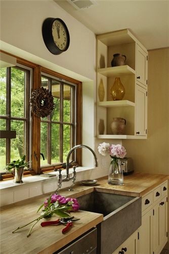
And I will have something similar on the side to the right: not a wall but the cabinet for the fridge. I just love the coziness of this image. My windows will be larger, because I am also trying to get more light in here.
Christopher Alexander’s pattern about the question: 239 Small Panes**
Another argument for small panes: Modern architecture and building have deliberately tried to make windows less like windows and more as though there was nothing between you and the outdoors. Yet this entirely contradicts the nature of windows. It is the function of windows to offer a view and provide a relationship to the outside, true. But this does not mean that they should not at the same time, like the walls and roof, give you a sense of protection and shelter from the outside. It is uncomfortable to feel that there is nothing between you and the outside, when in fact you are inside a building. It is the nature of windows to give you a relationship to the outside and at the same time give a sense of enclosure.
My overall vision is “English country kitchen meets New England Vernacular Georgian Revival of 1860,” which I possibly just made up.
Knitting Corner
I don’t think I ever showed you the finished Selbu mittens?

They were, honestly, a pain to make. The project is too small to make sense enough to memorize (or maybe I’m too distracted). However, I do love them. Don’t look at the mistakes!
Gardening Corner


We have had so much rain. Other than the peppers and eggplants, which find everything too cool, most things are loving it. I have that ugly row cover out there to shade the lettuce from the hot sun when it does choose to appear, because around this time of year it tries hard to bolt.
The slugs are having a wild party, but otherwise, things are looking good! Note to self: time to harvest garlic scapes. Further note: I don’t have a kitchen in which to prepare them…
Book Corner
Two books on my mind:
The Friendship of Christ (affiliate link) is an important spiritual classic. I decided to re-read it after I found it in my mother’s bookshelves in her room. It gets to the heart of our problems, that we don’t abandon ourselves to true friendship with Our Lord. If you are looking for spiritual reading, I highly recommend. (This edition says that the scripture citations have been modernized. I can’t find what version they use.)

The second was one I pulled out to reference in the new podcast I made, coming out soon on the Center for the Restoration of Christian Culture site: Ask Auntie Leila: How do I teach my son beauty?
The son in question is 10 years old, and as his mom points out, teaching him will be key to bringing his siblings along. She asked for resources, but my answer is more about the whole of the child’s education, which must be approached patiently and in harmony with his natural development. This is what I try to convey in all my curriculum advice, which is meant to offer guiding principles around the task of conveying fittingness and order so that ultimately, we may attain wonder.
I hope you can give it a listen!
Meanwhile, I do again recommend The Way of Beauty (affiliate link) to your attention if you have not already gotten it. David Clayton articulates an objective approach to beauty in a way I have not encountered anywhere else.
Today is The Immaculate Heart of Mary!
My book, The Summa Domestica: Order and Wonder in Family Life is available now from Sophia Press! All the thoughts from this blog collected into three volumes, beautifully presented with illustrations from Deirdre, an index in each volume, and ribbons!
My “random thoughts no pictures” blog, Happy Despite Them — receive it by email if you like, or bookmark, so you don’t miss a thing!
My new podcast can be found on the Restoration of Christian Culture website (and you can find it where you listen to such things) — be sure to check out the other offerings there!
Stay abreast of the posts here at LMLD, when they happen:
Consider subscribing to this blog by email. In the current situation, if we can’t meet here, it would be good for us to be connected by email!
We share pretty pictures: Auntie Leila’s Instagram, Rosie’s Instagram, Deirdre’s Instagram. Bridget’s Instagram.
Auntie Leila’s Facebook (you can just follow)
The boards of the others: Rosie’s Pinterest. Sukie’s Pinterest. Deirdre’s Pinterest. Habou’s Pinterest (you can still get a lot of inspiration here! and say a prayer for her!). Bridget’s Pinterest.
The post Kitchen update, with chitchat! appeared first on Like Mother, Like Daughter.
]]>While some women experience it less than others, it's still a devastating reality. And clueless or ignorant men don't help. One Reddit user wanted to learn what women wish men would stop doing, and people were eager to share advice on how men can be better.
Almost 5k replies later, Bored Panda selected the best answers on men's behavior that bothers women the most. From enormous egos to bad communication, scroll down to upvote the answers that resonate with you the most, and feel free to share any advice that we missed!

Image credits: BW_Bird

Image credits: Commercial_Compote35

Image credits: webbrlx

Image credits: ktamine

Image credits: teddybearer78

Image credits: anon

Image credits: HellKaiserFox

Image credits: NoLack5170

Image credits: BriRoxas

Image credits: Kaitzilla

Image credits: Specialist-Lion-8135

Image credits: Alternative-Tell5541

Image credits: Raaqu

Image credits: FUCK_INDUSTRIAL

Image credits: waffleironone

Image credits: poisonselina
Image credits: saltyeleven

Image credits: Idol_Luna

Image credits: prezzyofthedgc

Image credits: aliteralbagof_dicks
“Cabinetry is a huge part of kitchen design because it is usually the biggest visual component of a kitchen,” says Hannah Gebauer, marketing director at Showplace Cabinetry in Harrisburg, SD. “If you think about it, even if a kitchen gets new appliances, countertops and backsplash, the kitchen can seem outdated if the cabinets don’t match those updates. Outside of visual appeal, cabinets are important in making the most out of a space through convenience and storage accessories, or just designing the layout to be as efficient as possible,” she explains.
“The kitchen is the heart of the home and cabinetry is what makes it beat,” stresses Karen Wistrom, ASID, NCIDQ, CMG, v.p. of marketing for Dura Supreme Cabinetry in Howard Lake, MN. “It creates its look and its style, and it’s the number one feature that determines the layout and functionality of the entire space.”
Because clients have such a varied range in both style and practical use of the space, manufacturers must offer a vast range of options. With all those choices, clear trends aren’t always obvious. Even as classic elements – like shaker style and framed construction – prevail, innovative touches offer a fresh look.
“Many of our top-performing doors have a shaker style, but the latest cabinetry evolution is transforming the iconic look of the classic shaker-style cabinet door into a modern shaker or a modified shaker,” Wistrom continues.
Cindy Raymond, designer for Coaticook, QC-based Cabico, says, “We are still seeing a lot of warm neutral tones for wood and paint colors but, on the opposite side, color is back! Since we’ve spent more time in our houses over the past few years, people are really wanting to enjoy their living spaces more. Whether on the walls or through the cabinetry and kitchen islands, homeowners want to bring back color to these elements.”
Functionality is a top concern, with storage solutions a critical factor in the equation. “The more storage, the better,” Raymond stresses. “This trend includes hidden storage such as a hidden pantry, deep drawers and accessories.”
Natural tones, interesting accents and mixed finishes or materials, increased function, and new material options are also on the rise, according to manufacturers recently surveyed by Kitchen & Bath Design News.
While shaker-style doors are still on top, the profiles are changing to offer a more updated and modern look. There’s also increased demand for slab doors, and those without hardware, due to their sleek aesthetic.
Sarah Landl, product manager for Elmwood, based in St. Catharine’s, ON says “Shaker, slab and recessed panel-style doors currently dominate the trends. The traditional shaker door is evolving into a thinner profile, which gives it a refreshed and more contemporary look.”
“Consumers continue to choose straight, clean lines in their designs with shaker styling continuing to be the focus,” adds John K. Morgan, CEO at Green Forest Cabinetry in Chesapeake, VA. “But look closer and you’ll see they are selecting softer profile attributes by rounding outside edges as opposed to stark 90-degree options. Sometimes, consumers are further leaning towards beaded options on the inside profile too.”
Jon Dahl, v.p. of sales & marketing for QCCI in New Holland, PA, states they are seeing more and more use of slab doors with a small molding profile wrapped on the edge. “In our Quality Custom Cabinetry brand, we call these our Edge Series of doors. Gone are the days of a simple slab as well as the shaker – this style blends the two together to create a very transitional look,” he observes.
“We continue to see ‘fancy flat panels’ on the rise; door styles that are simplistic in overall design but with subtle shape/visual interest introduced in the inside and outside edge treatments,” explains Ann Rottinghaus, v.p. sales + marketing for Indianapolis, IN-based The Corsi Group, which manufactures the Greenfield and Siteline brands. “Stile and rail width is also critical; many designers today favor a narrower stile and rail.”
Priscila Forster, manager at MandiCasa NY Flagship Showroom in New York, NY, says, “Our style is mainly modern and contemporary, with the eventual transitional design request. We do offer different door styles but the flat door with little to no hardware is the most sought after. Clients and designers who come to us are already looking for clean lines, and often they will select a handleless model with a channel that allows you to open drawers and doors without the need of any exposed hardware.”
Manufacturers say both framed and frameless construction are popular, and the selection often depends on the region. “Since we are a national manufacturer – we see the answer to framed vs. frameless being very regional. We are seeing more and more frameless cabinetry move into the Northeast, a historically framed region; yet we are seeing more framed cabinetry going to areas that historically were primarily frameless five years ago,” states Dahl.
Morgan adds, “Framed is still overall the most popular, with frameless ruling select regions. But this has less to do with consumer taste than it does dealer/installer preference and legacy supplier dominance. This will change in the future as yet-to-be-seen disruptor suppliers evolve in the North American channel. Frameless is just too easy to manufacture, and easy is more affordable. Millennials and Z’s will love and drive this.”
Gebauer offers, “For us, framed cabinetry is more popular, but our frameless offering continues to grow, and we don’t see that stopping.”
One thing their designers are doing to create visual intrigue, Rottinghaus says, is to combine the two types. “We are experiencing new levels of designer creativity by mixing full access and inset cabinetry styles within the space,” she reports.
Cabinets finished in shades of white paint are still on top, manufacturers say, but demand for both natural looks and neutral tones is increasing.
“White, ivory and sand are still the most popular colors, but earthy colors such as our Fjord Blue or Mineral Green are seeing rising demand and are very trendy,” states Andrea Fernandez, product training specialist at nobilia North America, based in Miami, FL.
“We are just starting to see the trend shifting from kitchens with bright white paints to muted, natural whites and raw, light stained woods like quartersawn white oak,” adds Wistrom.
Dahl adds, “Painted is still the vast majority of cabinetry we produce, but we are happy to see an increase of woods. Light species like bleached walnut or white oak are very popular.”
“Two-tone and even tri-tone designs are fashionable today. More often than not white is complemented with either soft, earthy light brown stains alone or in combination with green, blue or iron hues,” Morgan says.
“Wood grains with neutral or mid to light stains are really strong right now,” offers Gebaeur. “The past few years we’ve seen a seismic shift in the stain tones. Homeowners want mostly neutral with less warm red, orange and yellow undertones.”
“The hard part with stains is the inconsistencies between formulas. Our natural quartersawn white oak is a beautiful clear coat stain, while some other manufacturers may have a ‘natural’ white oak, but it may actually be a toner formula,” she continues.
“Designers have so many options to choose from when designing kitchens. The finish they choose, natural wood or painted, really depends on the overall aesthetic of the design,” adds Jay Pannebaker, director, product management – NorthPoint Cabinetry, Hardware Resources, based in Bossier City, LA. Regardless of what is trending, he says, there is consistent demand for white and gray. “These neutrals can be paired with darker finishes like Espresso and Slate to add a dramatic effect,” he states.
While neutral tones dominate as the main finish, manufacturers say there’s a lot of interest in mixing finishes and adding color accents in the space.
Forster reports that pops of color are increasingly common, with shades of blue the preferred choice, including navy, gray blue and MandiCasa’s best seller, Blu Petrolio, a dark blue made with mica powder for a slightly pearlescent effect. The company offers other specialty lacquers as well, and she adds, “We have seen these special finishes being used as very interesting accents in combination with neutral ones.”
Rottinghaus states, “Custom-matched paint is hugely popular, and often mixed with a stained wood or complementary paint color for islands, coffee bars, butler’s pantries and other spaces within the overall design.”
“We have experienced a growth in the breadth of complementary colors used in islands and vanities,” Morgan reports. “The navy blues are a little old but still strong, and the seafoam greens have stabilized their market share. In addition, we are seeing a big jump in demand for the super dark gray paints, almost black, and of course huge demand in the light earthy brown stains that have subtle black undertones, avoiding any red hues.”
Isabelle Gendron, product manager at Cabico, says, “We find that consumers who like to see some wood grain opt for mixing and matching uppers and lowers, such as warm stains and tones paired with a lighter paint color.”
Brian Stowell, president of Crown Point Cabinetry in Claremont, NH remarks, “For the past decade, painted cabinetry was 85% of our sales. The painted projects were often complemented with a stained or natural wood island. Currently, we are in the midst of a shift from reclaimed wood towards natural and lightly stained rift and quartered oaks”
While aesthetic trends are important, the primary purpose of cabinetry is to offer easy storage solutions that keep the kitchen organized and free of clutter. Advances in technology have led to a wide range of options that can be added, both internally and on the exterior, to increase functionality, including lighting, automation and organizational tools.
“The kitchen is more than a place where families make and enjoy meals. It is where people gather to socialize, share, learn and play. The feel of the space can be greatly enhanced with thoughtful lighting design,” says Pannebaker. “Cabinetry lighting solutions under and inside cabinets, as well as toekick lighting, create real ambiance.”
“Keep your eye out for cabinet lighting solutions being integrated at the manufacturing level, and not something you have to buy aftermarket to install in the home,” reports Gebauer.
Fernandez believes integrated lighting is the most important advance, but automated opening of wall, trash and sink cabinets is also relevant. Storage flexibility and ergonomic design are given more consideration as well, she adds.
Rottinghaus notes that they encourage and are seeing more requests for motion, such as Servo drives for waste cabinets and wall cabinet lift doors, and lighting, especially in corner cabinets. “Every cabinet must have a purpose in the space,” she states. “Specialty storage is king.”
“The main requests we’ve been getting are for organization and functionality,” offers Forster. “A major trend is for clean-looking working surfaces, so built-in appliances and ways to hide or easily put away utensils, spices and small appliances are always in high demand.”
They have also seen an increase in automation within the cabinets, from electric assist opening to integrating and controlling cabinet lights via home automation apps, Forster continues. “Some high-end appliance brands such as Gaggenau and Miele offer touch-to-open systems that allow for a seamless panel installation without the need of handles, matching the no-hardware look of the other cabinets,” she states.
“From a manufacturer standpoint the advances in consumer technology that we are focused on is the evolution of appliances, especially under counter items like speed ovens and multipurpose microwaves,” Morgan says. “We are taking time to engineer/develop standardized cabinets that are more adaptable to the evolving appliance installation requirements.”
Advances in the manufacturing process have led to new materials being used for cabinetry, manufacturers say.
“Kitchen cabinets are central to every kitchen, no matter how big or small. People interact with their cabinets on a daily basis. It’s important that cabinets be made from quality materials that can withstand the test of time,” remarks Pannebaker.
“As technology continues to improve, we see interesting new materials become available and, because our manufacturing facility is highly automated, we can add new finishes and new models very quickly to our collection and stay on top of all new trends,” Forster says. “The environment also wins with technological advancement. Traditional cabinet materials get greener as manufacturing processes improve and move towards zero waste and zero emissions.”
Wistrom notes, “HDF material has become more and more agreeable to machining and works so well for painted door styles, and Thermofoil surfaces are anti-fingerprint, anti-microbial and even self-healing for small scratches or mars.”
Landl observes, “Textured laminate finishes are growing in popularity thanks to advances in realism in the look and feel of these products. The newest laminates for cabinetry follow trends we have seen in flooring that provide very realistic wood grain patterns and textures with enhanced durability for wear and tear as well as anti-fading properties.”
“The decorative surfaces category is very innovative, and a lot of products offer great benefits for the end user – for example, anti-fingerprint, anti-scratch, heat resistance, etc.,” adds Gendron. “Textured faux wood is a lower price point as opposed to real wood but with the same finish look as oak – which is very trendy right now.” 

SLX by SieMatic features a handle-less design and incorporates a unique LED lighting concept; integrated into the design’s grip channels, beneath 6mm floating countertops, are LED light strips. The color, temperature and brightness of each strip can be individually controlled to create any number of lighting combinations.

CNC Cabinetry has introduced two new exclusive finishes to its Milano door style: Sand and Seaside. The smooth matte textured finishes evoke the natural beauty of the coastline. Sand showcases warm beige hues with a hint of gray, while Seaside is a cool blue-gray.

With the Cologne Reeded door style, Wood-Mode has put texture front and center. A new take on the company’s Cologne door, the transitional door style is part of the Moditional Collection, which incorporates simplified profiles, beveled molding and hidden dust rails.

Wellborn Cabinet offers a floating shelf program as part of its Premier, Select, Estate and Aspire product lines. The shelves are offered with the option of metal or wood and are available in multiple sizes, with wood and MDF floating shelves also available as a corner shelf.

The centerpiece in Signature Custom Cabinetry’s new design showroom showcases Decorator White molding- wrapped doors with the new Adler door, complementing the warmth of white oak with its new Shoreline stain finish. The 15′ island adds a touch of vibrancy with its Blue Agave paint.

The Blue Topaz Kitchen Cabinet Collection from Sunny Wood has the same clean design lines of the company’s Shaker Hills Collection in a dramatic blue painted finish. The soft-close cabinets feature solid wood dovetail drawers, full-extension drawer slides and ¾-length storage shelves.

According to Dura Supreme Cabinetry, the latest evolution in cabinetry offers a modern twist on shaker using subtle variations including thin stiles and rails or a shallow panel. The company’s collection of door styles includes several skinny shakers, including Reese (shown), which has a thin, low profile.

Designed for the modern kitchen, Bakes & Kropp Fine Cabinetry presents the Emerson Border door style, pictured here with High Gloss Polyurethane and Stonewall Oak finishes. The company’s Soft Modern aesthetic incorporates European style but tempers them with softer materiality.

Siteline Cabinetry has added designer- inspired paint colors to complement the firm’s existing palette. The new colors – Dusk, Evergreen (shown), Holland, Seaweed and Sky – are available on a variety of door styles, including the two newest styles: Hayden and Lexi.

The monolithic Brazilian quartzite sculptural island in the Poggenpohl +Segmento kitchen features a chamfered curvature. The Showcase series glass display cabinets surrounded in Smoked Oak Light stand tall to the side and provide an illuminated stage for special objects.

Diamond Cabinetry’s Caldera door style features a clean aesthetic with a recessed center panel, 3″ door rail and neat chamfered inside profile. The door is shown in the trending Buckskin stain, which offers a soft and subtle hue that is light, neutral and multi-dimensional.

eggersmann’s Lausanne design features a linear, crafted style with a silver oak finish for the islands, with a channeled and grooved pattern that adds depth. The Work’s rotating pantry system behind the islands offers multi-functioning accessories for cooking and prep.

In a departure from white painted cabinetry, Brighton Cabinetry offers a range of colors from light to dark. Shown are some of the company’s newest standard colors that represent its offering. Brighton Cabinetry can also match colors requested.

The N037 Hyper Kitchen from Nero Cucine features a contemporary design with a gray marble monolithic island. Its Wing Top mechanism enables the countertop to be lifted, exposing a stainless steel working area. The raised top creates a 90-degree angle that transforms into a backsplash with a built-in LED light.

An example of Italian craftsmanship, Yota is a modern luxury kitchen from MandiCasa. In this space designed by Davide Bot, Yota cabinets in walnut veneers intersect with Ambra metallic lacquer for a striking effect. Open shelves on the island and framed glass cabinets help the kitchen blend with the living area.

Designed by Susan Spath with Kern & Co., this kitchen showcases traditional cabinets from Habersham in a soft cream, paired with sleek stainless steel appliances. Luxury cabinets from Habersham can be customized with custom finishes and dozens of hardware options in numerous design styles.

Part of Wolf Home Products’ curated Wolf Artisan collection, the Bellefonte door in Boulder Stain blends lighter wood tones with customization, notes the firm. The door style pairs well with a variety of styles, finishes and accents and features customizable construction and virtually unlimited cabinet dimensions, the company adds.

Häcker Kitchens now offers over 1,900 NCS (Natural Color System) custom paint shades, in addition to its RAL program with 190 colors. All colors offered can be applied throughout all product lines including: lacquered fronts, visible sides, plinths, cornices and light strips. The water-based paints produce 90% less solvents, notes the firm.

In keeping with the trend in blue kitchen cabinetry, Kountry Kraft Custom Cabinetry showcases this custom-painted set inspired by Benjamin Moore’s ‘Mysterious’ hue. The versatile denim blue can appear as a rich navy or near-black as shown in this kitchen, designed by Martha Gargano of Kitchens and Baths by a Matter of Style.

The Musa kitchen by Scavolini, designed by Vuesse, includes base units with Matera Grey matte glass doors and Bronze finish metal handles, while the top housing is 1.2 cm thick Matera Grey matte glass. The wall units have Oriental decorative melamine doors, combined with Dark Steel finish aluminum frame doors with linear wire mesh.

Cobblestone, the latest offering from Kountry Wood Products, is a timeless oak wood cabinetry line. Designed in a light gray finish with tan undertones, the traditional style delivers a relaxed but polished look, notes the firm.

Inspired by the forests of Appalachia, JSI Cabinetry’s Upton style blends the beauty of distinctive graining with striking knots, notes the firm. The warm walnut finish showcases the wood’s distinctive character. Shown here, Upton is paired with stone for a timeless space that celebrates the essence of nature, JSI adds.

Greenfield Cabinetry has added three door styles – Quaid, Quentin and Quincy – which feature narrower stile and rail door choices. The Q series is offered in Paint Grade, Hybrid Walnut and Hybrid Rift Cut White Oak.

nobilia’s purposeful design philosophy derives from the principles of the Bauhaus movement: form-follows-function, and its fronts and decors now feature warm colors and basalt designs. Taupe gray basalt completes nobilia’s StoneArt range of coating materials and features texture that is reminiscent of real stone.

Crown Point Cabinetry, which delivers handcrafted custom cabinetry for the home, now incorporates American black walnut interiors and drawers – every base, wall and tall cabinet. The cabinets are fashioned in New Hampshire and are available direct, nationally and internationally.

The technology of Primary Kitchen, coupled with the sophisticated material of FENIX NTM, results in a striking design with outstanding functionality, notes the firm. The additional 16 colors added to the PK library have low light reflectivity, extremely opaque surface and soft touch, and are fingerprint resistant.

Premier Custom-Built is seeing a transition back to warm wood tones, texture and soft radiuses as shown in this kitchen by Bluebell Kitchens of Wayne, PA. For the cabinets and island, rift white oak is finished in a light stain/glaze combination, while the hood brings drama with a painted finish called Pitch Black.
Showplace Cabinetry is seeing a blend of white paint and light stains on quartersawn white oak gaining in popularity. Stained wood in the kitchen can create a serene space, reflecting the beauty of the outdoors, notes the firm. This kitchen incorporates stained cabinetry and the company’s simplistic Pendleton door style.

This bespoke kitchen, designed by Elite Kitchen & Bath in Manhasset, NY, features Rutt Quality Cabinetry’s Ruskin Series, inspired by the temples of Greece, the Arts & Crafts Movement, and modernism. The unique elements of Ruskin include faceted columns, framed panels, detailed face frames and concave curved drawer fronts.

Cabico has launched Striking Nuances, 13 new finishes that complete the palettes of the company’s Unique and Essence series. Inspired by elements found in nature from around the world, the stains enhance natural wood tones and pair well with color accents, notes the firm.

Galaxy Timber recalls the look of natural cabinetry with a modern, updated feel. With warm undertones, the cabinetry delivers a clean aesthetic that echoes the beauty of nature, notes Fabuwood. Timber’s natural stain brings nature indoors, delivering a calming atmosphere, the firm adds.

NorthPoint Cabinetry from Hardware Resources is a line of in-stock cabinets that features a QuickBuild assembly process. The QuickBuild designation refers to the engineering of the cabinetry that makes them fast and easy to assemble and creates a clean interior free of fasteners. The cabinetry is available in an array of designs and finishes.

Crystal Cabinets has developed a white wash Ceruse material with warm undertones, in four stains – Aged Cedar, Basalt, Greystone and Sand Dune – offering a range of colors. Available on red oak, quarter sawn and rift cut white oak, the Cerused finish accentuates the natural wood character.

The configuration created with the LAB1313 model, redesigned by architect Ulisse Narcisi, takes up the concept of the original model. This composition from ARAN Cucine – with bases in Planked Black oak and 130 cm high wall units in bronze liquid metal – is completed with the Copernico system and Fenix Grigio Bromo back panel.
The post Creative Twist appeared first on Kitchen & Bath Design News.
]]>
If you’re a cheesehead, you’ll love our podcast “Welcome to cheeseland“! But for those who aren’t into podcasts, here’s a summary (not a transcript – you can find that here in its entirety) from the podcast so you don’t miss out!
The French love their cheeses – and everyone else loves them too! I never much cared for cheese before I moved to France but you can hardly eat a chunk of cheese without someone telling you a story about it and when food comes with such a fascinating history it’s hard not to get caught up.
So let’s dive into histories and more of the stinkiest, weirdest and oldest cheeses of France… an homage to fromage.

When you think of France – maybe you get an image of your head of a man carrying a baguette, perhaps wearing a stripey Breton T-Shirt and maybe wearing a beret. But for me, now that I live here, my image of a typical French person revolves around food, sniffing wine and say “mmm …… “. Yes maybe carrying a baguette or more like eating the end of it on the way home. Taking ages to pick just the right cake in a cabinet full of cakes. And discussing which cheese to buy with the help of an affineur in a cheese shop, a fromagerie.
An affineur is a cheese maturing specialist! Basically, they get the cheese from the maker and they care for it, ripen and age it – they refine it until it is perfect for eating. So there are shops all over France run by affineurs who buy the cheese in and just as you lay wine down until it’s at its best, they nurture the cheese until its ready to go on the shelf in the shop.
They are some famous affineurs in France, they’re cheese celebrities, like the Hollywood Stars of the cheese world, Philippe Olivier who is from the north of France for instance, is a legend.
Cheese, to the French is a symbol of Frenchness really. And it’s more than that because cheeses are a regional symbol and they are a symbol against the mechanisation of food because the best and most loved cheeses are often made by hand, artisan products. Although in the supermarket there are also loads of corporate-made cheeses too – whole aisles full of different cheeses.

In a little restaurant in Le Touquet near where I live, I ordered moules cooked in white wine and Reblochon cheese. It was delicious. And there was a lady on the table next to mine and she heard me say “I’ve never tried Reblochon before in a sauce – it’s really nice”. She was a French lady and explained the story of Reblochon to me. It comes from Haute Savoie and comes from the word ‘reblocher’, literally: ‘to pinch a cow’s udder again’. In the 14th century, the French farmers were taxed according to how much milk their herds produced. The clever farmers thought if we only partially milk the cows when the tax assessors are here, wait until they go and then milk them again – we’ll save money. So that’s what they did and the second milking was more full and rich and they used to make Reblochon cheese.
The French love their cheese legends. It’s said that “Le Banon” from Provence which is wrapped in chestnut leaves, caused the death of the roman Emperor Antoine Le Pieux (Antoninus Pious) through gluttony. He just couldn’t get enough of it!
Cheese flavours everything in France and it comes in all shapes and sizes, covered in ash, herbs, flowers, straw, leaves and all sorts of things. One of the cheesiest cheese dishes ever is local for northern France – it’s called Le Welsh…Some say that the Welsh archers of Agincourt fame made it popular, hmm I don’t think so. Anyway it’s a bit like Welsh rarebit – a cheese and ham toasted sandwich, and it’s basically cheese sizzling away in a dish. Basically it’s a bowl of melted cheese on top of a piece of bread and sometimes they use maroilles.

Maroilles was made by monks more than 1300 years ago in the town of Maroilles in the far north of France. The monks paid their taxes with it. It’s very very smelly. And it comes in many forms including round here at least, the famous Boulette d’Avesnes nicknamed the ‘suppositoire du diable’ – the devil’s suppository, thanks to its pointed shape and intense red colour which comes from the paprika it’s covered in, as well as pepper, tarragon, cloves and parsley. It’s been made for at least 500 years and in the old days it was left to mature on windowsills for a month to dry – that must have been nice for the neighbours!
I first ate Maroilles cheese in Lille in Nord. I’d been cycling in the city to see the sites with friends and we were really hungry and wanted real food afterwards. We went to the Guingette de la Marine, which is one of those authentic little places that pepper the region. There were wooden swings hanging from the ceiling in front of the bar, and old man with a hat sat there nursing his pastis and moaning about politicians. There was an old hurdy gurdy organ in the corner, fabulous French music played – the sort you play on your radio station Oli, classic and vintage, and there was a big blackboard menu. On it was a dish called flamiche Maroilles.
I asked my French friends what it was – a sort of cheese pie they said, with Maroilles and they nodded to each other knowingly. They said it was very strong, very pungent but less so when cooked as it would be in the cheese pie. Well You could smell it before the waitress came from the kitchen… strong, earthy, powerful. It was ferried across the room with reverence, it felt like everyone was watching its progress and I could almost swear that I got a nod or two from other diners – a sort of secret acknowledgement of my excellent good taste.
I felt like everyone was watching me as I tucked in. It was hot, liquid, sticky, strong, full bodied, fermented and fruity and very very smelly with a just hint of sweetness and – absolutely delicious. For me it was love at first bite.
Another strangely named cheese is crottin de Chavignol from near Sancerre in the Loire Valley. Crottin is an old French word for sheep dropping! French food isn’t all haute cuisine, it’s earthy too, I love to think of some shepherd hundreds of years ago coming up with this cheese mix and thinking hmmm – where I have seen something like this before?! It’s delicious – creamy and nutty, especially good with a glass of Sancerre…
And how about a slice of cheese that really packs a punch. Vieux Boulogne, Old Boulogne or as the locals call it ‘Old Stinky’. It was tested by scientists in the UK who were attempting to categorise the smelliest cheeses in the world, and it was awarded first place. They used an “electronic nose” sensor but I could have guessed the outcome as I have smelled it myself from about 100 metres away from where it was being sold. A creamy, cow’s milk that’s pungent, powerful and pugnacious. You never forget your first time. Enjoy it with a glass of local beer and a picnic on the cliff tops of the beautiful and uncrowded Opal Coast of northern France.

You can’t talk about French cheese without mentioning France’s most popular cheese – Camembert. Legend has it that it was first made in 1791 by Marie Harel, a farmer from Normandy after she was given advice by a priest from Brie – where another famous French cheese is made. Brie was invented by monks more than 1200 years ago and it was a favourite of the great Emperor Charlemagne who visited the priory where it was made in the year 774. He liked it so much he had it regularly delivered to his castle.
1000 years later another King loved it so much it cost him dear. Louis XVIwas under house arrest during the time of the French Revolution and was about to escape but he couldn’t resist feasting on Brie and red wine – and missed his chance… In French they say “La gourmandise te perdra” – greed will be your downfall.
Camembert is known as the King of Cheeses. In the early 1800s a series of diplomatic meetings were held in Europe called the Congress of Vienna. During a break, the diplomats held a cheese contest – suggested by the French delegation of course! More than sixty varieties of cheese were presented, including English stilton, Dutch Limberger, Italian Strachino and Swiss Gruyere. The French Duke de Talleyrand waited until the end, and had Brie brought in. Everyone had to vote, and Brie was declared the winner: ‘Le Roi des Fromages’ (King Of Cheeses). I love that – you know all these old geezers, because I doubt there were any women involved in the meeting then, all really serious, taking themselves more seriously than anything, and then having a cheese eating contest!
Cantal cheese is so old that the Romans knew about this cheese, Pliny the Elder mentioned it in his writings. It’s a cows milk cheese made in Auvergne and named after the Cantal Mountains. And it’s the only French cheese made like an English cheddar! And this is a big cheese, a round of Cantal can weigh up to 100 pounds! It’s very nice with a little glass of fresh red, like a Beaujolais. The cheese tastes of the flowers and the herbs of the mountains. If you go to the region and find a farm where they make it the tradition way, get some butter to go with a baguette and your cheese – they scrape the cream off the whey from the cheese and if it’s a real artisan maker they put the cream in a bucket and just churn it with their bare hands. It’s amazing to see, to smell, to taste…
The weirdest cheese I’ve ever heard of is casu Marzu. I visited Corsica on a brilliant cruise with CroisiEurope – which I thoroughly recommend by the way, and we were walking through a gorgeous town called Porto Vecchio and the guide was telling me about the local specialities and he mentioned what he called “wormy cheese.” He said you can’t buy it any more as it’s illegal to sell it though he said he knew of someone who still made it. Anyway it’s not wormy cheese – it’s maggoty cheese. It originates from the island of Sardinia which is very close to Corsica. It holds the Guinness Book of Records for world’s most dangerous cheese.
Basically it’s a sheep cheese and flies lay eggs on the cheese and then they hatch and the maggots turn the cheese into a soft creamy cheese. The guide assured me that when you open the cheese up it’s full of maggots and people eat the whole lot. But some people get rid of the worms, they store the cheese in Brandy and then spread it on toast. The guide didn’t think it was weird, but a tradition! Some people say that it can get up and walk thanks to the critters inside…
Some even say it’s an aphrodisiac.

Mimolette also has bugs on it. It’s also known as Boule de Lille after its city of origin, or Vieux Hollande because it’s a bit like Edam cheese from Holland. It has a long history and was commissioned by the French King Louis XIV. Or that’s what they say… some people think it has always been made in France but was rebranded to suit the times but no one knows for sure. Legend has it that in the 1600’s the King decreed that the importation of foreign products to France was to be actively avoided. He wanted French goods to take their place so he put restrictions on imports included Edam which was very popular and everyone was very upset. So the King demanded that a French alternative be found, and if there wasn’t one – make one.
So, the cheese makers of Lille came up with a cow’s milk cheese in a ball shape weighing around 2kg with an orange rind created by introducing a natural dye called Anatto (this was used to differentiate it from Edam). But they didn’t stop there – those clever cheese makers found a way to add extra flavour by introducing little cheese mites, microscopic organisms, which create holes in the surface. They’re brushed off from time to time in the cheese making process, but some remain.
Mont d’Or –is one of just a handful of cheeses you eat with a spoon! In France it is seen as the best of the raw milk cheeses and when you taste it for the first time – you’ll understand why. It’s made in Franche-Comté (east of France) and ripened in wood cases which gives it a slightly woody taste. It was a favourite fromage of King Louis XV. It is only made between mid-August and mid-March. And only eleven factories in the French Jura region are licensed to produce it. It’s a protected cheese and there’s nothing else quite like it.
If you get a really ripe Mont d’Or you can eat it straight out of the pot. Dip in a chunk of fresh baguette and scoop it up, or slather it on with a spoon! It has got a delicious nutty, earthy taste. Or you can bake it too – that’s a really popular way to eat it in France as it brings out even more flavour.
Every year in France there are a load of cheese competitions for the best affineur, the best cheese maker, the best cheeses, goats cheese. That’s the Concours National des Fromages, the Salon du fromage and the Mondiale du fromage – the world cup of cheese making. At this contest candidates from around the world have to make and mature the cheese, then cut and sculpture it for presentation on a cheese platter.
French people don’t say fromage for photos. We say cheese in English when posing and want to have a big smile. If you say fromage, you won’t be left smiling but looking slightly demented with your lips puckered in a sort of goat face way. Nope the French say “marmoset”! Except they say it in French which is ‘oustitii’ – if you’re listening – give it a go, it pulls your smile right out.
President Charles de Gaulle famously said: How can you govern a country which has two hundred and forty-six varieties of cheese?” Well old Charlie was a bit off the mark with that number because there are so many more than that. In fact nobody knows how many varieties of cheeses there are – more than a thousand, maybe 1300, maybe more! Just think if you are a cheese head, you could eat a different cheese every day of the year for three years. A challenge I would willingly take up (excluding that Corsican cheese I mentioned).
Subscribe here to never miss an episode: thegoodlifefrance.com/podcast
All episodes on Apple podcasts: podcasts.apple.com/thegoodlifefrancepodcast
Find all our France Podcast episodes on all podcast platforms from Apple Music to Spotify
Janine Marsh is Author of My Good Life in France: In Pursuit of the Rural Dream, My Four Seasons in France: A Year of the Good Life and Toujours la France: Living the Dream in Rural France all available as ebook, print & audio, on Amazon everywhere & all good bookshops online.
The post Everything you want to know about French cheese! appeared first on The Good Life France.
]]>Cliff Chapman, director of provincial operations for British Columbia Wildfire Service, said crews have welcomed recent rain in the southern half of the province, including Vancouver Island. But the province needs what Chapman called “sustained rainfall” through the month of June heading in July and August, not the “drips and drabs” with some localized downpours of recent days.
“We have not seen sustained rainfall in this province really since we wiped snow free,” Chapman said in reminding the public about the drought through the fall of 2022 and record-breaking temperatures through May and June 2023. “We are in a tricky spot.”
B.C. needs seven to 10 days of rainfall, he added.
“That’s just not in the forecast right now,” he said.
More rain is expected to fall today, but it is going to be scattered and enough to make a difference. Forecasts call for a range of somewhere between 5 and 20 millimetres of rain, he added.
“That will help but it won’t be enough to make knock down that hazard as we enter into July and August, which typically set up as our warmer, drier, hotter months, where we see ridges of high pressures sit over the province for sometimes weeks.”
Paradoxically, rain also bears risks. “Unfortunately, rain is also coming with thunderstorms (with lightning),” he said.
Chapman made these comments during a briefing with top ranking officials — Emergency Minister Bowinn Ma and Forestry Minister Bruce Ralston, as well as other representatives from other relevant ministries, including transportation.
The update revealed that 86 wildfires are currently burning across British Columbia with 13 discovered in just the past 24 hours.
“Since April 1, 2023, 433 wildfires have burnt a total of 762, 000 hectares,” Ralston said. “The 20-year-average for this time of the year is 306 wildfires and 18,000 hectares.”
He added that more than 1,300 crews are working across the province, with the most of the firefighting efforts taking place in the northeastern corner of the province. BC Wildfire Service has moved to operating around the year, having hired more than 100 new permanent staff while recruiting another 330 crews, Ralston added.
But he also issued this warning.
“Even with scaled-up investments and programs, we have had a difficult fire season to date and we may well have a difficult summer,” he said.
Chapman said that British Columbia has enough resources to manage existing and future fires. But B.C. has already proactively submitted requests for support from other jurisdictions for local crews in action since mid-April to rest and recover.
RELATED: Officials warn of ‘very challenging’ fire season ahead in B.C.
“We may see some staff coming in from the United States,” he said. He added later that B.C. has requested an incident management team consisting of some 20 crews from the United States.
“That’s what’s coming this weekend and we put requests in for the next two weeks,” he said, adding that B.C. can cancel these requests any time. Up to 100 firefighters could also potentially arrive from the United States at a later date, he said.
“We’ve also been in conversations about potentially looking at firefighting resources from other agencies like Mexico, the United States (and) the European Union,” he said.
Ralston stressed that money won’t be an issue. Spending for wildfires is statutory, meaning that money will be available when it is needed without having to go through the cabinet process, he said.
As for the actual amount that B.C. could end up spending, Chapman said that is difficult to forecast, adding that one potential reference point are the wildfire seasons of 2017, 2018 and 2021, the three worst seasons on record.
“It was roughly $500 million in direct response recovery costs associated with those fire seasons and slightly up from there depending on which of those three years,” he said.
Ma also used the occasion to remind the public to prepare ahead by putting together an emergency plan, sign up for various information sources and follow local instructions, when asked to evacuate. According to Ma, just over 2,750 people in northeastern B.C. have evacuated so far in the face of wildfires.
@wolfgangdepner
wolfgang.depner@blackpress.ca
Like us on Facebook and follow us on Twitter.


Chair-shaped sculptures and a doughnut-shaped paper lantern were among objects displayed inside a Copenhagen apartment during 3 Days of Design.
Yoonede – derived from the word "unity" – was a group exhibition featuring the work of 20 artists, designers and brands.

The idea behind the show was to promote collaboration, with everyone's work displayed together. Some designers also teamed up with other participants on their exhibits.
Objects were displayed in the rooms and courtyard of an apartment on Gammel Mønt, a street in the heart of the Danish capital.

Line Øhlenschlæger, one of the three founders of Yoonede, told Dezeen: "The only stipulation we made to the artists, designers and brands involved was that they should be willing to combine with others who may or may not be on the same level."
"Normally when you do a group exhibition, you have one designer in one corner and one designer in another corner, but the idea here was to lift everyone together," she said.

Øhlenschlæger, who works as an art director, put together the exhibition in partnership with product designer Sofie Østerby and interior architect Maaria Repo.
The trio, who are former colleagues, had long wanted to work together on an exhibition and decided to invite other creatives that they admired to join.
They only expected a few of them to say yes, so were shocked to see the list reach 20 participants.
Øhlenschlæger's contribution to the exhibition is a series of circular tables, supported by three-pronged volumes made from either steel or aluminium.

Østerby created a sculptural coffee table using wenge, an African hardwood, while Repo exhibited a bowl with a distinctive streaky glaze finish.
MBADV – an ongoing collaboration between designers Maria Brunn and Anne Dorthe Vesyter – was behind the chair-shaped sculptures, one made from oak and the other from stone.

The paper lantern, by lighting designer Laura Fiig, was suspended above a bench made by Studio Oro using both epoxy resin and travertine.
Designers Anne Brandhøj and Signe Fensholt combined skills in wood and ceramic to create a series of totem-like sculptures, while Atelier Madirazza presented a grand marble-framed mirror.

Cabinet-maker Antrei Hartikainen contributed a slender, curved shelving unit as well as mouth-blown glass vases.
Other key pieces included a minimal chandelier by Kasper Kjeldgaard and a woven textile by Bettina Nelson.

Brands on show included Kusiner, which presented wool carpets, and Danish audio brand Iril, which showed its minimal speakers.
The exhibition continued outside, where terracotta plant pots by heritage brand Bergs Potter sat alongside sculptures by artist Josefine Winding.

The founders plan to run Yoonede as an exhibition platform, so that it can continue beyond this 3 Days of Design debut.
"The exhibition is built around the wish of bringing creatives together, learning from each other’s differences and sharing a passion for design, art, and objects," said Østerby.
"We're showcasing inspiring individualism while letting a strong and curated cohesiveness stand out," added Repo.
The photography is courtesy of Yoonede.
Yoonede was on show from 7 to 9 June 2023 as part of 3 Days of Design. See Dezeen Events Guide for information, plus a list of other architecture and design events taking place around the world.
The post Yoonede exhibition brings together emerging and established designers appeared first on Dezeen.
]]>Quick Facts
Square feet: 4,200
Bedrooms: 3
Offices: 2
Bathrooms: 3 plus 2 powder rooms, including one outdoors
Garage: Oversize 2-car
Amenities: Swimming pool, gym
Fireplaces: 2
Decks: 1 upper and 1 lower
Darryl Chemel and Cindy Granek were happy in Toronto, except for the traffic and noise, which seemed to get worse each year. Visiting Kelowna, they were captivated by a lone vacant lot with sweeping views of mountains, lakes and vineyards.
It was the last lot in Woodland Hills, so they bought it, and over the next year, they worked with Destination Homes and Uprise Design + Drafting to create an eclectic, functional and comfortable home—built just to their liking.
It’s apparent that this professional couple has eclectic tastes the moment you walk up to their bright orange front door. As you step inside the house, the open space immediately takes the eyes darting from one unique feature to another. First, they settle on the gas fireplace, which is encompassed in a tiled, 18-foot-tall, monolithic-style wall. These gorgeous tiles have warm browns, whites and greys running through them to create asymmetrical patterns.
A glance to the left and the kitchen area pops with splashes of colour, like the bright red quilted island stools and deep red kitchen cabinet uppers.
Look again and you’ll see a custom-made, 42-inch round kitchen table attached to a rectangular island. This works remarkably well in the room and adds a softness to the right angles. The island countertop is made of Dekton, a mixture of 20 minerals bonded to create a composite that is functional, easy to clean and beautiful.

When you look more closely at the large open-concept area, you’ll note that while everything is beautifully designed, much of it is not symmetrical. This couple loves asymmetrical patterns, and this theme repeats itself throughout the house.
“If you were to describe us, you could say we are very asymmetrical,” Cindy says. “We don’t need things to be perfectly balanced.”
This attitude is present in the asymmetrical patterns in the counters, the fireplace surrounds and the unique lighting choices. The highly asymmetrical Kuzco Cursive LED linear pendant above the island draws the eye with its unique design. The fixture above the dining room table is also asymmetrical, with a different number of lights on each end.
No matter how you look at it, this kitchen/dining area is ready for any cook or chef to create cuisine to their heart’s content. The kitchen backsplash features vertical glass tiles instead of horizontal ones. The couple decided on a BlueStar six-burner gas stove with a pot filler and a large double-door fridge/freezer by Frigidaire. Add two Miele dishwashers, a Blanco sink in the island, and another below a window on a side counter, and you have a dinner party just waiting to happen.
Heading into the butler’s pantry, you’ll see more Dekton counters, both in the pantry and in the large mudroom and laundry room, located off the garage. The pantry also has Norelco pull-out shelving, a sink and a coffee area.

Back in the great room, one can’t help but notice the 18-foot ceilings are complemented by the entire dining and living area walls, which are constructed almost entirely of glass. Five glass doors lead out to the upper deck, and each can be opened on its own or, since they are joined together, they can be folded into each other. Sixteen transom windows in the great room let even more of the great Okanagan sunshine in.
There’s more on this spacious main floor. To the right of the front entrance sits Cindy’s office, which catches the morning sun. From here, you’ll find a large closet and a powder room for guests, and snuggled away behind that colossal fireplace is the master suite, which happens to be Cindy’s favourite room.
“We end up with a gorgeous view of the lake and the sky with the L-shaped windows,” she says. “The light is amazing, especially at sunset. I love it here at that time of day. Then in the morning, we wake up to the mirrored surface of Okanagan Lake.”
The master en suite has a full soaker tub, a double-headed walk-in shower and a separate side room with a toilet and sink. Off that is the master closet complete with shelving.
As we head downstairs, it’s time to see Darryl’s favourite room. It’s not the open-concept family/entertainment room with more gorgeous Okanagan views and floor-to-ceiling windows and doors. It’s not the almost-full second kitchen complete with sink, dishwasher and freezer/fridge. It’s also not the two large bedrooms with a full bathroom and steam shower sitting between them. It’s not even the downstairs fireplace, which mirrors the one upstairs, without the towering height.
It’s the electrical and mechanical rooms that Darryl loves, because this home is a techie’s dream come true.
“I have an app that does almost everything in our smart home,” Darryl explains. “I can change the temperature of the floors in each room separately. I can choose lights anywhere in the house and turn them off or on. I can open the garage door for deliveries and close it when they are done. I love that I can see who is at the door without going to the door. This smart home has it all’ from the control of the blinds, lights, security cameras and alarms, to floor and room temperature and so much more.”
After a tour of the mechanical room, we enter the home gym. It is a huge space and comes complete with Fibrematt flooring. Natural light pours through the windows and there’s another bathroom with a shower right around the corner.
On those days when work has to get done, Darryl simply walks into his lower-level office.
Hands-on from far away
When you plan to build a home in the Okanagan while living in Toronto, you may assume it will be stressful. Darryl and Cindy say there was a little stress, but for the most part, it was easy.
“We’d come out for four or five days and we’d have three to five appointments in a day,” Darryl said.
They give a simultaneous head shake when Cindy brings up the day they went to Wolseley Plumbing to pick out sinks and plumbing fixtures.
“We have 14 sinks,” Darryl says, “and we had to pick out every one of them.”
“Then there were the faucets,” Cindy adds. “Each one was accompanied by a question like what kind of finish we wanted. Near the end of picking out sinks, we just told them to pick anything, we were done!”
Darryl, the gadget-loving owner, admits that much of the stress was relieved due to their Buildertrend app. “We knew when everything was being scheduled. All the materials were listed on it, as well as the architectural drawings. If we needed information, we just went to the app.”

Asked why they chose Destination Homes as their builder, both smile.
“Travis from Destination Homes was better than great to work with,” Darryl says. “You could tell he cared. He treated our home like it was his own. He’d drop by just to check in to see how things were going.”
Describing how they found Destination Homes, Cindy says, “We went to Lakeshore to see the open house, but it was after hours. Charlotte, Travis’s partner, told us to come in anyway. They were having a little party for their subcontractors. We felt that if they treated their workers that way, we wanted that too.”
Cindy and Darryl are looking forward to warmer days when they can use their outdoor, in-ground pool.
“We’re looking forward to enjoying the Okanagan summers,” Cindy says. “And all they have to offer.”
Supplier List:
Destination Homes
Uprise Design + Drafting
ROBINSON Lighting & Bath
Coast Appliances
Folding Sliding Doors Canada Ltd.
Ply Gem
Smarttech Integration
K2 Stone
Interior Pool & Spa
Wolseley Plumbing
Story courtesy of Boulevard Magazine, a Black Press Media publication
Like Boulevard Magazine on Facebook and follow them on Instagram
Finding class time during the day to allow students to work on their addition and subtraction basic facts can be challenging! But knowing those facts quickly will help your students master the harder math skills ahead of them! You will love how easy it is to prepare these Cute Owl Themed Addition and Subtraction Task Cards for your class.


My students LOVED Task Cards and your students will too! You can dedicate one of your math centers, math workstations, as a task card center. By changing out the skill each week, your students already know the directions for using the task cards. Your students will enjoy the freedom of task cards while learning and reviewing important skills at the same time! Students can answer these Addition and Subtraction Basic Facts Task Cards in your classroom math journals or on the included recording sheets. These Addition and Subtraction Task Cards are perfect for assessment grades for third grade, fourth grade, and fifth grade classrooms! The Answer Keys are also included to help you quickly and efficiently check your students work in a very short amount of time.

→ Eight task cards focus on addition doubles.
→ Eight task cards focus on addition doubles plus one.
→ Eight task cards focus on the addition plus one strategy.
→ Eight task cards focus on the addition plus two strategy.
→ Four task cards focus on the addition plus zero strategy.

2. These Subtraction Task Cards have been divided into five different subtraction strategies, each section is labeled to help the teacher sort by strategy or just mix and match!
→ Eight task cards focus on subtraction doubles.
→ Eight task cards focus on subtraction doubles plus one.
→ Eight task cards focus on the subtraction less one strategy.
→ Eight task cards focus on the subtraction less two strategy.
→ Four task cards focus on the subtraction less zero strategy.

Once your students are use to the expectations of using task cards, your task card math center can run all year with different skills from a variety of over 700+ of my task cards! Click here to see all my task cards.

When it comes to the ease of prepping these Addition and Subtraction Task Cards, all of the pieces are rectangular and easy for you or a parent volunteer to cut on a paper slicer. No need to cut around a cute turkey or a complicated flower pattern task card, just rectangles with graphics that are adorable and eye catching to hold your students' interest!

This Addition and Subtraction Task Cards and Recording Sheets Resource includes:
Addition
→ 36 Task Cards in color
→ 36 Task Cards in black and white to save ink!
→ 1 Printable Recording Worksheet
→ 1 Teacher Folder Cover in color
→ 1 Teacher Folder Cover in black and white to save ink!
→ 1 Task Card Folder Cover and/or Center Sign in color
→ 1 Task Card Folder Cover and/or Center Sign in black and white to save ink!
→ 1 Answer Key Sheet
Subtraction
→ 36 Task Cards in color
→ 36 Task Cards in black and white to save ink!
→ 1 Printable Recording Worksheet
→ 1 Teacher Folder Cover in color
→ 1 Teacher Folder Cover in black and white to save ink!
→ 1 Task Card Folder Cover and/or Center Sign in color
→ 1 Task Card Folder Cover and/or Center Sign in black and white to save ink!
→ 1 Answer Key Sheet

These Addition and Subtraction Task Cards also include the answer keys, which you can laminate and leave at the center to be student led, self-checking sheets. In small group lessons you can give each student three to four task cards and they can help each other and review their Addition and Subtraction Skills by checking the answers that their partner or neighbor answered, keeping everyone involved! Keep your students engaged, alert and on their toes with this one little, cute Owl Themed Addition and Subtraction Basic Facts Task Cards Resource!

Have you ever been given a volunteer one day without advanced notice? A college student or a local business person maybe that the office assigned to you? These task cards are perfect to give to the volunteer to work one on one with each student during the day. Place a small desk in the corner or in the hallway and your students will love some one on one time practicing their basic facts with the volunteer that day, in addition to making you look like an amazingly prepared teacher! Download this resource today and you'll be ready to go!
*** Excellent for a substitute teacher folder, or sub tub! ***
Common Core State Standards
CCSS.MATH.CONTENT.1.OA.C.6
Add and subtract within 20, demonstrating fluency for addition and subtraction within 10.
CCSS.MATH.CONTENT.2.OA.B.2
Fluently add and subtract within 20 using mental strategies. By end of Grade 2, know from memory all sums of two one-digit numbers.
** Grab this resource to enjoy these Addition and Subtraction Task Cards in your Math Center today! **

A More Detailed Description of What is Included in this Addition and Subtraction Task Cards and Recording Sheets Resource:
Addition Task Cards
This 24 Page Task Card Resource Includes:
Page 1 - Teacher Folder Cover - Cute, colorful cover for your personal teacher files. Attach to the front of a folder, keep all your pages inside the folder, place into your file cabinet, and you are all ready for next year with this easily identified Addition Task Cards folder cover.
Page 2 - Matching Printable Center Sign saying "Task Cards" to post at your center, or attach to a folder for a moveable, well organized math center. See my "new letter" at the end of the resource for more details.
Pages 3 to 11 - 36 Owl Themed Addition Task Cards in Color.
→ Eight task cards {two pages} focus on addition doubles.
→ Eight task cards {two pages} focus on addition doubles plus one.
→ Eight task cards {two pages} focus on the addition plus one strategy.
→ Eight task cards {two pages} focus on the addition plus two strategy.
→ Four task cards {one page} focus on the addition plus zero strategy.
Page 12 - Recording Sheet for your students' answers to the task cards.
Page 13 - Answer Key for the Recording Sheet
Page 14 - Teacher Folder Cover - Cute black and white cover for your personal teacher files. Attach to the front of a folder, keep all your pages inside the folder, place into your file cabinet, and you are all ready for next year with this easily identified Addition Task Cards folder cover. In black and white to save money without using colored ink!
Page 15 - Matching Printable Center Sign saying "Task Cards" to post at your center, or attach to a folder for a moveable, well organized math center. See my "new letter" at the end of the resource for more details. In black and white to save money without using colored ink!
Pages 16 to 24 - 36 Matching Addition Task Cards in a Black and White Outline Format. Perfect for a Make and Take Family Math Night or a weekly take home homework task card set.
Pages 25 to 36 >>> NEW FREE BONUS FILE
A Twelve Page Letter From Me! This letter includes many ways to use Center Games, Task Cards, and Color By Number in your classroom!
(The actual number of pages listed on this TpT description page does not include this bonus letter. The resource is a total of 24 pages and these 12 pages are a free bonus for my followers!)
Please Note --- This letter is included in both resources, but it is NOT included in the TpT description of actual page numbers. This letter is a FREE bonus for my TpT followers! Thank you, Fern :)
Subtraction Task Cards
This 24 Page Task Card Resource Includes:
Page 1 - Teacher Folder Cover - Cute, colorful cover for your personal teacher files. Attach to the front of a folder, keep all your pages inside the folder, place into your file cabinet, and you are all ready for next year with this easily identified Subtraction Task Cards folder cover.
Page 2 - Matching Printable Center Sign saying "Task Cards" to post at your center, or attach to a folder for a moveable, well organized math center. See my "new letter" at the end of the resource for more details.
Pages 3 to 11 - 36 Owl Themed Subtraction Task Cards in Color.
→ Eight task cards {two pages} focus on subtraction doubles.
→ Eight task cards focus {two pages} on subtraction doubles plus one.
→ Eight task cards focus {two pages} on the subtraction less one strategy.
→ Eight task cards focus {two pages} on the subtraction less two strategy.
→ Four task cards focus {one page} on the subtraction less zero strategy.
Page 12 - Recording Sheet for your students' answers to the task cards.
Page 13 - Answer Key for the Recording Sheet
Page 14 - Teacher Folder Cover - Cute black and white cover for your personal teacher files. Attach to the front of a folder, keep all your pages inside the folder, place into your file cabinet, and you are all ready for next year with this easily identified Subtraction Task Cards folder cover. In black and white to save money without using colored ink!
Page 15 - Matching Printable Center Sign saying "Task Cards" to post at your center, or attach to a folder for a moveable, well organized math center. See my "new letter" at the end of the resource for more details. In black and white to save money without using colored ink!
Pages 16 to 24 - 36 Matching Subtraction Task Cards in a Black and White Outline Format. Perfect for a Make and Take Family Math Night or a weekly take home homework task card set.
Pages 25 to 36 >>> NEW FREE BONUS FILE
A Twelve Page Letter From Me! This letter includes many ways to use Center Games, Task Cards, and Color By Number in your classroom!
(The actual number of pages listed on this TpT description page does not include this bonus letter. The resource is a total of 24 pages and these 12 pages are a free bonus for my followers!)
Please Note --- This letter is included in both resources, but it is NOT included in the TpT description of actual page numbers. This letter is a FREE bonus for my TpT followers! Thank you, Fern :)
*** Excellent for an assessment. ***
These Addition and Subtraction Task Cards are PERFECT for...
These Adorable Owl Themed Addition and Subtraction Task Cards are so easy to prep, it is perfect to give to a parent volunteer who is asking, "How can I help?" or your PTA / PTO volunteer room. It is also terrific for an Emergency Substitute Tub, Folder or Binder!

To Recap ~ This Addition and Subtraction Task Cards Resource Includes:
→→→ Would you like some fun Color By Numbers to go with these task cards? Click here to see one of my favorite addition and subtraction worksheets, Color By Number Addition and Subtraction Transportation with Free Bonus Coloring Pages Bundle. You and your students will LOVE it!♥
 ]]>
]]>

"This razor gave me the silkiest, smoothest shave I've ever had! I never get any cuts or scrapes, even on those hard-to-shave places."
We’ve previously featured glimpses of Carly’s apartment on the site—just take a look at the dazzling photos below and you’ll see why—and are eager to share the full home tour of her Hell’s Kitchen abode below. Read on for all the details of this chic and sophisticated NYC apartment.

Source: Carly Fuller | @mycityapartment
Name: Carly Fuller
Location: Hell’s Kitchen, New York City
Square Footage: 450
Rent/Own: Rent
A decade! Wow, that sounds so long! I came to the city because my cousin was begging me to babysit her children. Her nanny was leaving and she couldn’t afford the standard nanny salary. At first, I said, “No way!”—she had four kids under five. Then, after a few months, I thought, “Why not?” I’d be living in the middle of Manhattan! As much as I missed everyone at home, I loved NYC so much. I ended up working in a bar for extra money and made friends, and then that was it—I never went back to England.

Source: Carly Fuller | @mycityapartment
I found this apartment on Craigslist, though I’m not sure anyone still uses that as a resource anymore. It’s technically a two-bedroom, and I moved in with a roommate who was living here already. My room was what is now the living room. I didn’t know much about Hell’s Kitchen, but I loved how busy it was, and eight years later, I still do! My roommate ended up moving out a couple of years later and my boyfriend moved in.

Source: Carly Fuller | @mycityapartment
I’m really lucky that my partner doesn’t have a design preference, so I was basically able to do whatever I wanted. Storage is an issue for sure, but we live quite minimally. I don’t have many beauty products in the bathroom, and we don’t own that many clothes! That’s probably not what everyone wants to hear, but maybe this will inspire someone to go through what they really need/wear/use and do a big clearout!

Source: Carly Fuller | @mycityapartment
I love my vintage dresser in the living room. It holds all of the bed linens and laptops/chargers in the top drawer. Dressers and benches under the TV aren’t your traditional living room furniture, but when it comes to small homes, anything works. The shoe cabinet in our kitchen is actually a buffet table that I got secondhand and sanded down on my roof. We needed something by the front door for our shoes, and we don’t have an entryway, and since it’s in the kitchen, I didn’t want it to look like a shoe cabinet!

Source: Carly Fuller | @mycityapartment
Thank you! I think using a lot of textures and natural materials makes it feel comforting. And greenery helps add some life to a room. I think I could be drawn to neutrals because I live in such a busy, fast-paced city, so it’s nice to walk into a home that’s soothing and serene.


Source: Carly Fuller | @mycityapartment
I think I was so beyond excited about having a full apartment to decorate how I wanted that I went crazy and copied three different Pinterest images for the three rooms (LOL). One room was bold stripes and eclectic (crazy!!!), one was farmhouse boho, and the other was girly glam. I then tried to make each of the three rooms more cohesive and went slightly modern with black accent walls. Then I was over that and painted all three rooms in different off-whites. Over time, I think my apartment aesthetic grew up with me. Not that I’m calling myself sophisticated and mature, but that’s how I want my apartment to look.

Source: Carly Fuller | @mycityapartment
My inspiration is the fact that I’m always on a budget, and if I think I can make something for cheaper, then I’ll try! I think adding the built-in shelving in the kitchen, which is our little bar area, is my favorite thing I’ve done. But the nightstands, the bedroom pendants, or the art above the living room dresser are all close seconds!

Source: Carly Fuller | @mycityapartment
In the kitchen, I applied peel-and-stick marble paper on the countertops and covered the black backsplash with beadboard wallpaper. That last project didn’t really go that well, and the wallpaper fell into the tiles’ grooves and you can clearly see. However, I still prefer it over the black tile! I also replaced the hardware with some pretty vintage ones from Etsy. But best of all, I convinced my landlord to pay for a new faucet and sink because the one I had was terrible! We have a good relationship and he knows how much I love design, so he let me pick whatever I wanted as long as it was within his budget.


Source: Carly Fuller | @mycityapartment
The marble bistro is from World Market and a vanity table is exactly what I bought it for, but it’s sometimes fun to bring into the kitchen corner and use for a dining moment.
I love the Chelsea Flea and a shop called Vintage Thrift for little treasures, lamps, and artwork. For bigger furniture pieces, I think Facebook Marketplace is amazing, as well as other secondhand websites like AptDeco.

Source: Carly Fuller | @mycityapartment
I think storage was the main problem. I made sure to buy a bed and sofa/futon with height so I could utilize the space underneath. I also made sure our nightstands have storage rather than using a regular end table. Basically, every piece of furniture was bought with storage in mind. With the kitchen, I had enough room to add an island, which provided dining seating and more kitchen storage, too.

Source: Carly Fuller | @mycityapartment


Design is my true passion. I searched for home staging jobs online and applied to a few. I was lucky enough to be given the chance with no NYC home staging background, which they all seem to require! I now work for a couple of home stagers and one designer, so my week is always different. I’m all over the city in a different neighborhood every day, from a penthouse on the top floor of a skyrise to a little studio in Tudor City. It’s so fun!

Source: Carly Fuller | @mycityapartment
I started a whole other Instagram for my apartment so I could share it with people who were interested. I didn’t go on it that much, and I still use it quite casually. Probably connecting with people has been the best part. It’s so lovely seeing others try a DIY I did or buy something I recommended and just inspiring anyone in general to make the most of whatever space they call home.
The post This Chic City Apartment Proves That 450 Square Feet Doesn’t Have to Limit Style appeared first on The Everygirl.
]]>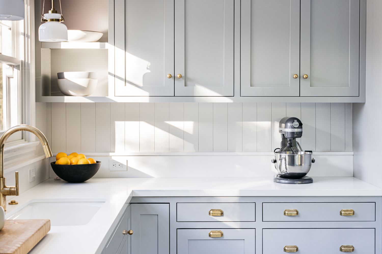
Let’s take a look at 8 of the most important considerations before you select your ideal cabinets:
Cabinets serve as a visual anchor in the kitchen. Whether you lean towards traditional, contemporary, transitional, or rustic styles, your choice should reflect your personal taste and harmonize with the rest of your home. Shaker-style cabinets offer timeless appeal, flat-panel cabinets give a modern edge, while intricate designs with raised panels and molding are characteristic of traditional kitchens.
The cabinet material plays a crucial role in durability and appearance. Solid wood is a popular choice due to its robustness and variety of finishes. Plywood is a sturdy and cost-effective alternative. For modern design lovers, materials like stainless steel, melamine, or thermofoil may be appealing. For an eco-friendly option, consider bamboo or reclaimed wood. Each material has its own pros and cons, so be sure to do your research before settling on a decision. You don’t want to end up with a cabinet from an unsafe flammable material or a material that’ll fall apart in a year.
The cabinet construction type also contributes to the overall look and functionality. Framed cabinets are traditional and offer strength, while frameless (European style) cabinets provide a sleek, modern look with more accessible storage.
Door style is a key factor in defining the aesthetic of your kitchen. It’s the most visible design element of your cabinets. From simple shaker-style doors and decorative inset doors to sleek slab doors or those with glass fronts, the choices are plentiful. Choose a door style that aligns with your overall kitchen design theme.
Whether you prefer a natural wood look, a pop of color, or a painted finish, the choice can dramatically change the vibe of your kitchen. Lighter hues can make a space feel larger and brighter, while darker tones offer a cozy, luxurious feel. Consider your kitchen’s size, the amount of natural light it receives, and, of course, your personal preference.
While often overlooked, hardware is the jewelry of your kitchen. It adds the final touch to your cabinets. From modern minimalist pulls to vintage-style knobs, hardware choices can further emphasize your kitchen style.
Think about the functionality that you expect from your kitchen cabinets. Soft-close hinges, full-extension drawers, pull-out shelves, and corner drawers can increase your kitchen’s efficiency. Don’t forget to consider your storage needs to decide on the appropriate mix of cabinets, drawers, and open shelves.
No matter how aesthetically pleasing your cabinets may be, if they can’t withstand years of use, they’re not a wise investment. Prioritize quality construction features like solid wood frames, doors with solid wood panels, and drawers with dovetail joinery. Remember, quality cabinets should look great and stand the test of time.
Remember, your kitchen is an investment that will serve you and your family for years. It’s important to consider all aspects of your cabinets, from style to quality. Your chosen professional will understand the importance of this decision and get ready to help you navigate this exciting journey toward your dream kitchen. Happy cabinet hunting!
The post Choosing the Right Kitchen Cabinets: A Comprehensive Guide appeared first on Style Motivation.
]]> Above: The former kitchen was smaller and more closed off to the rest of the house. The couple opened up the kitchen area and centered it around a large functional island. Photography courtesy of House of Bullet from “This Is the House I’d Leave Amsterdam For”: A Family’s Airy, Springy 1893 Quarters in Haarlem.
 Above: The couple sourced a vintage cabinet, painted it a shade of pale green, and mounted it in the corner of the kitchen as dish storage. Photography courtesy of House of Bullet from “This Is the House I’d Leave Amsterdam For”: A Family’s Airy, Springy 1893 Quarters in Haarlem.
 Above: Ikea Metod cabinet bases are finished with Classic Style doors, drawers, and brass hardware from Noremax. They’re painted in Farrow & Ball Studio Green.
 Above: For a similar, lighter shade of green seen on the vintage cabinet, Farrow and Ball’s Whirlybird No. 309 is a light but lively pale green shade.
 Above: The pink subway tiles in a diagonal stack are Azulejos Detroit Rose from Dutch online source the Tegel Store.
 Above: For a similar stone to the Carrara countertops, the Bianco Carrara Polished Marble Slab seen here is $2,548 at Bordignon Stone.
 Above: The pendant lights are the &Tradition Utzon Pendants in Brass.
 Above: The Jielde Wall Sconce SI300 in Matte Finish Black; $486 at Horne.
 Above: The faucet is the Meir Round Kitchen Mixer Tap, shown in Tiger Bronze, for $529 at Meir.
 Above: The Elica Venting Gas Hob is a similar model to the one pictured featuring a central vent; £1,999 at AO.
 Above: The cabinets are fitted with the Noremax Bolmen Classic Handle in Unpolished Brass; €20 each at Noremax.
 Above: The Hawkins New York Brass Cake Stand is $60.
 Above: The Raawii Strøm Vase in Coral Blush; $102 at Finnish Design Shop.
For more colorful kitchens with sources to match, see our posts:
]]>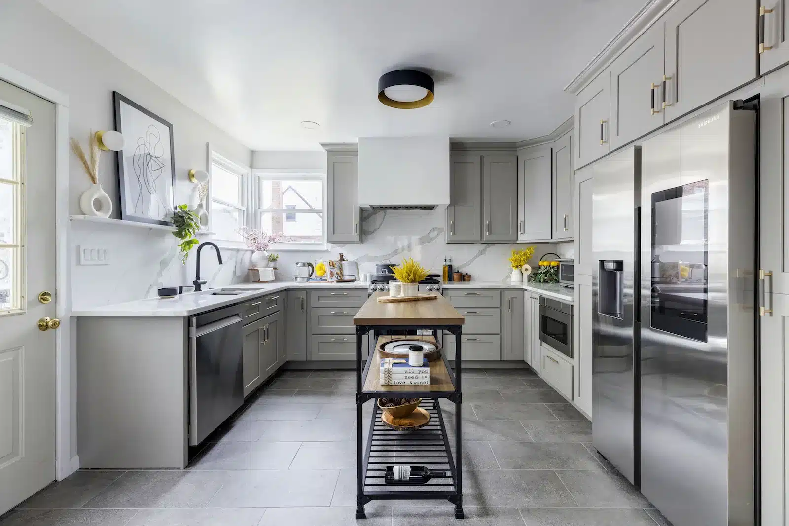
Written in partnership with homeowner Gabby. “After” photos by Kate Glicksberg.
My biggest question was, “How do I make it feel like a million bucks—without spending a million bucks?” My mom bought this house when I was in high school and I inherited it when she passed away. As an ode to her, we wanted to invest in the property and renovate; something mom had dreamt of doing but never had the funds to do it. So we began planning—kitchen and bathroom first.

My name is Gabby. I am a realtor and designer, and Perrin, my husband, is a security officer. Our five-year-old daughter is Rinelle. I’ve always wanted to build my dream house, and I was able to refinance at a good time. Although I do real estate full-time, I also take on freelance design projects. One example: Christina and Aaron’s kitchen, remodeled by a Sweeten contractor.
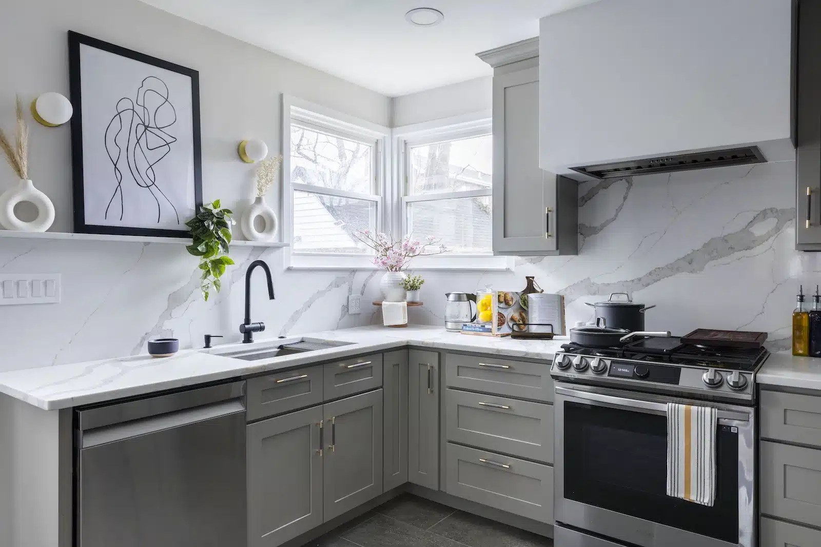
The house, a single-family Cape-style that is common to our area of North Rosedale, Queens, was built in 1950. We needed to overhaul a kitchen which had so much wasted space. Storage was severely lacking based on the existing layout and was not serving my family’s needs. In addition, the materials were outdated, required a lot of maintenance, and no longer standing the test of time.
We envisioned a partial open concept between the kitchen and dining room, which felt cut off. Our bathroom was also old and had ventilation issues which lead to a lot of rust. It was due for a total gut.
I like making spaces beautiful and functional, so I decided to plan my home’s redesign. I listed my renovation project and Sweeten quickly connected me to three contractors in Queens who all seemed great. The contractor I hired offered me the best time frame, materials, and cost. His crew went above and beyond and did not cut corners.
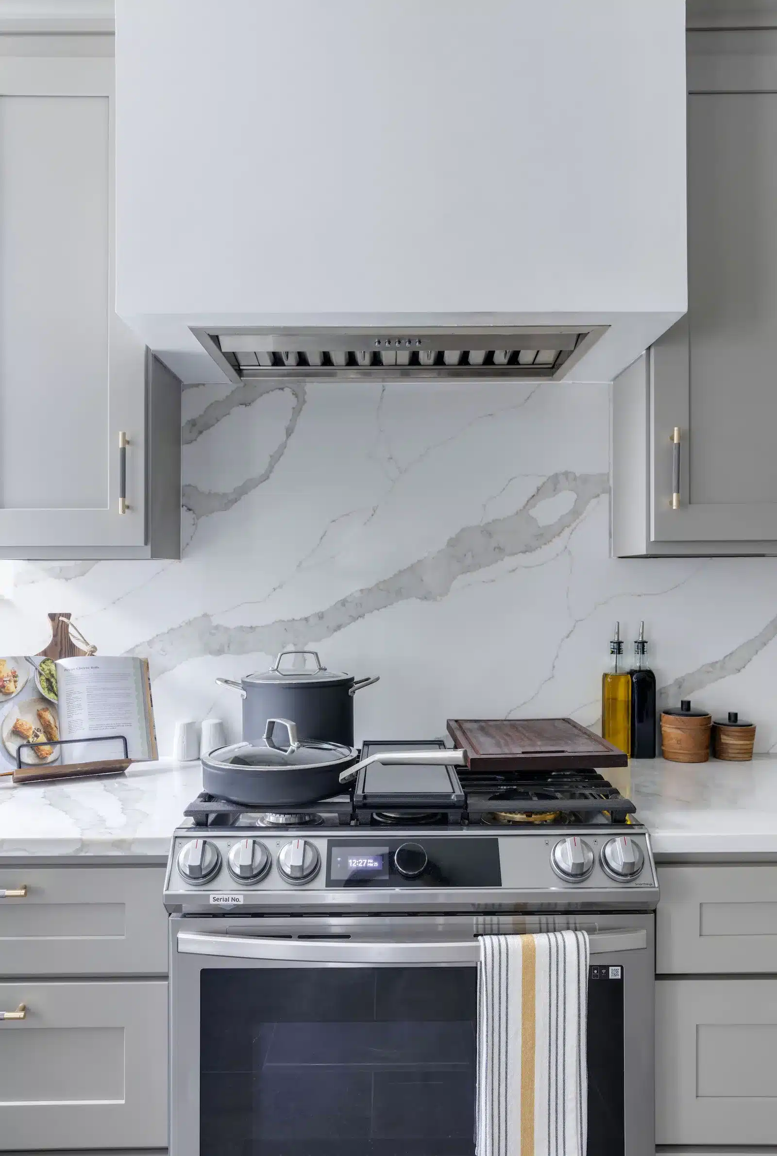

We started the process in the kitchen, where I got to work on design and storage solutions. Cabinetry covered one wall from floor to ceiling. The U-shaped layout gained space by eliminating the permanent island. However, we bought a mobile island for counter space on demand.
I wanted a “greige” finish on the cabinets and had a light-colored quartz countertop in mind, with beautiful veining. A tile backsplash would have saved money, but I went with my heart’s desire, making the countertop continue up the backsplash.
Figuring out how to utilize a wall near an awkwardly placed window, I added an art ledge, which brings such life to the room. In the adjacent dining room, we built a niche to create another art ledge—perfect for a picture of mom and me.
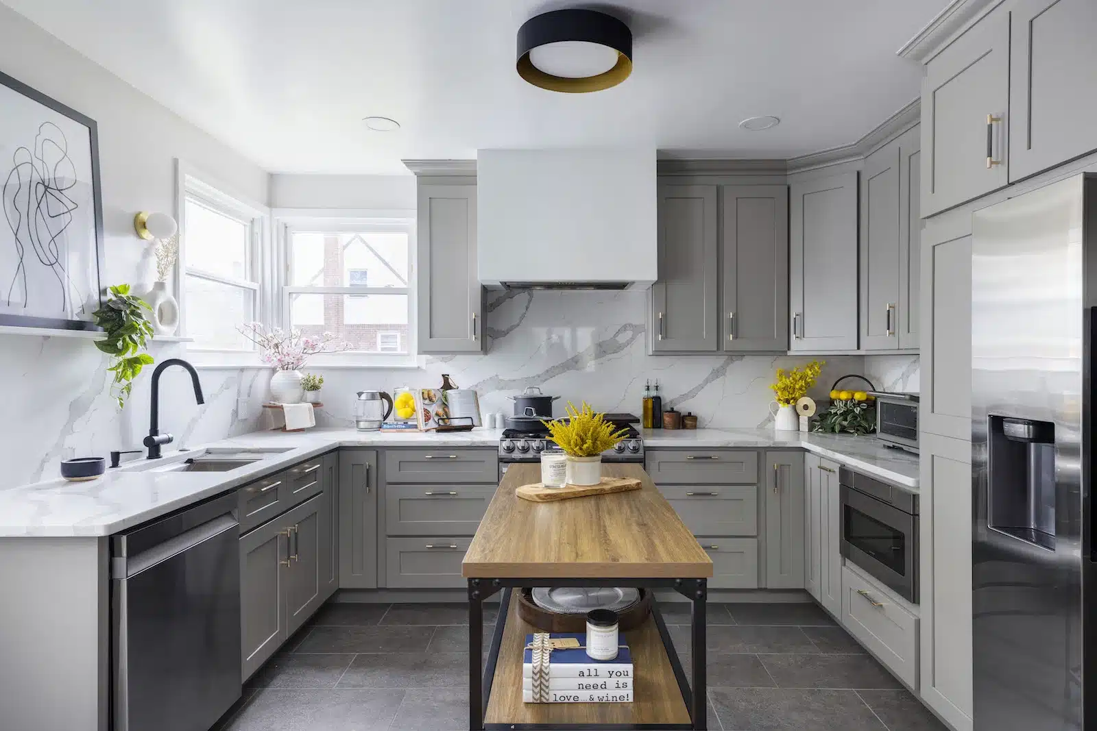
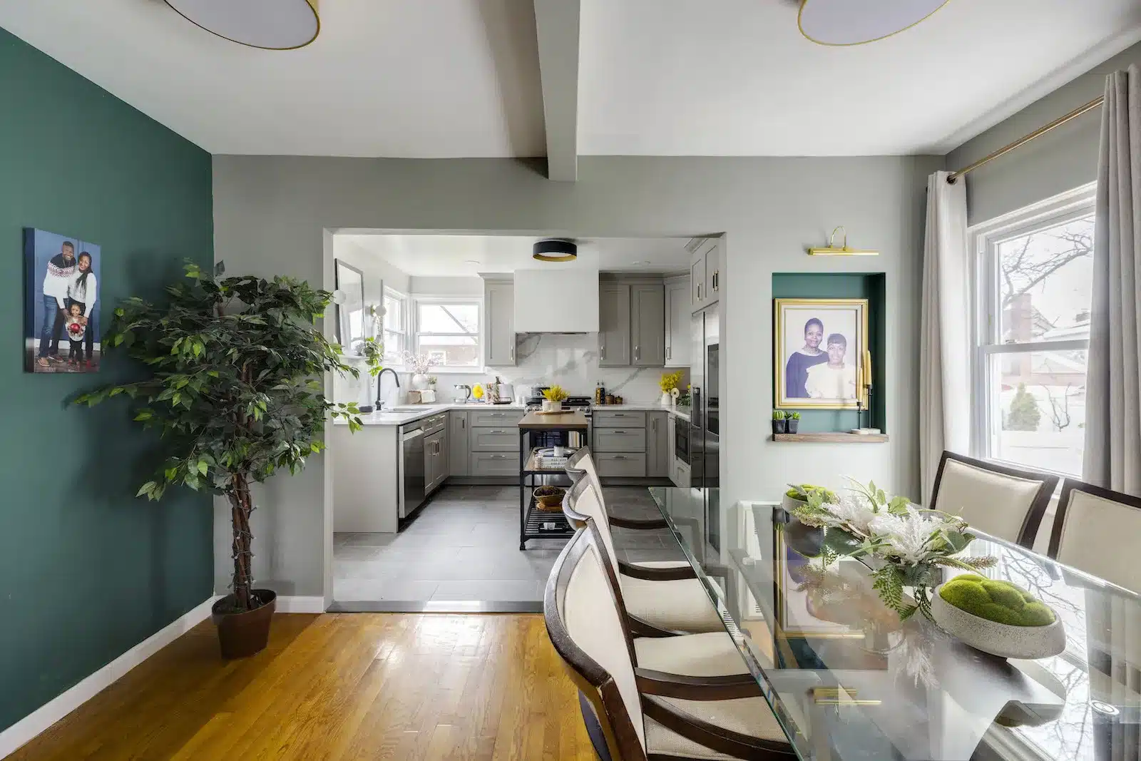
I decided on a symmetrical design using as many drawers as possible. We added lazy susans to the corner cupboards and added drop-down storage trays to the front panels at the sink. Not an inch of space was wasted. I didn’t want to spend a lot on pull-outs, but we splurged for deep cabinets like the pantry. Another pantry-like cabinet sits on the opposite side of the fridge for cleaning products, mops, brooms, and the vacuum.
For the design, I selected a black faucet and light fixture to pop against the quartz and the white ceiling. Then I added the “jewelry,” which is what I call the pretty cabinet hardware.
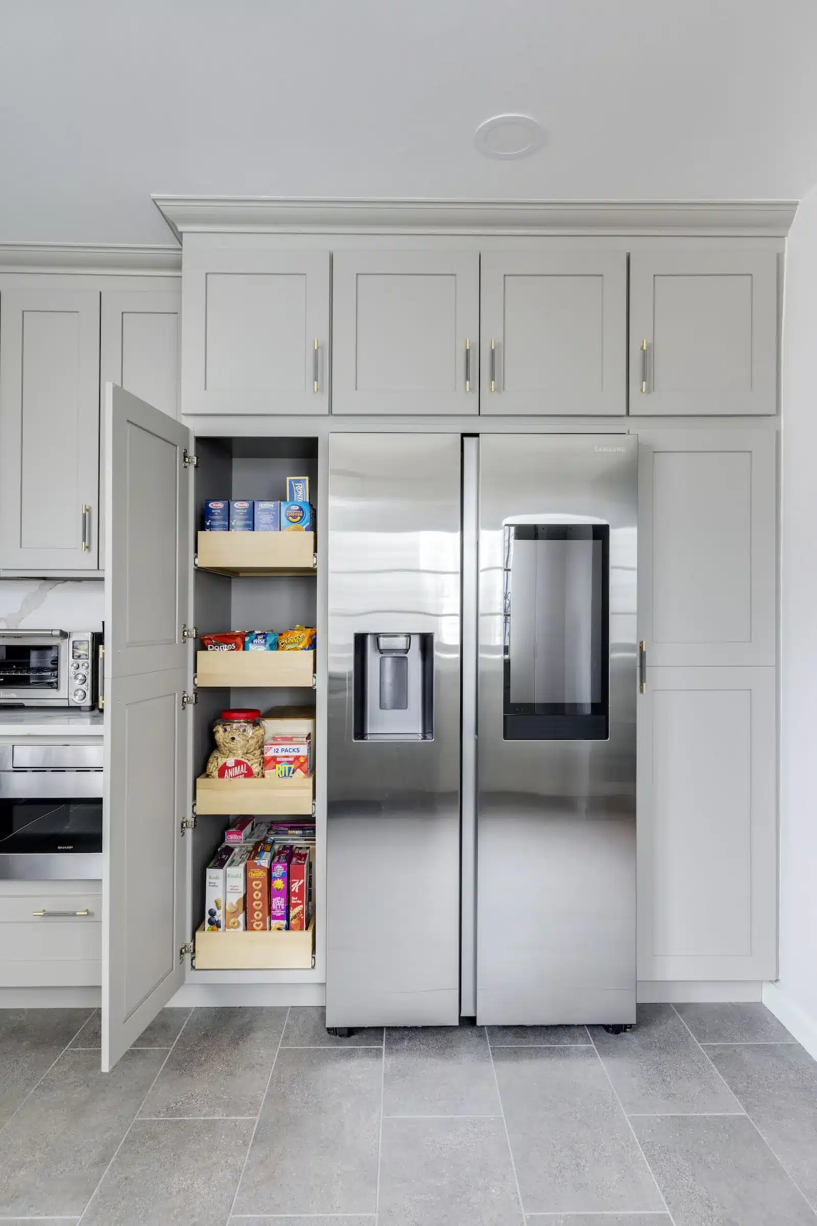
Adding fillers above the upper cabinetry brought the crown molding to the ceiling. No gaps! For the floor, I chose a concrete-look porcelain tile for its ease of maintenance. Its texture also had some grit to it so it was less slippery.
"I listed my renovation project and Sweeten quickly connected me to three contractors in Queens who all seemed great."
Next, we got to work on the bathroom. Due to minimal square footage, I looked for ways to make it feel open. A vanity with a drawer provides ease of access. The large medicine cabinet keeps personal items out of sight.


I selected mid-century modern-style patterned hex tile and searched for other tiles to blend with it on the walls. The large-format, asymmetrical honed tile contrasted nicely and also looked great with the black and champagne-gold fixtures. Solid gray floor tile pulls it together, and natural wood elements bring a spa feel.
One sticking point involved getting the contractors to see my vision and follow my drawings. To get the look just right, the hex tile pattern needed to be placed strategically and the grout had to match in thickness to show continuity. In the bathroom above the tub, I wanted to center a large-format tile design; when I explained my vision, the contractor and sub-contractors’ jaws dropped. But they got it done.


Choosing every paint color, finish, countertop, and tile was so exciting. I saw my design come to life. I documented it all. Based on experience, I suggest moving out during construction, if you can. The biggest challenge I had was doing construction while living in the space. We had no use of our kitchen and used the basement bathroom for over a month.
Also, check functional details. For example, consider which way the door swings and know what you will put in every storage nook. As a designer, I plan out all of the kitchen design details with the cabinetmaker and work with the contractor to execute it. Planning makes a difference. Lastly, make sure you have your appliances, fittings, and fixtures delivered before construction begins to prevent delays and keep the project moving.
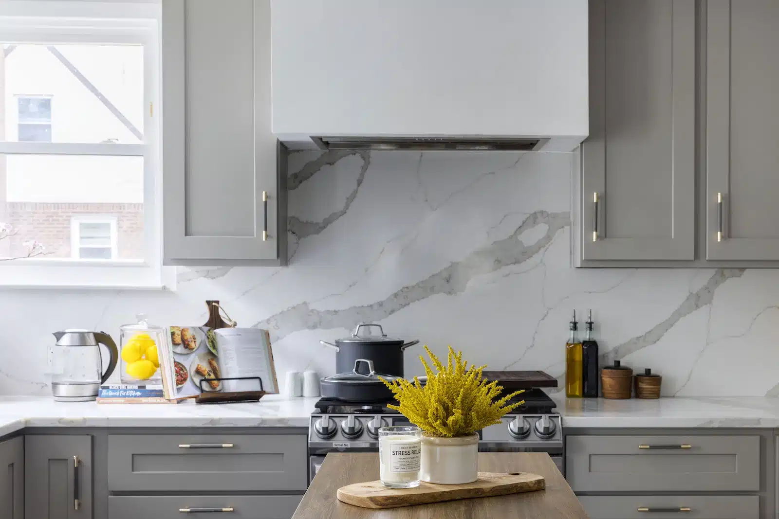
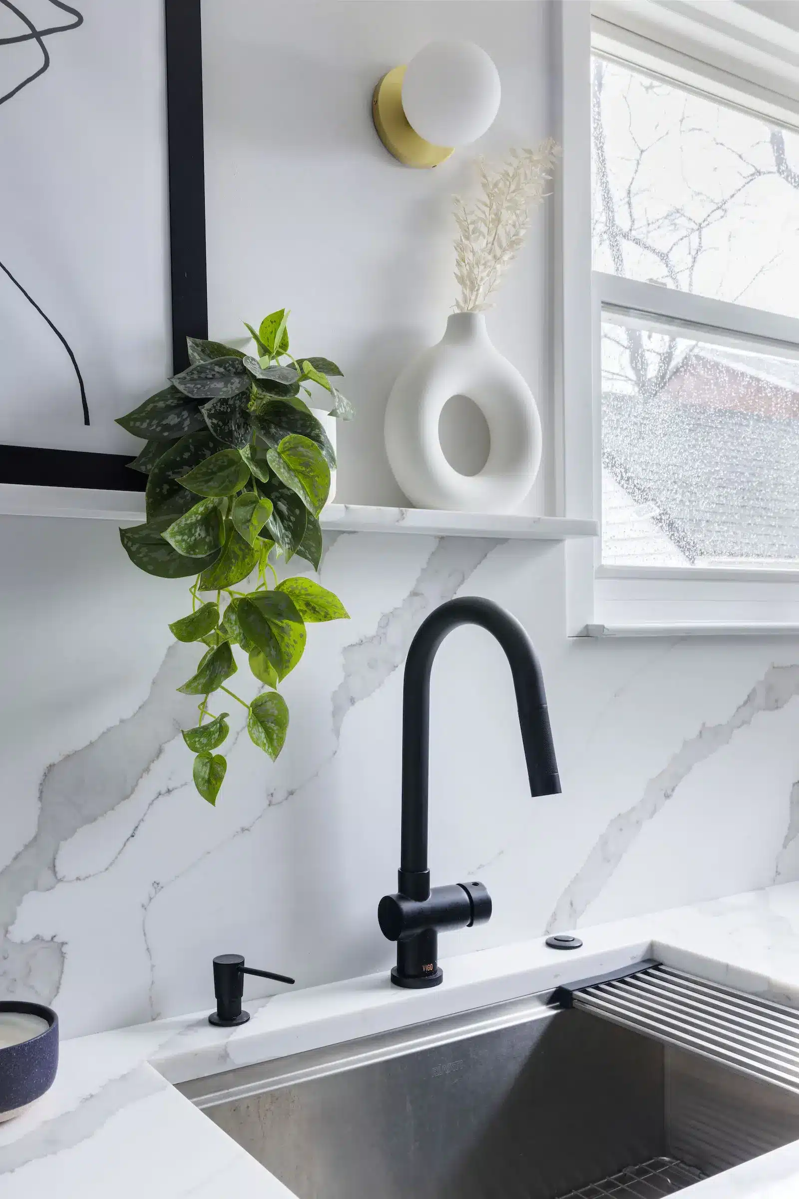
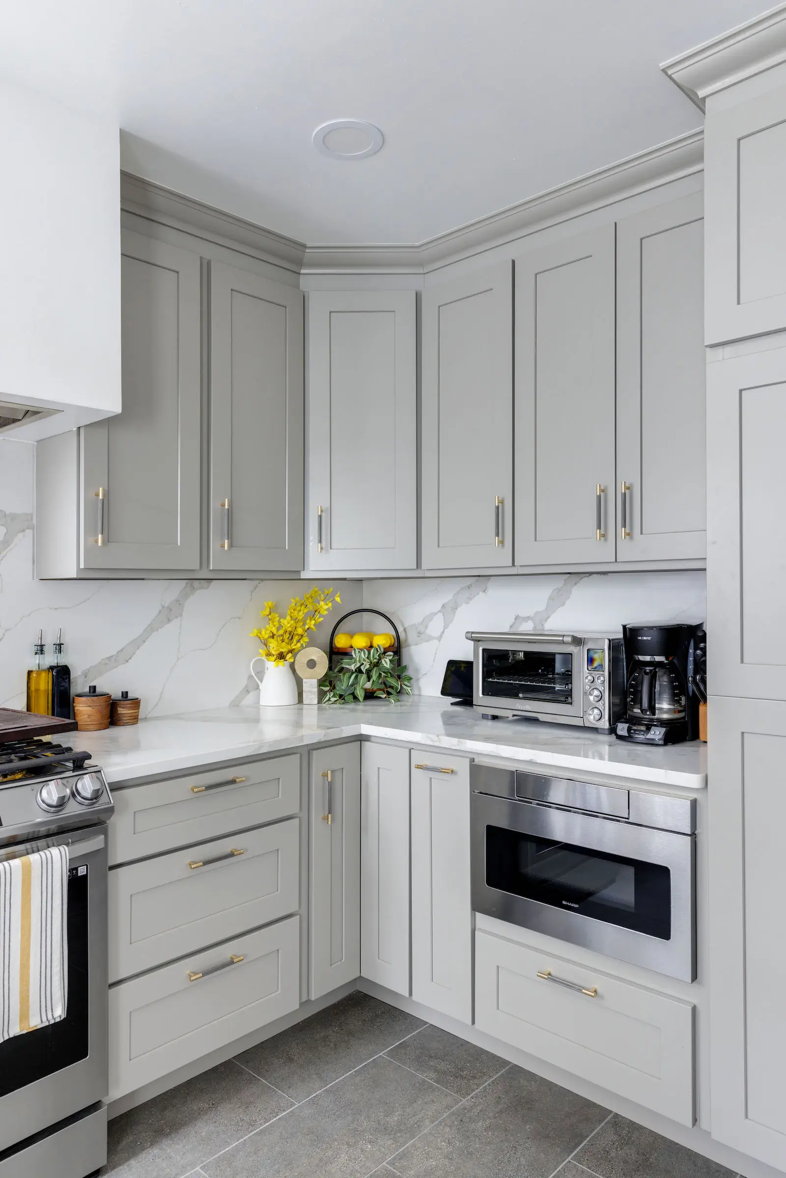
As for working with your contractor, be specific about your wants and the time it will take to complete them so you don’t get hit with surprise costs. Hold contractors accountable for their promises but prepare for the unexpected if you open walls. We hoped to keep costs under budget but we went over.


My favorite part of the renovation was just after it was over. We’d cleaned up the dust and started to live in the space. Every night I would stand in my dining room and stare at the kitchen. It was quite an accomplishment.
Perrin stood in awe of the transformation and says that seeing the video reveals on my social media highlights page (@gabby_the_realtor) brought his “magic” moment.
We all love the result, and our new spaces make us feel proud. My daughter was excited each day after school, seeing the progress, and I got to show her how a dream can become reality if you work toward it.
KITCHEN RESOURCES:
BATHROOM RESOURCES:
—
Sweeten handpicks the best general contractors to match each project’s location, budget, scope, and style. Follow the blog, Sweeten Stories, for renovation ideas and inspiration and when you’re ready to renovate, start your renovation with Sweeten.
The post New Memories For a Kitchen and Bathroom Remodel in Rosedale appeared first on Sweeten.
]]>
This is what I wish my workshop looked like – clean workbenches, clean floors, and nothing in the way.
Lean manufacturing principles are about reducing waste and improving efficiency.
Ben V has the right idea – shown above is what his workshop looked like after building a couple of modular workbenches and tool cabinets. (You can see what he’s been working on at @dusty.tools on Instagram.)
Every now and then I’ll hear some “lean manufacturing” tips and techniques, with some applying just as effectively to DIY workshops.
Lean manufacturing suggests that you should buy what you need as you need it.
I have a couple of sheets of baltic birch plywood in my garage, as well as hardwood boards. My material cache doesn’t stop there – I have a couple of small sheets of plastic, bar stock, and more. That’s more than I have immediate need for.
I still have a couple of 4-foot cypress 2x boards that I bought for building raised garden planter boxes.
Oh, I’m glad to have materials available for impromptu projects. The plywood will be used for an upcoming cabinet build, and I bought a few extra sheets to justify the delivery fee from the lumber yard.
I also tend to overbuy for ToolGuyd purposes. Part of the job is trying out new tools, accessories, brands, and so forth, and so it’s regular and habitual for me to buy more than I need.
But, I also have a tendency to overbuy, especially when I find something on sale. When I do this, some of the surplus sits around until I need it, which can sometimes take a while.
I often have multiple projects at various stages of planning and preparation. Sometimes a project might be delayed, changed, or put on hold for an extended period of time.
I hate having to make multiple trips to the store, and so I might buy extra. Do I need #10 x 1-1/2″ screws, or #8 x 1-1/4″? Sometimes things don’t work out as well in real life as they do on paper. So I tend to have Plan A and B purchase plans.
That mindset can be beneficial, and I am often glad I don’t have to waste money or time placing another order when my Plan A selections don’t work. An extra box of machine screws or other small fasteners will usually cost less than having to pay shipping twice.
Past experiences have also lead me to always ask myself “what if it doesn’t work?” or “what if I need more?” Overbuying can save me time and money.
I bought a couple of IKEA butcher block-type countertops a few years ago, and still have one left, plus a couple of still-usable offcuts. They work great for workbenches, tool stands, and heavy duty tops for cabinets.
IKEA doesn’t offer solid wood bitcher block countertops anymore, at least not that I have seen. They changed things up a few times over the years, but seemed to make the permanent change from solid wood wot wood veneer countertops.
I have another workbench project in the works, and the extra countertop should work perfectly there. Alternatives do exist, of course, they just cost more money; those IKEA birch (or was it beech?) countertops were a great deal, and delivery fee was the same whether I was buying one or six.
So on one hand, I’m glad to have the cache of materials I’ve accumulated. On the other hand, what about space?
Once I work through my plywood and wood boards, I’m going to try to adhere to a “buy as I need it” policy.
Maybe I can allow for some exceptions; I’m sure there could be a balance between how much I immediately need and how much will be good to keep on-hand.
A lot of my habits come from my buying supplies on sale to save money or overbuying to save money on multiple shipping fees. Sometimes I do similar when concerned about future availability or pricing.
I can only blame some of my lumber excess on recent years’ shortages. That led to a “buy it when I find it” mentality.
I don’t plan to have overstock. Often I roughly plan for how the extra materials will be used, at least in the context of lumber, but sometimes those plans change or are frequently interrupted by other priorities.
I’ve seen others’ workshops and know that I’m not alone in this. Woodworkers, for example, tend to hoard wood and offcuts.
I bought a piece of oak at the lumber yard last year when shopping for maple. It had a great grain pattern, and I knew I could use it for something, but I still haven’t committed it to a particular project yet. I couldn’t pass it up, and have no regrets.
Shifting mindsets isn’t easy.
“Do I need to buy this now? If I wait, can I easily buy it when I need it? Will it cost me substantially less to buy right now?”
There needs to be some margin for error or unexpected circumstances. If I need 40 fasteners, it’s a good idea to buy 50, in case some are defective.
If I need 18 board feed of wood for a project, buying 20 is a good idea (at least), just in case I need a little extra or have to cut around a knot. But do I need a 10 board feet project pack of cherry just because it’s on sale?
Having a full lumber rack, or stack in my case, isn’t a bad thing if you have the space. The same goes for other materials, components, or what-not.
But, I find myself being short on space while also being more capable of paying shipping fees twice if needed.
Being budget conscious occasionally leads me to think “what else should I order now instead of soon or later, to make the most of the shipping fee?” Or, if there’s a discount, I look ahead to what I might not want to spend full price on a few weeks (or months) later.
Sure, that might save me money, but leads to inefficient utilization or storage space.
Let’s say someone is starting to lift weights. Buying a set of dumbbells can cost substantially less than buying them one size at a time. The same goes for wrenches. There’s a point where it’s more cost effective to buy a set than just a couple of sizes.
The “lean manufacturing” way would be to buy just what I need as I need it, plus a little extra where it makes sense.
But lean manufacturing is about reducing or eliminating waste.
If I try to apply lean manufacturing practices, things start to look contradictory. I’m not a manufacturer with well-defined material or part needs. Do I waste a bit of space, or money? They are interdependent – saving space results in higher costs, and saving money results in less storage efficiencies.
Lean is about improvement, and about assessing the state of things to look for opportunities for improvement.
So, it’s not about finding lean manufacturing practices that work for me, but applying the “look for opportunities to reduce waste and improve upon something” philosophy to my specific needs and contexts.
What I think makes sense for me is to keep materials on-hand except when doing so interferes with other needs or activities.
I have a couple of rubber sheets that I use for gaskets, washers, and similar things, and that’s okay. But I think my goal for lumber and plywood should be to only keep on-hand what I might use in an immediate project.
It’s not easy – what if I have trouble finding clean 2x cedar again? Baltic birch can be hard to find in certain sizes now, and so I don’t entirely regret buying extra.
Lean manufacturing doesn’t demand I adhere to certain practices. The goal is to eliminate waste and seek improvement.
All of this came up recently because I ordered a couple of bars of aluminum, plus a heavily discounted 12″ x 36″ sheet that I don’t have concrete plans for yet, and wondered if I was being wasteful. Maybe it’s a little wasteful, but the savings are substantial (I plan to cut it up as needed), and as I can fit it on a shelf or in a corner, it’s relatively easy to store.
A 60″ x 60″ sheet of plywood isn’t as easy to store.
So, my hybrid approach will be to keep a small supply of easily-stored materials on-hand – the same as I’ve been doing for the past 15-18 years or so – and buy plywood and hardwood as-needed, aside for “gotta have that” hardwood boards and a 2x or two as they frequently come in handy.
Are there areas of improvement in your workshop? Work van or truck? Hobby corner?
I think that “lean” finally clicked for me. It’s not about certain practices, but the philosophy of assessing, improving, and repeating until everything is as efficient as can be.
]]> Succession actor Natalie Gold, who played Rava Roy on the show's four seasons, at the final season premiere in March.
Actor Natalie Gold thinks it’s important to point out she does not think her character, Rava Roy, “is a saint by any means”. Yet, any time Rava would show up over the course of the four seasons of Succession, it was hard not to think of her as one of the show’s unsung heroes.
Quite simply, Rava has been through hell. As the ex-wife of failson Kendall Roy (Jeremy Strong), she continually tries to stay above the fray that is the Roy family’s mess, while doing her best to co-parent (or, let’s be honest, be the primary parent to) their kids Sophie (Sway Bhatia) and Iverson (Quentin Morales).
But by the show’s final season, her heroic reserve of patience finally starts to run out, like when she informs Kendall that Sophie, a teenager of colour, was attacked on the street. It’s just days before a high-tension election involving fascist candidate Jeryd Mencken (Justin Kirk), whom Kendall and the Roy family enabled through their right-wing news network ATN.
Kendall blames Rava and questions her parenting. “I was raising our daughter, while you were fucking running a racist news organisation!” she responds. Kendall then makes the absurd claim that “I’m breaking my back, and it’s all for them,” which Rava brilliantly dismisses with what Natalie described as “a vicious laugh.”
The final time we see Rava in the series is in the show’s penultimate episode, when she decides she and her kids will not attend patriarch Logan Roy’s funeral, for their safety, as protests have erupted since Mencken declared victory. Kendall throws a pathetic tantrum, threatening to physically stop traffic (which he does not) and file an emergency restraining order to prevent her and their kids from leaving the city. “You do that, OK?” Rava scoffs, heading into her car.
The funeral episode set the stage for that explosive series finale. During the Roy siblings’ final showdown, Roman (Kieran Culkin), to get under Kendall’s skin, casually throws out the stunning possibility that Kendall is not the father of either of his children. The line stunned Gold, too, who was among a group of New York-based cast members who gathered at a bar to watch the finale together.
She recalled that even they were as shocked as we were by the breathtaking episode. None of them were exactly sure what to expect in the final version of the episode, since scenes and shots can change during the editing process.
❤️❤️❤️❤️❤️❤️❤️❤️❤️❤️❤️❤️ #succession#SuccessionFinalehttps://t.co/YoyLIzel3r
— Natalie Gold (@nataliegold) May 29, 2023
“I was shaking watching it. I had an idea of what was coming, but I’m still like, ‘Whoa,’” Natalie said, describing the visceral emotions in the room. “I’d like to rewatch it again on my own. I haven’t done that yet.”
In a conversation with HuffPost, Natalie shared more about the cast’s watch party, explained what she made of that bombshell about Rava and Kendall’s kids, looked back at her many fond memories of the show and expressed immense gratitude for the show’s brilliant writers (TV and film writers, including those who worked on Succession, are currently on strike over key issues including equitable pay and working conditions in the streaming era.)
Were you all reacting to the same things that we were all shocked by?
Yes, we were all reacting. I was sitting next to J. Smith-Cameron, and I think I was just squeezing her arm really tight the whole time. And so much got kind of huge laughter and such joy — that scene in the kitchen with the three of them was so wonderful, and beautiful and sweet. And then everybody just had a pit in their stomach knowing that that wasn’t going to last.
I think what got the biggest reactions: that hug between Kendall and Roman, oh boy. I was squeezing J. [looks at arm] I have no bruises. I hope I didn’t leave any on her. But that hug was so brutal, and beautiful and painful. And then I think there was a loud, raucous cheer when Tom and Greg finally go at it, slap each other.
There were lots of laughs and applause when people would come on, and just generally very supportive. But stunned into silence by the end, I would say. Stunned into silence.
I had a big reaction to the line that Roman says to Kendall about their kids: Logan always said one was “a buy-in” and the other was “half Rava, half filing-cabinet guy”.
Yes! I wanted to ask you about that. Was that news to you, as the person who played the mother of his children for so long?
Yes and no. [Show creator Jesse Armstrong] and I had a conversation back in season one about Sophie being adopted, and got into that a little bit, it being difficult to conceive. That was always in my head, that her getting pregnant was difficult.
But it’s also unclear to me, and it’s the perfect mix of the Succession writers, where it’s something Logan said, right? Who knows if it’s true? Is it a sperm donor? We don’t really know. Did Rava have to go through rounds of IVF? We don’t know.
But the fact that Logan said that ― is that true? I don’t know. I don’t know that to be fact, or is that just a horrible thing that he would say about his grandkids?
Yeah, that’s a good point.
Whether it is true or not doesn’t matter. They’re our kids — but just the fact that he said it was horrible and that it was repeated to Kendall in such a vicious way.
Right, the brutality of it and also just that precise moment when Roman decides to use it as ammunition.
Absolutely. They’re tearing each other apart, and I think even Shiv says, “Roman, back off”. And he’s saying: “This is just what Dad always said behind Kendall’s back,” which, I think Rava always knew Logan was talking shit about those kids!
Yeah, you’re right. In my head, I was trying to work all of that out as well. I thought: We know Sophie’s adopted, and in season one, they had alluded to some issues with infertility. For some reason, I then assumed Iverson was biological. But like you said, ultimately, it doesn’t matter.
I assumed he was as well, and I assumed that there were fertility issues. But again, I don’t know for a fact as an actor. The writers do that so well, how that doesn’t matter. True or not, we don’t know. It’s just a horrible thing to say. They’re still his kids, but it’s something that tells so much of a story about their characters and also about who Logan was — part of that kind of older generation who just dig their heels in and say these vicious things with no flexibility, and the idea of a bloodline not being “pure enough” or something. It’s so evil.
When you started on the show, I imagine you probably got a pretty basic description of: “OK, Rava is Kendall’s ex-wife.” How much did you then end up inventing for yourself in terms of a backstory? Did you have conversations with Jesse and the writers about who Rava is, what’s her life like independent of Kendall? Did she grow up with money as well? All these different questions.
I have those as well, and I would say, everything I needed as an actor was on the page in terms of the relationship and any backstory that I felt I needed. I would have some conversations with Jesse about it, and I have no doubt that he and all of the writers have a full canon and bible for these characters. But one thing he doesn’t do unless you really specifically ask, which I didn’t, is impose who he thinks this character is on you. It’s all there on the page. It’s a beautiful amount of freedom for you to interpret what you want.
I mean, there were some factual questions. I have my own thoughts and feelings and kind of research that I did for myself about who I thought Rava was, because that’s fun to imagine, and I like to do that as an actor. But everything I needed was really on the page, and anything else was just fun for me to help get into her more and daydream about and imagine a little bit.
It’s not Jesse-vetted or canon, but I kind of felt like she — I mean, it was said in the script that she’s kind of an executive. She works as a consultant at a McKinsey-type firm. She’s smart; she’s good at this business stuff. She just doesn’t want to get involved with the Roy business stuff. She’s staying out of it.
And again, it’s my own kind of imagination: I always thought her and Kendall met in business school. But again, that was nothing Jesse told me or not a conversation we had, but that made sense to me. They met young and fell in love. And my theory, and I’ve said this before, is I don’t think Rava is a saint by any means. And I’m sure the allure of Kendall being a Roy was part of it, but I do believe she fell in love with Kendall despite the Roy name, not because of it.
I think she didn’t come from a billionaire class, Rava, but I think she came from enough privilege and would’ve had a fine, nice life financially. I mean, not the billionaire life, but she’s well paid at her job. Not for the Woolworth building, maybe. Not for the helicopters.
Right. I like that especially in season one, there are these moments when we can see there was definitely love there, at some point in this relationship.
Yeah, I remember reading that first scene in the pilot, and when I auditioned, it made me laugh out loud, and it just solidified their dynamic so much in my mind, that enough time has passed that she could joke around with him in a way. And there was a give-and-take and kind of a no bullshit way she had of talking to him, that she could mess with him a little bit. Like, when he asks her if she’s seeing anybody and she says, “Yeah, I hope this one doesn’t leave coke on the kids’ iPads”. I mean, that line just made me laugh out loud when I read it.
But then, I think that’s absolutely what happened. I think that’s the moment where Kendall’s addiction became too much, and she had to get out with the kids, and then he got sober. And I think by the pilot, we’re seeing them trying to be happily separated, or Rava is at least trying to. She keeps showing up. Keeps showing up at the family events, keeps bringing the kids, keeps trying.
 Kendall (Jeremy Strong) berates Rava (Natalie Gold) when she informs him their daughter, Sophie, was attacked.
In a lot of those moments, I also love that — I think it’s a combination of the writing and your performance — there are these small little moments where he’ll say, “I’m doing this for the kids”, and you’ll be like, “Suuuure”. Just these small choices that make a world of difference in a split second of a scene.
Yeah, it’s amazing, and it’s so in the writing as well, it’s what is in the script, too. I love that, too. In the first episode of season three, when he comes to her apartment, Rava hasn’t even watched the big speech that he gave. She’s busy at work, right? “They told me about it. I heard about it.” She’s proud of him, but: “I haven’t gotten to it yet.” He said, “Well, I’ve done this for you guys,” and [she says]: “Yeah, well...”. That’s in the script, which is perfect.
She knows him well enough to know he may believe that, but she certainly doesn’t believe it.
Exactly. There’s a similar moment in this season when Sophie was attacked by the person wearing the Ravenhead shirt. You’re walking off-screen, and we don’t actually see you. But we hear you kind of chuckle a little bit at him being like, “I’m doing this for our kids”, or something. And you’re just like, “Oh, sure”.
I think I did a vicious laugh. That just came out, that vicious laugh just came out, and then I had forgotten that I had done it. And then it made the episode, which I was happy about. That kind of came in the moment, one of those happy accidents.
But, yeah, I think that’s the joy of getting to work on this show: the freedom that you’re allowed to play within the scene, to have those human reactions that come out that you don’t expect, which is the most fun. But I remember thinking: With him saying that, the only choice that made sense was just a laugh that came out, because I think for her, after that scene especially, the exasperation level is at a fever pitch.
Was the final scene you shot for the show the big scene in episode nine?
That wasn’t my final scene. It’s just because of the way, scheduling-wise, how things worked out. My final scene that I shot was actually episode eight, which I shot after episode nine, which was Sophie and I — Sway, who played my daughter, Sophie — and I are in the car driving around at night when we call Kendall and say, “I think there’s somebody following us”. That was my final day on set.
Andrij Parekh directed that episode, and Mark Mylod directed episode nine. Episode nine felt like: “Oh, that’s a great season wrap.” But then it wasn’t, and I was happy to have more to do. I got to shoot this scene with me and Sway and our incredible camera operators, Gregor and Corey, stuffed into a car, driving around New York City. It was perfect.
We’ve talked about some of your big scenes already, but are there any particular scenes that are seared into your memory? Or even beyond that, memories of the set that you’ll never forget?
I mean, all of them. All of them, honestly. I think in that first season, England, that was, I think, five weeks of just being all together in a small town, away from our families, doing this thing, doing night shoots in this gorgeous, drafty old castle, this huge wedding. That will always be seared into my brain. Banding together was such a beautiful memory. I think especially the cast can get close when you’re not going home at the end of the day. We’re all going back to the same hotels, we’re all in the same place together, which makes the bonding so much fun.
Since then, to go to the Woolworth building and shoot that episode [in season three] was so fun and exciting, and it had been — God, we were still in the pandemic. Everybody was masked and wearing these face shields but so happy to be there and figuring out a way to make this work, and doing it. It felt like seeing family again after a long pandemic time of isolation. Kind of beautiful.
And then Kendall’s birthday party. It’s just one of the most amazing sets I’ve ever seen. The level of detail, the writing, the props, working with Lorene [Scafaria], who’s an incredible director.
And then everything I’ve gotten to do this season just felt like a deepening level. I felt it just cemented, for Kendall, a level of what he was losing even more, because I felt that Rava was somebody who had shown up and always had.
And it felt like a kind of beautiful, heartbreaking arc to see, really the crumbling of this already fractured relationship, culminating in her actually not showing up to the biggest event of his life thus far. His father has died, and she doesn’t go, I thought was a really bold, beautiful choice. And shooting the scene with Jeremy on the street was amazing, and Mark was amazing, and just getting to go at it in all kinds of different ways. It’s so fun. I’m going to miss it so much.
 Rava (Natalie Gold) in Season 3 of "Succession," when Cousin Greg (Nicholas Braun) opens a valuable bottle of wine in her apartment without her permission.
Yeah, I’m going to miss it as a viewer.
I know.
I feel like part of why I wanted to talk with you ― and I also talked with Juliana Canfield [who plays Kendall’s aide Jess] yesterday ― is wanting to stay in this headspace of the finale just a little longer and keep writing about Succession for as long as I can. Something I asked her about as well: Everyone who’s worked on the show has talked about the unique way the show is shot and the unique way that you all work together. Is there anything from this experience that has helped sharpen your focus in terms of what kinds of things you want to do as an actor, what kind of sets you want to work on, the direction of your career, all these sort of bigger questions beyond the show?
Oh, that’s a good question. For me, as an actor, it starts and ends with the writing. And I mean Jesse Armstrong, ’til the end of time, and all of the writers on this show, all of them, all four seasons: Tony Roche, Lucy Prebble, Will Tracy, Jon Brown, Susan Stanton — if there’s anybody I’m forgetting, I’m really embarrassed. The level of writing is so spectacular: to get a script and be just constantly blown away. And as a fan of the show — not getting a script and seeing: “What am I going to do in this episode?” — just as a fan of the show, you’re reading it kind of shaking, like, “Oh, my God, that’s happening!” and laughing out loud, and sobbing. I mean, that’s the dream.
Everybody brings absolute commitment and play and respect for each other. There’s a trust involved and a dance that happens that feels really magical. Like, working with the camera crew, where you never quite know where they are. It’s a level of working that I’ve never, ever had before. And it’s so liberating and it’s so free, and it makes you feel like you’re just really living inside and inhabiting this world.
So, more of that! But it’s so specific to this show. I hope what I can bring, and I think what it strengthened for me and honed, is the level of dedication I felt to this job and the kind of love for the ensemble. Because as an actor, the thing that I love to do most is collaborate. When you get onto a set where you feel like it is just a big joy of collaboration amongst crew, amongst cast, amongst the writers, just to feel a part of something, to have your ideas heard and to have your opinion matter. And also to be able to ask the smartest people I’ve ever met: “What do you think about this?” That’s the greatest joy in the world. Or to get alt lines from Lucy or Tony or Jesse, which are so hard to say because they’re so funny. They make me laugh out loud. It’s just working on a level of complete and utter instinct because there’s so much trust there. A long answer to your question.
No, that was great. It makes me appreciate the show even more than I already did.
Yeah, me too.
What’s next for you? Are there things that you’ve shot that we should be looking out for?
What is next? We will see. In this time, I’m not sure. There’s a couple of films pending that I’m excited about, but TBD, as far as when they can shoot. One of them I’m very excited about: Our amazing script supervisor for Succession, Lisa Molinaro, is a genius. And she sent me a short film that she wrote. She’s been very encouraged by all the writers of Succession and Mark Mylod to actually make this thing. So she’s making this thing, it’s written and it’s exquisite and gorgeous. And Mark Mylod is going to executive-produce it, and I think our [director of photography], Pat Capone, is going to jump on board. We’re trying to figure out when we can do that. I cannot wait to do that because it will feel like a mini-reunion.
Juliana mentioned that there are several group chats that you all are in. It’s always nice when you watch something incredible and then find out the people who made it also seem to have had an incredible time making it.
Yes, there are several group chats, and I think it’s fair to say everybody just genuinely loves each other. It’s a kind group of people, a hilarious group of people. And all the actors on the show know what a lucky experience that was. And we all felt it and all knew it. Dying to go to work, dying to read the next script, dying to be there, feeling just incredibly lucky to be there.
Juliana and I texted after episode nine, which was such a brutal episode and painful to watch and beautifully done. We texted each other after and said, “Well, a lot happened in that episode.” One of the things that happened is Kendall’s women had left him. Jess and Rava have gone. And so we texted, and I said, “I think Jess should come work with Rava.” Not for Rava. With Rava. Rava will give her an executive job. I think Jess and Rava are friends.
She had mentioned also that maybe Jess goes to work for Rava — yes, because she loves and respects her — but also because it’s a nice way to get back at Kendall.
A twist of the knife. He would hate it. I mean, he would really hate it. But not for me. With me. That’s very important.
Yes, yes, yes.
Jess is done with her assistant job. She has earned the executive level. She deserves the corner office.
The actors come from all over. Obviously, Sarah [Snook]’s from Australia, Matthew [Macfadyen]’s in England, Alan [Ruck] and Justine [Lupe] are in L.A. But it’s this kind of adventure of all coming together in New York, or all the different places that we’ve traveled to, that it’s kind of this big wonderful family.
But a lot of us New York actors have known each other before the show for so long as well. It’s just been heaven. J. Smith-Cameron and I did a play together during this, where she played my mom. Peter Friedman and I have done a million readings together. Arian Moayed and I did a play together back in 2008. Zoë Winters and I had met doing a reading. A lot of these amazing actors are also dear friends, previous to the show — and even cemented further because of the show.
I was going to say, yeah, a lot of you are New York-based, so I’m sure you’ll get to work together again.
That’s the dream.
Is there anyone who’s particularly active in the group chat? I’ve heard J. especially…
Yes, J. is an excellent communicator. She really is. She is highly active in the group chat. And then one thing that happened that was really nice: Georgia Pritchett came from London, Georgia Pritchett, one of our writers. God, did I not mention her? A genius of a writer. She was in town last summer in August, and she said: “Let’s get the women of ‘Succession’ together.”
Bitches of Succession. It’s a total blast writing for these bad bitches. pic.twitter.com/FIeBjLg1qo
— Georgia Pritchett (@georgiapudding) August 10, 2022
Oh, I saw that!
We had this beautiful dinner, the women of “Succession,” and that’s continued on a little bit. We have a separate group chat of the ladies, which I also really like.
One final kind of bigger-picture question. Obviously, we’re at the end of the show. Is there anything that you haven’t been asked about, or something you want to kind of reiterate, or something you wish you’d gotten to talk about more?
Oh, it’s such a good question. I feel like your questions are so thoughtful and smart, and I feel like everybody’s questions have been so thoughtful and smart.
I don’t think that there’s anything that I haven’t been asked about. I think I just always want to make sure that it comes across in a truthful way, and that it begins and ends with the writing for me. These writers have given me one of the greatest gifts of my life, and I’m just forever grateful and in awe of them. And having them on set — at least three or four writers on set — it’s the only way to work, the best way to work. It was a dream. It was a dream.
Oh, I’ve gotten into some good debates with people — not in interviews — all men, who have a problem with Rava, which I find interesting. “If you were more supportive of him, maybe he would’ve really flown. If you had just done more for him.” And I find that so fascinating, and I love to get into a good debate about that, if anybody would like to debate on that, because I think there are some people out there who just think Rava is just not supportive enough of Kendall. I would enjoy a good debate on that. But it’s only men. It’s only men.
Right, of course. I’m laughing because I’m just like, “Rava has been through hell!” The fact that she really finally cracked in season four was telling. You can tell this whole time has been a real test of her patience.
Yeah, she is much more patient than I am personally. I wish I had a shred of her patience and grace and humour.
But that’s one thing that I haven’t been asked about, which I’m glad about. It’s really only ever men, like, approaching me at a party or on the street, like: “You know, you should have been nicer to him.” But I appreciate their perspective and enjoy debating with them. Maybe I’ve turned some people around.

Immovable built-ins are part of the architecture, contributing to the look of the house as much as the staircase or mantel does. They take up less space than standard furniture, especially if they are recessed into walls. They don’t need to be moved during cleaning. Built-in furniture is ideal for a small home, whether it’s a period bungalow or today’s tiny house. Built-ins also serve the modern desire for uncluttered interiors. The idea is not new. We find built-ins in every era and house style. Some are simple or traditional, some drip with design and craftsmanship, and some are a little nutty. Here we look at a few originals.
Carved shell corner cabinets come to mind, as do dining-room sideboards. Benches and built-in window seats appear in every period—in a Georgian parlor, a Queen Anne turret, a bungalow window bay. Mid-century Modern houses and Ranches often have sleek built-ins, not only in the kitchen but also in the bedroom.
There is precedent for almost anything. When adding new cabinetwork, just be sure to use the design vocabulary that goes with the house’s age, style, and degree of formality. When in doubt, simplify a design rather than embellishing; and avoid back-dating.
The fervor for built-ins reached a peak during the bungalow era—when many houses were just 800 or 900 square feet, wood was abundant, and joinery was done by machines. During the 1920s, especially, seeing how many “space-saving features” could be built into the house became a minor obsession of house-plan companies and builders: Witness bookcases in the colonnade, a buffet in the dining room, linen cabinets in the upstairs hall, plus phone nooks, fold-out ironing boards, slide-away benches, convertible wall beds . . . it went on and on. Even the millworks catalogs offered ready-made built-ins. In fact, you can study vintage catalogs for endless design ideas. (Start with APT’s Building Technology Heritage Library, an online resource. Search “millwork catalogs” and specify years of interest at archive.org/details/buildingtechnologyheritagelibrary)
No longer can we order up a stock built-in for just a few dollars. A custom-build is the way to go today. You’ll need a designer familiar with period details, along with a carpenter or cabinetmaker who does good work. Many interior designers have a go-to woodworking team. A large built-in, especially, will add character as well as storage to the house. A piece made of paint-grade wood will cost less than one made with a fine hardwood to be given a clear finish.
“Consider how and where the piece will be built,” says Mary Ellen Polson, author of Trim Idea Book (Taunton). “A cabinetmaker, for instance, will usually create the piece in a shop, then custom fit it after assembly. A carpenter may build it right in your living room or bedroom, which turns your house into a job site.”
Polson suggests inquiring about (or specifying) construction techniques, asking for mortise-and-tenon joints, for example, rather that butt joints or splines. As with freestanding furniture, the stronger the joinery, the longer the built-in piece will last.
Built-ins can go almost anywhere. Obvious locations include the kitchen and bath, of course, as well as a pantry or a mudroom, which might have anything from open shelves and cubbies to “lockers” and fitted closets, along with a bench seat. We often assume that built-in kitchen cabinets date to the mid-20th century. Actually, a built-in base cabinet or tall pantry cabinet was common in Victorian and early-20th-century kitchens, as are pantries fitted with drawers, lower cabinets, and glazed upper cabinets.
Following householders in the past, consider other unused space to accom-modate built-in furniture: deep drawers
built into the sloped area under eaves, say; cabinets or pullouts in the vacant spandrel under a staircase; a tall book-case or china cabinet next to or flanking a chimney breast.
Finally, look for evidence of a built-in that may have been removed. Colonnades were torn out during changes in taste; patched flooring and “ghosting” on the walls may suggest where one once stood. A breakfast nook may have disappeared during kitchen renovation, or even turned into a powder room. Look for clues!

Beds that slide into wainscots, attic stairs that unfold from a closet, foldaway ironing boards—we’ve seen them all. (Perhaps the strangest was a kitchen banquette/bed that converts to a one-person “sleeping porch.”)

Impressive built-ins evolved from backless, shallow cupboards that stood in Colonial keeping rooms. In the 18th century, the cupboard moved to the parlor used for dining, to become the renowned corner cabinet of the Georgian and Federal periods. These featured fine millwork and carving and most often had display shelves over closed storage.
The Victorian era saw built-in, glazed china cabinets matching the fine hardwood used for trim—this in addition to a fully fitted-out butler’s pantry connecting the kitchen to the dining room.
The heyday of the dining-room built-in was arguably ca. 1900–1930, when Arts & Crafts Bungalows, American Foursquares, and Tudors often featured a massive built-in buffet or sideboard, complete with linen drawers, display cabinets, counter space, and a mirror. The sideboard might even incorporate a specially shaped radiator that doubled as a plate warmer. Bench seats, too, often are built into dining rooms.

With a raised back and narrow bench, the inglenook is both a throwback to Colonial times and a signature element of Arts & Crafts rooms. The idea was popularized by late-19th-century architects working in the Shingle and early Colonial Revival styles. Boston architect H.H. Richardson sometimes gets credit with importing the idea—fixed bench seats, usually on both sides of a fireplace—from England, but built-in seating has no clear time of origin.
Bungalows and related styles often have a colonnade separating main rooms; pillars sit on built-in display cabinets, open bookcases, or fold-down desks.


Although less common than in dining rooms, permanent furniture such as secretary desks, bookcases, and vanities were built in as part of the woodwork during the
Victorian period and later. Even closets could be quite elaborate, as compartments along one wall or as a full, separate dressing room with built-in drawers, wardrobes, and mirrors. Upstairs, a linen cabinet with pull-down doors and multiple drawers served bedrooms and baths. Bigger houses of the 1920s are likely to have such amenities.
The fitted kitchen with continuous base and wall cabinets became standard in the 20th-century postwar period. Many houses had built-ins earlier, though, particularly after ca. 1890, if only a single large pantry cabinet in the kitchen. In urban and estate houses, Victorian butler’s pantries were built decades before; these are easily adapted for kitchen, bath, or mudroom today. The breakfast nook was a popular feature in bungalows ca. 1900–1940.
Wallpaper: Adelphi Paper Hangings
Designer David Heide Design Studio
Wallpaper: Adelphi Paper Hangings
Museum: Capt. Elias Davis House, ca. 1804
Cape Ann Museum, Gloucester, MA
Lanterman House, La Canada Flintridge, CA P
Haas-Lilienthal House, 1886, San Francisco
Architectural Components
Custom wood millwork, windows, doors
Crown Point Cabinetry
Custom, period-inspired cabinetry & built-ins
Driwood Moulding
Hardwood mouldings in more than 500 profiles
The post Original Period Built-Ins appeared first on Old House Journal Magazine.
]]>Realtor.com
The oh, so familiar residence that served as the exterior for sitcom stalwart “The Brady Bunch” is this week’s most popular home on Realtor.com®.
Located in the L.A. suburb of Studio City, the five-bedroom home appears almost exactly as you might remember it from the show, thanks to HGTV. The network purchased the place in 2018 and had its stars transform the interior and exterior to create a near-exact replica of the house on the iconic show that ran from 1969 to 1974.
Other homes you clicked on this week include a Nantucket-inspired home in Connecticut, an entire island in North Carolina, and a cheap antique in Illinois that includes houseguests. (Yes, you read that correctly.)
For a full look at this week’s 10 most popular homes, keep on scrolling.
Price: $360,000
Why it’s here: This adorable Cape Cod cottage is decked out in classic beach style and is being offered completely furnished.
From the salmon-colored door to the seafoam-green kitchen cabinets, the cool coastal vibe is apparent the moment you enter the two-bedroom unit.
Offering just 560 square feet of living space, the seasonal cottage sits in the community of Salt Air Village. The recently updated interior also offers new appliances and a tankless water heater.
A monthly homeowners association fee includes activities as well as beach access. The little place is pending sale.

Realtor.com
Price: $1,260,000
Why it’s here: This sprawling six-bedroom home offers stylish single-level living.
The 4,500-square-foot interior reflects the midcentury modern style. Built in 1975, the home boasts a kitchen with a marble island and breakfast bar. There’s also a living room with a brick fireplace, built-in shelves, and walls of windows. The primary suite comes with a vaulted ceiling and a walk-in shower.
The 3-acre property includes a bonus space with a bathroom and a built-in dog bath out back.

Realtor.com
Price: $500,000
Why it’s here: “This MCM home could be a great rehab or tear down,” the listing states. Naturally, we wanted a peek inside.
This three-bedroom home offers a classic midcentury style. The photos show a wall of windows in the living room as well as wood-paneled walls and ceilings, so the bones appear to be salvageable.
The residence sits on 1.4 acres and is pending sale.

Realtor.com
Price: $684,900
Why it’s here: This luxury, Nantucket-inspired home is offered at a reasonable price.
Built in 1977, the exquisitely designed, 3,745-square-foot home boasts high ceilings, three fireplaces, shadowbox accents, bullnose arches, and many built-ins. A foyer clad in travertine features marble medallion inlay. The two-story great room comes with a cherry inlay floor plus a floor-to-ceiling stone fireplace. The chef’s kitchen comes with radiant floor heating, high-end appliances, and an oversized center island. The two-car carriage house provides extra storage space.
The wraparound porch with mahogany flooring and the private back deck are ideal spaces to soak in views of the 1.95-acre lot.

Realtor.com
Price: $199,000
Why it’s here: This ultra-affordable antique needs some TLC, but it does come with many period details.
The cute three-bedroom home offers 1,141 square feet of living space. A glass-enclosed sunroom opens to the spacious living room with the original wood flooring and a brick fireplace. The dining room has a built-in cabinet, and the primary bedroom comes with two closets plus sliders that open to the back deck.

Realtor.com
Price: $480,000
Why it’s here: This historic gem has been thoughtfully modernized.
Built in 1910, it boasts historic details, including seven fireplaces, stained-glass windows, and exquisite moldings. Restored hardwood flooring runs throughout the four-bedroom home, and there’s new plumbing and electrical.
There are two bedrooms on each floor, and the kitchen and two bathrooms were recently updated.

Realtor.com
Price: $2,400,000
Why it’s here: If you’ve ever dreamed of owning your own island, here is your chance.
The 4-acre Waterway Island comes with an updated, 4,534-square-foot home, saltwater pool, kayak launch, and private beach.
The five-bedroom residence includes a chef’s kitchen and a living room surrounded by windows. The primary suite is on the third level and comes with access to a private deck.

Realtor.com
Price: $130,000
Why it’s here: The enormous mansion comes with an affordable price tag—and tenants.
According to the listing, the antique is being sold as is and is “occupied.” Adding to the mystery, there are no interior photographs.
Originally built for local developer Charles Powers in 1910, the five-bedroom estate features “three full stories of grandeur.” The home sits on a corner lot of 1.3 acres.

Realtor.com
Price: $199,000
Why it’s here: Attention, entrepreneurs! This historic building offers an opportunity to operate a restaurant, café, or retail business in the space.
Previously operating as a restaurant, the 1,825 square feet of space has been completely remodeled, though some historic touches remain. The industrial-style interior boasts beamed ceilings, concrete floors, and exposed brick walls. The covered back patio offers a nice spot for dining al fresco.
According to the listing, all of the furnishings are available for purchase.

Realtor.com
Price: $5,500,000
Why it’s here: Here’s your chance to tell your own story in “The Brady Bunch” home. The exterior of this midcentury home was featured in the popular 1970s family show that became a cult favorite.
While the interiors of the beloved home of Carol and Mike’s blended family were originally shot on a soundstage, the interiors of this home were fashioned after the home we saw on TV.
That’s all thanks to HGTV. After purchasing the home in 2018, the network taped an entire series about the home’s interior makeover. From Alice’s kitchen with its burnt orange Formica countertops to the infamous sliders that open to the backyard where Peter hit Marcia in the nose with a football, the interior is decked out in groovy ’70s style.
“Curated furnishings and accessories are included in the sale,” the listing notes. However, “fireplaces and some appliances/fixtures are decorative only.”

Realtor.com
The post Here’s the Story: The ‘Brady Bunch’ House in Los Angeles Is the Week’s Most Popular Home appeared first on Real Estate News & Insights | realtor.com®.
]]>From enchanting shoe closets that could rival the allure of Narnia’s wardrobe, to gravity-defying shelves that seem to dance on air, prepare to be swept off your feet by a whirlwind of inventive and oh-so-creative solutions. Bid farewell to the days of tangled laces and mismatched pairs reluctantly shoved into cramped corners. Embrace the possibility of a shoe storage utopia that not only keeps your beloved collection in pristine condition but also elevates your living space to new heights of aesthetic wonder.
So, lace up your imagination and join us on this fantastical journey as we explore the enchanting world of shoe storage, where the ordinary becomes extraordinary and every step brings a touch of magic to your daily life. Are you ready to dive headfirst into the realm of shoe storage dreams? Let the adventure begin!

Try an innovative shoe shelf with a bench instead of a mundane old shoe mat. It combines comfort with convenience and is ideal for storing shoes while also working as a functional bench and decor. They come in various styles but are excellent for storing shoes of all sizes. Stylish, fun, and offering somewhere to sit, a shoe shelf with a bench is a great way to spruce up a room.

Unsurprisingly, shoe racks have a way of getting messy and dirty. Shoes often attract all kinds of dirt and mud. That’s why so many homes try a shoe shelf with silicone mats. They catch the dirt, keeping the area as clean as possible while protecting your kicks.
Add character, style, and class to your house with an elegant dark wood shoe rack. It’ll raise the level of your decor with a subtle yet charming appeal. It’s an efficient method for shoe storage with multiple shelves to keep the shoes organized, clean, and neat.

It’s common to have more shoes than space. That’s when a tiered enclosed shoe cabinet works out as the perfect solution. These creative storage options take up little space and are movable, allowing you to place them in any room around the house.
They also come in various designs, both vertical and horizontal, depending on the space. This type of shoe storage option is ideal for all types of shoe sizes and large families with a lot of shoes.

Boots often create an interesting problem. They’re usually long, take up a lot of space, and have an odd design. Boots have a way of messing up a shoe rack. A simple solution is to purchase an all-boot rack. Boot racks store the shoes in a stylish way and will keep the boots safe, avoiding a big tangled mess.

A repurposed cabinet is an excellent way to save money and create an original decor piece. There’s a good chance you’ll be the only person on the block with this type of shoe cabinet. Repaint and distress the cabinet to give it a stylish and rustic look. Since old cabinets usually have a lot of containers, there will be more than enough space for all your shoes. It’s a fun project that’ll make your shoe cabinet the “walk of the town.”
See more about - The 10 Best Basketball Shoes Under $100
A multi-purpose entryway rack adds class and style to every house. It’s cool, chic, functional, efficient, and simplifies organizing. It has a shelf for shoes and hooks for jackets, hats, and bags. Extra shoe shelves are a great place to store other household items such as books, decor, or accessories.
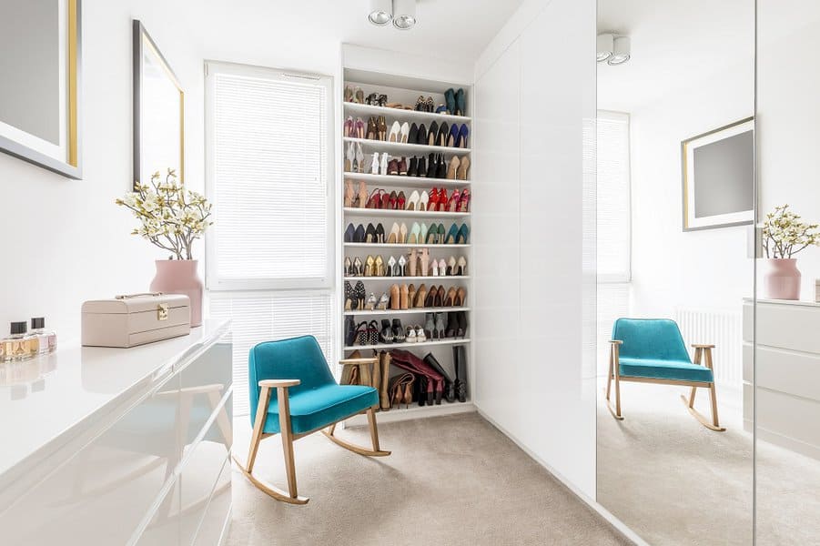
Small spaces pose many obstacles for homeowners. Shoe storage can be quite a headache when there is little space. A built-in shoe closet can solve that shoe headache within seconds. It frees up a lot of space while adding cool and creative decor to any room.
Additionally, built-in shoe storage reduces clutter while enhancing the openness of the room. Many have cool designs that fit in any room of your house, adding style and creativity.

The closet door shoe rack is easily the most efficient way to store shoes. In theory, the closet is one of the most organized places in a house. Mounting the shoe rack on the door will keep your shoes clean and organize the closet. It’ll keep everything out of the way while still being easily accessible.
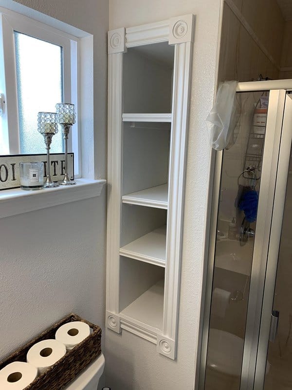
Nowadays, most people have a pair of sneakers, snow boots, fancy kicks, or gym shoes cluttering up their room. This is why people need more space for storage. One option, a recessed shelf, is perfect for large families or people with a ton of footwear.
It makes excellent use of the area by allowing you to store twice as many shoes. It also takes up little space and adds chic and functional decor to the room. A recessed shelf allows for ample space for various shoe sizes and styles. The shelf is the ideal decor for a small space while adding style too.

Many people like to keep their shoes by the door. Since that’s the case, most homes enjoy adding another element to use the space best. For example, a shoe shelf with counter space is chic while freeing up space.
The counter is perfect for storing keys or leaving notes. The extra space will allow you to get creative without worrying about shoes getting in the way. Plus, the shelf is perfect for decorating the room by adding some character.

Take efficient shoe organizing to new places with shoe hangers. Shoe hangers eliminate the need for storage space or boxes. Simply hang your favorite shoes on your wall with mounts. It makes for cool decor, requires minimal setup, and takes up zero floor or wall space.
See more about - Your Guide to Waterproof Trail Running Shoes for Men

Lots of people like to store their shoes near the front door, especially those who don’t like people walking through their house with shoes on. This is why a doorway shoe self is one of the easiest storage options.
They work best in a small apartment or condo that has limited space. The doorway shoe shelf adds style but is often compact. They fit perfectly next to any doorway, taking the decor to new levels.
Another great option is to place the shelf next to the couch. It’ll change the way you put your shoes on. No longer will you need to stand awkwardly against the wall to put on your favorite Jordans.

Get creative with shoe storage ideas with the vertical shoe rack. The vertical shoe rack is hugely popular and comes in different sizes, designs, and styles. The vertical shoe rack is ideal for a small space and for organizing various shoe types.

Have a lot of shoes lying around on top of each other? Need a solution fast? Well, look no further than tiered wall shelves. They’ll change the way you store shoes forever.
A tiered wall shelf makes excellent use of vertical space, giving the illusion of ample room. It’s a creative and efficient way to store shoes to decrease clutter. It adds a neat slice of decor to the room without taking up a lot of space. It also makes organizing and selecting shoes much more accessible. It’s impossible to go wrong with a tiered wall shelf.

A shoe rack with enclosed crates will change how you store your shoes. The design adds character and chic to any doorway. It’ll always keep your shoes neat, clean, and organized. The crates are big enough for every style and on top of that, the shoe rack slides into any closet or corner. Brilliant.

There are several creative ways to store shoes. It’s always great to repurpose an old piece of furniture. However, a new style is repurposing and mismatching old shoe racks. It’s a custom shoe rack that’ll free up lots of space while adding a unique style to the place.
Layered shelves allow you to get a shelf for each shoe design. Stack multiple shelves on top of each other to create a stunning shoe rack tower. The finished product will be a unique piece of decor nobody else owns. You can store rain boots, work shoes, and casual and summer footwear.

There’s always a solution for a cluttered and small space. A shelf compartment with coat hooks is perfect for a family with many little kids. It’s an open space that adds style and character.
It’s accessible, gives the illusion of a larger area, and adds style and convenience. It’ll keep your shoes and jackets off the floor while at the same time is easy for kids to grab their shoes to go on an adventure.

The vintage-style shoe rack isn’t only for the doorway. The chic and classic piece of furniture is ideal for the bedroom or walk-in closet. Vintage style is perfect for every shoe shape and design. Take your decor back in time while organizing your shoes.
See more about - How To Clean Suede Shoes: A Step-By-Step Guide
[TAG0]
Designer: YZDA | Yoshida + Zanon Design Atrium
First and foremost, consider a useful placement for your home bar. Will it be used frequently enough to make it part of your living room or would it make more sense as a piece of the dining room? This home bar is teamed with a glass island and a set of electric blue chairs to create the appearance of an authentic night out.
[TAG1]
Designer: Anova Interior Design
Visualizer: Stanislav Ananev & Tanya Vorobyeva
Make your home bar a part of the arch decor trend by fitting it right inside of a shaped alcove. Apply a colorful tiled backsplash to accentuate the curved silhouette.
[TAG2]
Designer: Jasmin Reese Interiors
Create a party atmosphere with a bright and colorful wallcovering. This wild zigzag paper is overlaid with lustrous gold wall shelves and playful monkey-themed wall sconces.
[TAG3]
Designer: Jenkins Interiors
Define your bar area from the rest of your living space by installing a peninsula.
[TAG4]
Designer: Pineapple House Interior Design
Flank your wet bar with wine storage refrigerator cabinets to keep your favorite tipple at optimum serving temperature.
[TAG5]
Designer: Kalaa Chakra Interiors
These wine storage units turn the bottles sideways so that you can read the whole label at a glance. Sideways bottle storage also allows the units to be very shallow, making them a great fit when space is limited.
[TAG6]
Designer: Catdal Interiors
If space is extremely tight, then a chic bar cart does the trick! This chic little number is teamed with a full-length wall mirror to double its effect.
[TAG7]
Designer: Zaha Hadid
If you’re a sci-fi fan then a futuristic home bar might meet your adventurous taste.
[TAG8]
Visualizer: Agora Studio
Don’t be afraid to take your wine storage shelves all the way up to the rafters. The highest shelves can be used to keep those special occasion bottles safely stored, while lower shelves are for regular plonk.
Set an eye-catching scene, no matter the limitations of space. This relatively narrow wall comes alive under a covering of rugged rock and atmospheric LED illumination.
[TAG10]
Designer: Sync Studio
An L-shaped bar provides extra space for guests to gather around. Add a wall-mounted TV to make this into a great hangout during sports seasons.
[TAG11]
Visualizer: Artpartner Architects
Open up your home bar to a wonderful skyscape by installing skylights above it. You can sip on your favorite drink while the rain pitter-patters against the glass.
Elevate your home by crowning it with an exquisite chandelier.
Muted green and cognac leather create a mature color set for a sophisticated home bar. Back your bar shelving with mirrors to introduce a bright plane of light.
[TAG14]
Visualizer: Simple Form Interiors
Integrate a home bar into your kitchen diner area if that’s where you’re most likely to indulge in something a little stronger. Wine storage nooks can be raised up high alongside wall cabinets. A pegboard wall offers endless opportunities for displaying different types of glasses.
Build a room within a room. This modern bar design features a curved canopy that differentiates it from the rest of the space. It also creates a support beam to hang wine glasses.
[TAG16]
Designer: Locati Architects
Try a sturdy metal worktop to set your home bar apart from the rest. This one features a cool, nailhead trim.
[TAG17]
Designer: Solk Architecture
A dining room home bar makes a convenient addition to dinner parties. If you don’t want it to detract from the food, tuck it away neatly into the corner.
[TAG18]
Designer: Alexander Design
Unique black bar stools are the main focus of this stylish home bar area. They make stark contrast with an elegant white marble counter.
[TAG19]
Visualizer: Smadar Studio
Already maxed out on space? How about hanging a drinks bar from the ceiling above your kitchen island?
[TAG20]
Source: 281 Bentley Circle
When you have a lot of friends with a lot of different tastes, it’s best to be equipped. Make wall shelves as long as you can to accommodate all of those bottles and copious drinking vessels.
[TAG21]
Source: E C Schmitt & Company
If you have prized bottles to show off, then build a showcase right at the heart of your home bar design.
[TAG22]
Visualizer: Viresha Choudhary
Guide guests toward the celebration area with a series of recessed strip lights that bridge the walls and ceiling.
Let’s face it, bar stools aren’t the most comfortable places to park up for hours of fun. So, how about some cozy tub chairs instead? The only problem we can see here is that your guests may never want to leave!
[TAG24]
Designer: Tays & Co Design Studios
Set up a rustic home bar with a beautiful stone wall, chunky timber shelves, and a traditional brass faucet.
[TAG25]
Visualizer: Blue Studio 288
Make practical wine storage the star of the show with a magical backlit configuration.
[TAG26]
Visualizer: Hrvoje Sedlic
Stack rows and rows of wine up to the ceiling to build a lavish bar theme.
[TAG27]
Designer: David Lucido
Via: Introspective
Let a classic paneled wall treatment shine through your new bar setup by installing low-impact glass shelving.
[TAG28]
Designer: Design Milieu
Fashion a mid-century modern bar area with a vintage freestanding teak unit and some retro glassware.
Surround your bar area with useful storage cabinets. These units feature a unique geometric slatted design that adds a striking pattern to the room.
Situate your bar counter at the boundary of a split-level floor design. The step creates a comfortable footrest for your bar stools.
[TAG31]
Visualizer: Rae Duncan Interior Design
Hang artwork at the center of your bar area to create a pleasant focal point. Flank the wall art with glass cabinets full of bottles to create a colorful frame.
[TAG32]
Visualizer: Orange Coast Interior Design
Use color-changing lights to call attention to key points in the bar area, like a selection of fine wines, favorite spirits, or fine crystal glasses.
[TAG33]
Designer: 2id Interiors
A small fridge is useful for storing beer, larger, and soft drinks. A glass-fronted drinks fridge builds a true bar aesthetic.
Sliding doors offer a flexible solution for a home bar. When closed, the room is simple and homey. Once open, the room transforms into a sleek, celebratory zone.
[TAG35]
Designer: Gallagher Interiors
Globe home bars were popular in the 50s and 60s, and they’re still pretty cool now.
[TAG36]
Visualizer: Paul McClean
Build a luxury home bar with glossy walnut cabinets and bold black marble countertops. Bright blue LED strips make a perfect accompaniment alongside a panoramic view of a blue ocean horizon or an illuminated infinity pool.
[TAG37]
Designer: Nadav Rokach
Jazz up your home bar with intricately patterned wallpaper. Balance out the busyness with swathes of natural wood tone.
[TAG38]
Designer: Hermitage Kitchen Gallery
Construct an industrial home bar aesthetic with metal pipe shelf brackets and reclaimed wood worktops.
This brass pipe and glass shelf unit makes a gorgeous pairing with a petrol blue bar unit.
A little bit of clever shelving can go a long way. Check out this wine holder and spirit shelf unit, which also looks great in multiples.
[TAG43]
Visualizer: Galeria 733
Make use of a wide walkway for your home bar.
[TAG44]
Visualizer: Ivane Gavasheli
Double-height living rooms extend the opportunity for vertical wine storage.
[TAG45]
Visualizer: Two —o Seven
Tag a tall bar unit onto the end of your kitchen run to make serving guests a breeze. This way you don’t have to plumb in a separate wet bar basin–just use the kitchen sink.
[TAG46]
Designer: KOZÉ Studios
Conceal the bar area at the end of your kitchen run with full-height doors and racks of door-mounted shelving.
[TAG47]
Designer: Nina Maya Interiors
This occasional kitchen bar is cheerfully on display, yet protected from dust, behind sliding glass doors. Sloping bottle shelves build a jaunty, geometric statement.
[TAG48]
Via: The Designory
Pastel colors and light woods build a sweet aesthetic that’s perfect for making summertime Pimms.
[TAG49]
Designer: M House Development
A well-thought-out, small home bar design can fit into unlikely nooks and crannies. This tiny nook fits 36 bottles of wine, a full drinks fridge, an edge-to-edge glass rack that holds up to 24 vessels, and even a couple of cute decor shelves.
[TAG50]
Visualizer: NANYU DESIGN
Use metallic edging and perimeter lighting to illuminate a bright beacon of fun. Utilize a few of the bar shelves to display decorative bowls and sculptures for added interest.
This subtle wall-mounted drinks cabinet looks like a piece of wooden wall decor until it opens on a central hinge. A piece like this could fit almost anywhere – even next to the bathtub for some extra cheeky bubbles!
[TAG53]
Source: Planning & Building
Style a fabulous light installation along your home bar, like this punchy blue glass concept. The colorful glass catches the daylight even without the electricity flowing. At night, the tinted mini pendants set an enlivening atmosphere.
Recommended Reading: 40 Captivating Kitchen Bar Stools For Any Type Of Decor
For more regular updates from Home Designing, join us on Facebook.
[TAG54]
If you are reading this through e-mail, please consider forwarding this mail to a few of your friends who are into interior design. Come on, you know who they are!
Related Posts:
]]>
Welcome to my elementary Autism Classroom Tour, where the magic happens! Here you’ll find me spending most of my days, hanging out with tiny humans bringing me joy and never ceasing to amaze me! It really is my home away from home. Does anyone else ever feel like you’re living at school? I have spent a lot of time (and a lot of money) on my classroom, making it as functional as possible for my students.
My second home, or Kaluger’s Koyotes as we are known on campus, is a special education day class for the moderate/severe Autism population. I currently teach the grades Transitional Kindergarten (TK) and Kindergarten. I have a total of 10 students, which is actually our maximum amount of students if you can believe that! The ratio for our program is 2:1 and I have 4 paraprofessionals. In total, there are 5 adults and 10 students (3 girls and 7 boys). I am loving having so many girls this year!

I just love my classroom door; it’s a real conversation piece around the school! My school really is all inclusive – it doesn’t hurt that our admin comes from a sped background! As we are a peanut and tree nut free classroom, I am always making sure that information is clearly labeled so anyone entering is aware. We also use baby gates in our doorways, this is the first school district I’ve seen that uses them in an Autism classroom and can I just take a moment to say how amazing they work?!

I’ve also hung a picture of my facility dog, Connie! I know that not everyone is a fan of dogs, so I like for people to know the classroom is home to my four-legged assistant before they enter. Canine Companions facility dogs are highly trained and trustworthy dogs partnered with a professional facilitator who is directly serving clients with special needs. She knows over 40 commands!

Colored dots on the floor are the first thing you see when entering my Autism classroom. These dots are velcro (hurray for no more ruining the carpet with tape!) which my students use as markers for lining up. (you can find them here! affiliate link)
Next, you will see a kidney table that students use for centers and whole group. The 3-drawer organizer next to the table holds writing utensils, reading and math curriculum. The letters of the alphabet and ten frames hang on the walls.

You’ll notice my standing desk (affiliate link) tucked in the back of the room (a highly recommended accessory for a teacher always on the move!). If you’re a teacher you know sometimes there is no time to sit!

You may also notice the dog crate in the corner- that’s where Connie takes her much-needed and hard-earned breaks throughout the day! Inside is a soft bed and a waterproof mat that holds her water dish. I left her water on the carpet at first but quickly learned my mistake as soon as one of my students dumped it out all over the floor! Hanging on her crate is a visual that says “Dog on break, do not touch”. Next to her crate is a laundry basket that has a tug strap attached. She is able to pull the basket backwards across the room!

Turning right, you’ll see the students’ cubbies. When they arrive, the students place their lunches in their cubby and hang up their backpack! You may also notice our Autism classroom rules, along with blue cubbies, for items or work that get sent home.

These visuals hang near the cubbies. A backpack routine and a CORE board are visible for students to access if needed. Similar visuals can be found here.

When entering through the front door and turning left you will see quite a few things! First, you might notice an orange button- this has a bathroom icon and when pressed says, “Bathroom.” A few of my non-verbal students use this to request a potty break.
Another set of cubbies holds manipulatives for our “morning tub” activity. This is the very first activity that my students do each day. You will also notice a birthday wall and word wall. The words that I use and focus on are functional (ie go, eat, more). You might also notice the clipboards hanging, which are used for data collection. You’ll also notice one of our center tables! I have multiple visuals hanging too, you know those are always needed FAST!
On the front of the cabinet that holds my data collection clipboards I have all staff listed (usually I have pictures of students under each name) which is used to know who will take data on what student. I also have more visuals and token boards for easy access. If you know, you know!!
Continue walking right and you will see my “calm corner”. Students use this when they need a break or a quiet place to calm down. Sometimes, adults prompt them to go sit and other times they know when they need to go calm down and they go independently. I have found this space to be essential in an Autism classroom. Some items that might be helpful to students are: fidgets, sequin pillows, weighted blanket, and an egg chair.

Adjacent to the calm down corner is our circle time spot. We do calendar and the whole group follows directions here. Different seating options include cube chairs (affiliate link), regular chairs and floor cushions. Students are able to choose where they’d like to sit within this circle.
The numbered balloons on the wall are used near the end of the year as a countdown to wonderful summer vacation! Students pop one a day and inside is a picture icon of a surprise activity. Surprisingly, they really love popping the balloons.

As you can probably notice, I think students thrive off clear, defined locations. Furniture partitions various areas of my classroom.
This next area is my play center. When students have free choice, they may go and choose any item. Students remain in this clearly defined area. There are a variety of toys and items for the students to choose from. The door that you see leads to the upper grade structured Autism classroom.

If you keep turning (are you dizzy yet?) you will see another center table and my “teacher area”. I have a small table to help block off the area. It hold crates containing file folders and curriculum.
Next to my standing desk you will see the dog crate, filling cabinet, fridge and microwave. The kidney table is in front of white boards that hold the classroom schedule, staff breaks, and important information listed. If you are wondering what the blue covers are on the lights they are light filters! It really helps make those florescent lights less bothersome!

Here is my daily schedule! I split my class for part of the day so that it is more manageable. I reference the schedule multiple times a day until they have learned our routine. Depending on student need, I will refer to it more often or make individual schedules. I rely heavily on using timers as well!

Making a full circle brings us to this view of the front of my classroom. On the very top of my whiteboard rest tubs for each month with my monthly activities. Behind the white boards I have quite the collection of manipluatives, puzzles, and games!
I hope you enjoyed touring my Kindergarten Autism classroom. What questions do you have?


The post Autism Classroom Tour appeared first on Simply Special Ed.
]]>
 Luxury Living Rooms: Ideas & Inspiration from Roche Bobois
 Design Styles - Cottage Style
 IKEA 2012 Catalog
 A Scandinavian Beauty

 Kitchens of the Future
 51 Decorative Trays to Organize Your Life in Every Room
 51 Modern Houses That Impress With Stunning Architecture, Pools & Landscaping