How To Update A Tuscan Style Home For A Fresh, New Look!
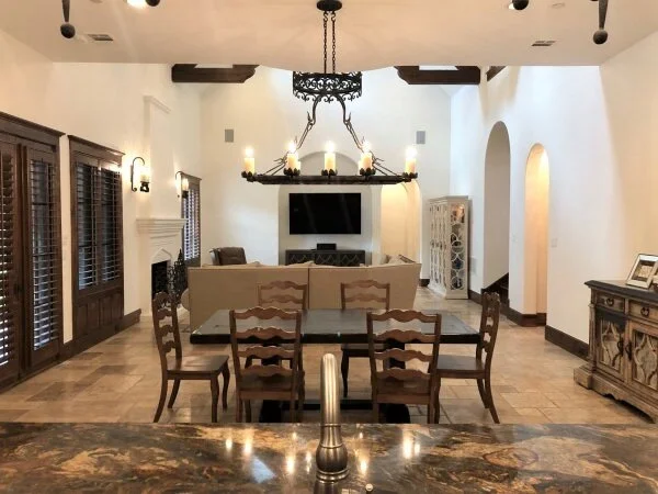
This Tuscan great room looks so fresh after a nice white paint job. It just needs a little more push to make it feel more up to date.
The home I’m sharing here today has really nice Tuscan style bones, and the homeowner went a long way to update it by painting walls and ceilings a lovely soft white. (Yes, while leaving her travertine tile!) She made a big impact with paint alone.
Now, for a few tips on how to bring it a little further along into the 2020’s!
This homeowner needed help with furniture arrangement and creating more distinct zones in this large room. She also wanted some suggestions on how to bring a lighter look to the kitchen and how to have the black tv not stand out so much down there on the end wall.
Let’s dig in….
My blog contains affiliate links. Any purchases, at no additional charge to you, render me a small percentage, are most appreciated and make this blog possible. :-)
Tuscan Style Home, Great Room and Kitchen
I can only imagine how this home must have looked painted in a more Tuscan style, typical muddy, beige/gold. Can’t you?
How fresh it looks with this light paint color, BM White Dove, painted a few years ago.
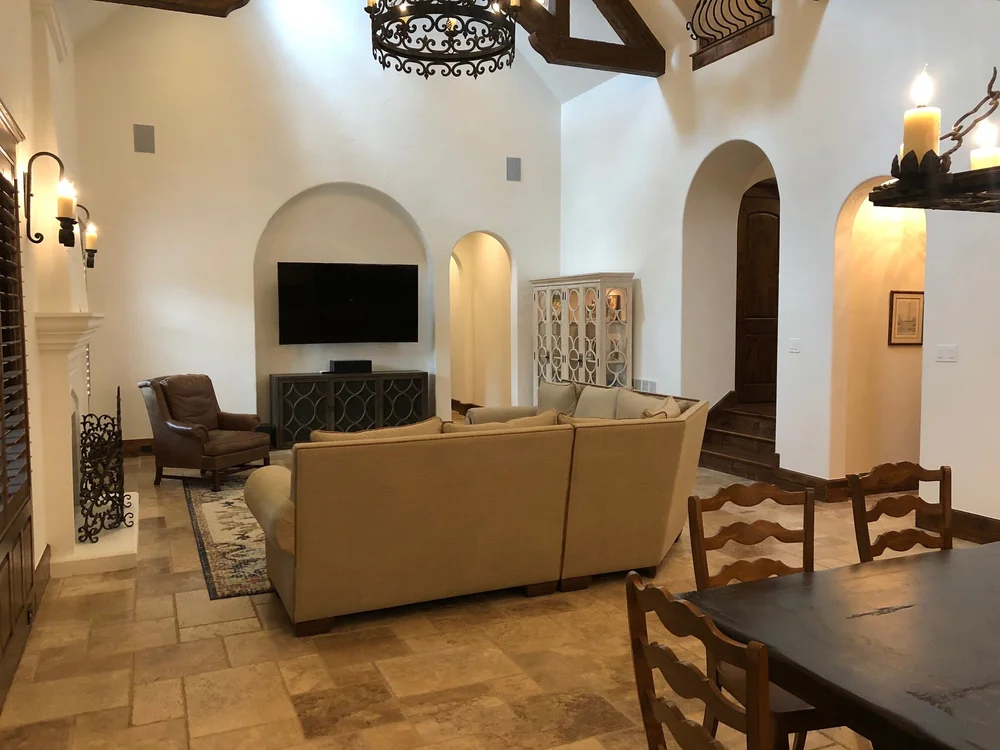
Benjamin Moore White Dove lightened up this formerly dark Tuscan style home with a large great room and open kitchen.
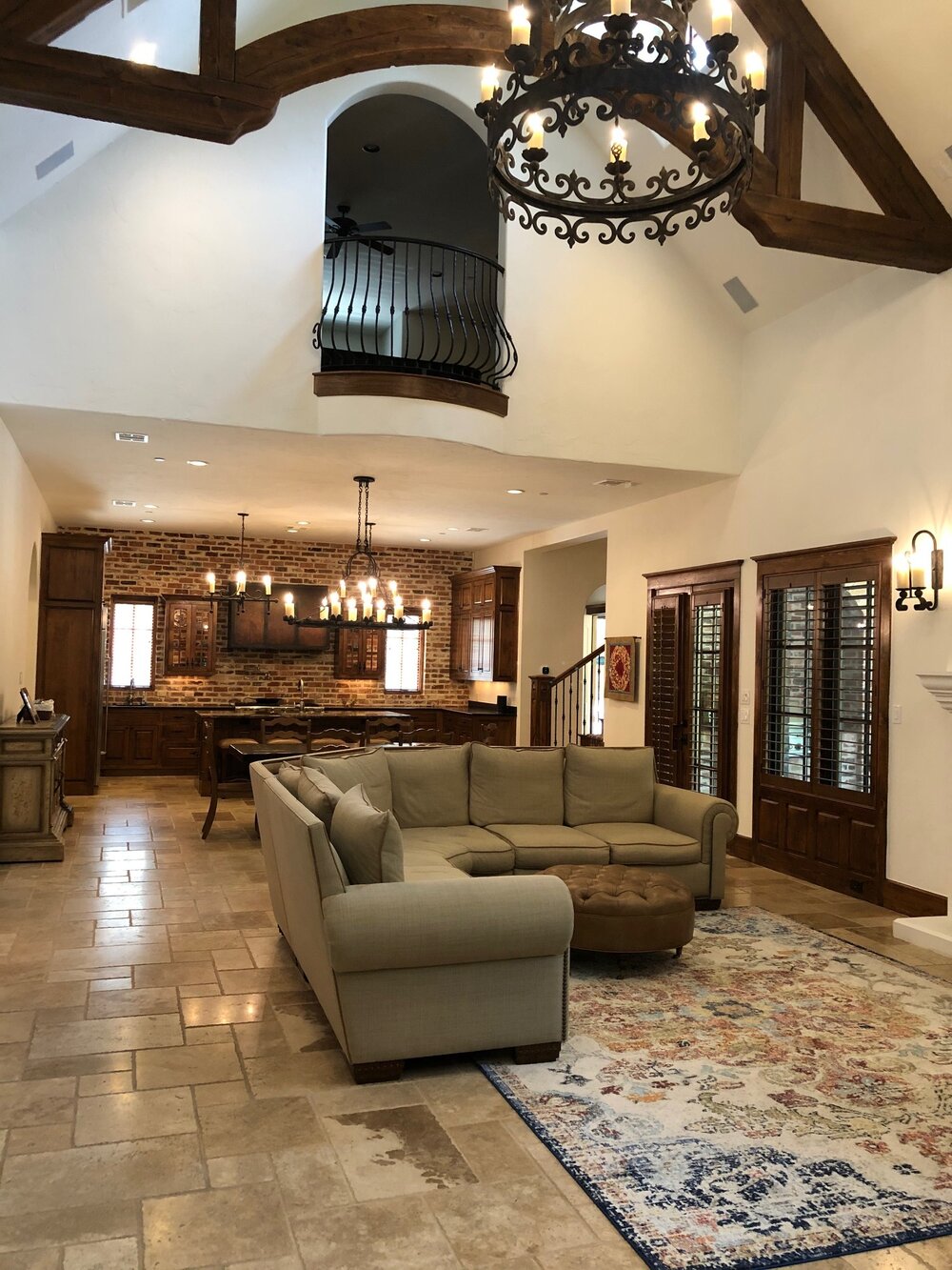
Tuscan style great room with travertine floors, dark doors and trim has been lightened up with a creamy white wall and ceiling paint.
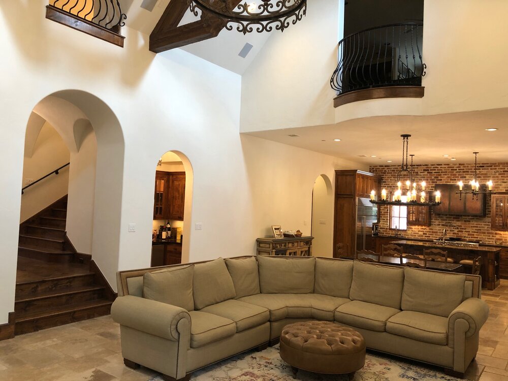
Large Tuscan great room with dark wood kitchen, beyond.
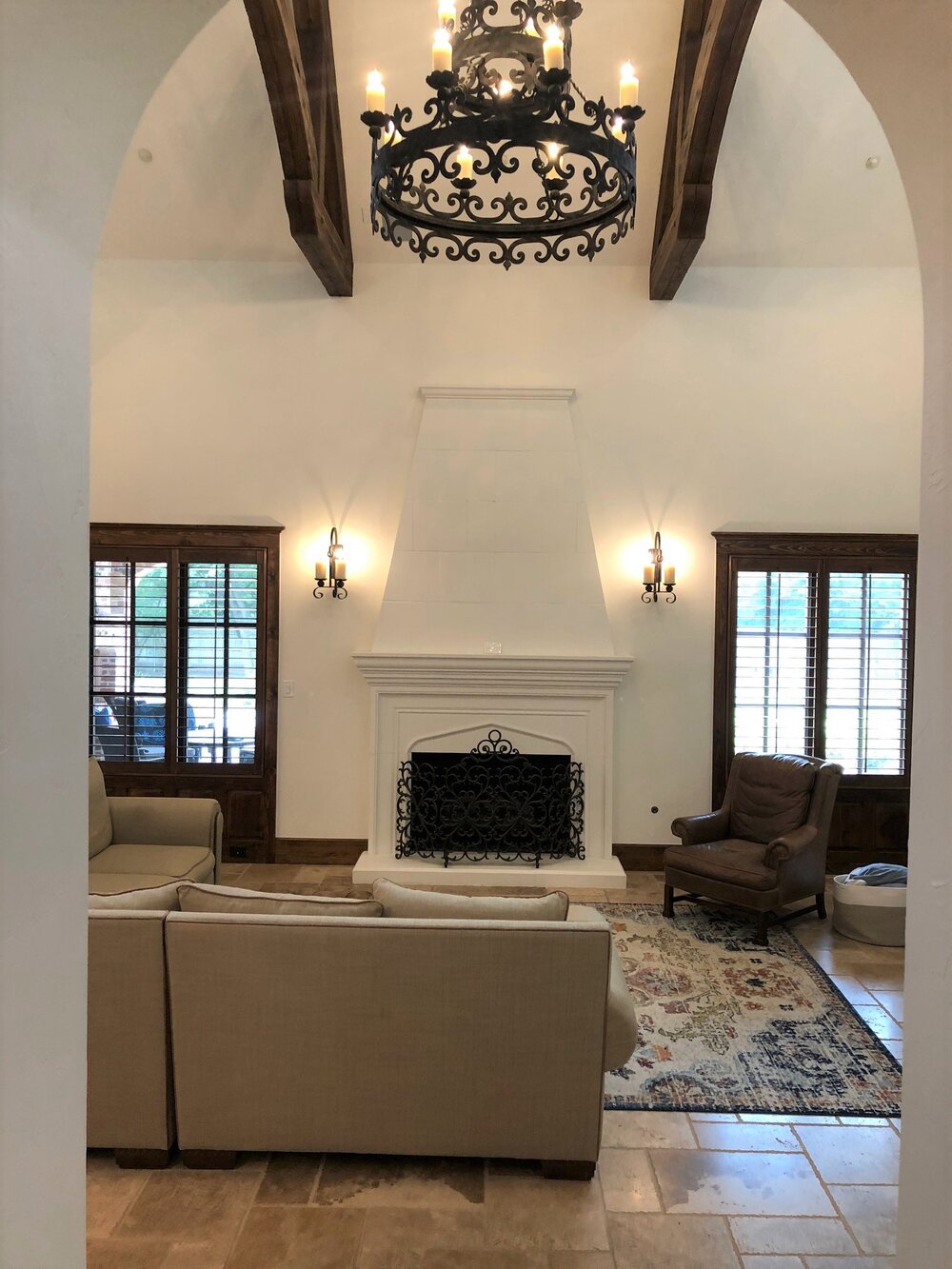
This homeowner wanted to know how to make the fireplace more of a focal point and arrange the furniture to help divide up the space in this Tuscan great room.
Furniture Arrangement In Open Tuscan Style Great Room
1) How do I arrange furniture for open flow from the entry hall (3 steps down into great room) with the fireplace as the focal point of the room?
I think you should definitely use a regular sofa, not a sectional in there. You can arrange the sofa facing either the fireplace or the tv, I think, however the sofa facing the tv might be better, just because it would help separate the functions of the room more and open up the view to the fireplace to the entry better.
It looks like you have room to place them either way though, doing some higher back chairs would also help divide the room some. A console behind the sofa as you enter doesn’t really come off as a barrier, but can be a nice visual. A lot of this depends on what type of seating you prefer for tv watching too.
I do think it would be nice to see the backs of two chairs facing the fireplace when you walk into the room, much like this photo in one of my projects, with the sofa facing the fireplace.
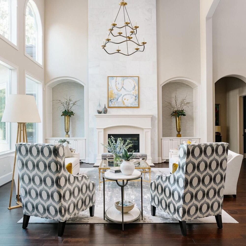
Great room seating group with two high backed chairs facing the fireplace. Carla Aston, Designer | Colleen Scott, Photographer
2) How do I create zones with rugs/ pieces/pictures in this huge room (kitchen, dining, living)?
I think you need to move the tall glass front cabinet down to the wall in the dining room, replacing the buffet console with it. Right now the fretwork design on the face is almost too much the same look as on the tv cabinet. It also looks a little large and pushed in the corner, I know because of the return air vent there.
I think a more open console, centered on that wall, with art above would be nice in that space and then you can position that in front of the vent, no problem. I also like the taller, more substantial piece in the dining area, centered on that wall between the openings, not aligned exactly with the dining table.
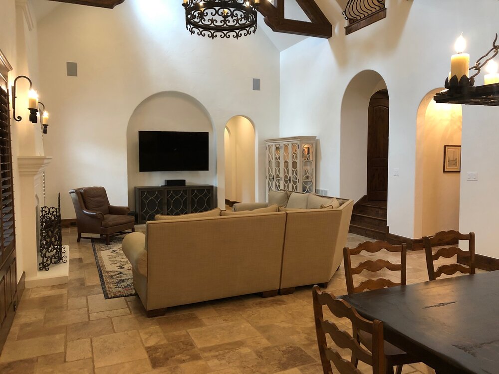
Large, open Tuscan style great room with dining area.
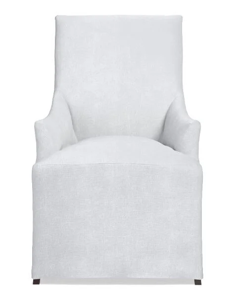
I think your dining furniture sort of blends into the kitchen and doesn't make enough of a statement. Doing some taller, upholstered chairs there will soften that area and divide the groupings better. Chairs that are upholstered in a light, creamy fabric would lighten up that area and make it feel more like a destination.
Something like these Belvedere chairs from Williams Sonoma would work.
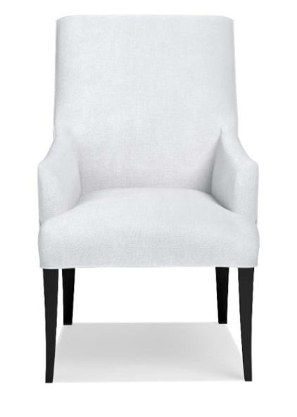
I kind of like the idea of a walnut live edge table, since your kitchen cabinets are walnut. It feels rustic yet up to date and interesting.
This is an Etsy shop owner that does these live edge tables custom. I know nothing personally about them, but it is a good example of having a table made to your own dimensions in a walnut live edge.
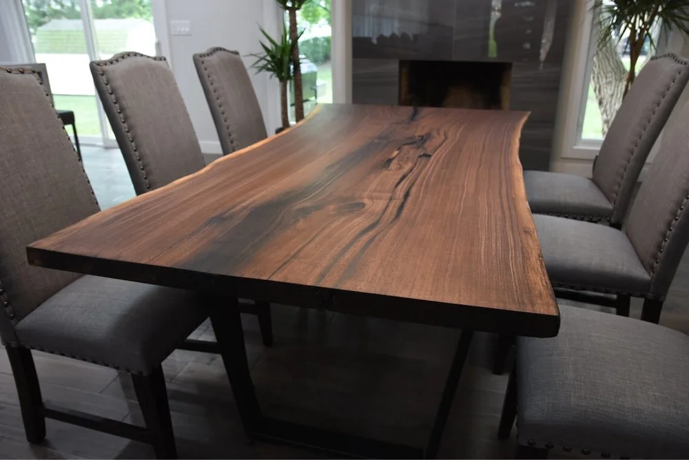
Live edge walnut table with modern base would work beautifully in a Tuscan style home to bring it more up to date.
The table you have is quite dark and could be a little longer in my opinion, for this space. I would go at least a foot longer and you could even go more narrow with the table size. I like how this sort of brings a nice mix to the furniture over here on this side of the room.
These selections would push the look away from a heavy Tuscan style without looking totally out of character.
How To Make This Tuscan Style Kitchen Lighter and Brighter?
3) What can I do to brighten the kitchen and keep my walnut cabinets?
Well, I don't think this is going to be an inexpensive solution. There are a lot of dark finishes in here. I do love the walnut cabinets and the brick wall. So, let's start with keeping those as is.
The one thing that seems a bit off to me is the hood. I know it is custom, but it feels low on the wall and since it blends in so much, it doesn't feel special and sort of disappears.
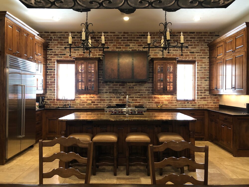
How to lighten and brighten this Tuscan style kitchen with walnut cabinets and a brick wall?
I feel like that is the main place you can change something and have a dramatic impact. You could do a new hood to the ceiling, either a plaster hood and have it be the color of the walls, or you could go with something like a quilted stainless to work with your refrigerator and appliances. Stainless doesn't bring the white in there, but it would brighten things up and reflect the light.
The other option is countertop, but again, not an inexpensive change and I have no idea if you want to go that far.
You could go light, something like a Taj Mahal (you would have to make sure it would go with your floors, Taj is coming in more and more beige now, so it might work well, but if you could take a tile piece or two to the slabs to check, that would be best). Calacatta marble would be gorgeous (with some warm veining), but not sure how you feel about maintenance or cost on that.
The one good thing about changing your countertops is that you can add a slab splash at the hood area on top of the brick.
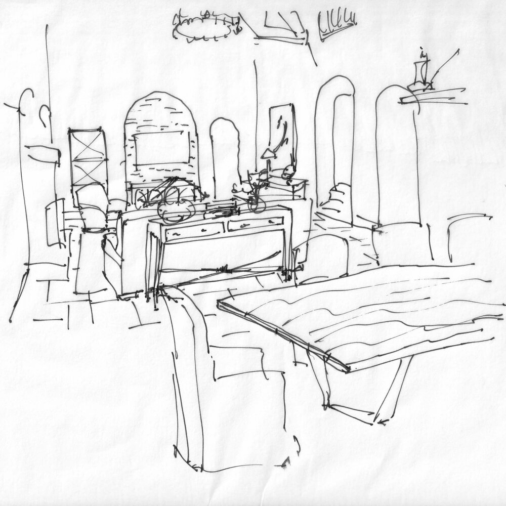
That would bring a more substantial light color to the kitchen, and really marry the light walls you have to this area. I love the idea of doing a curvy shaped splash to repeat some of the curves you have elsewhere, and soften that look. I have a sketch.
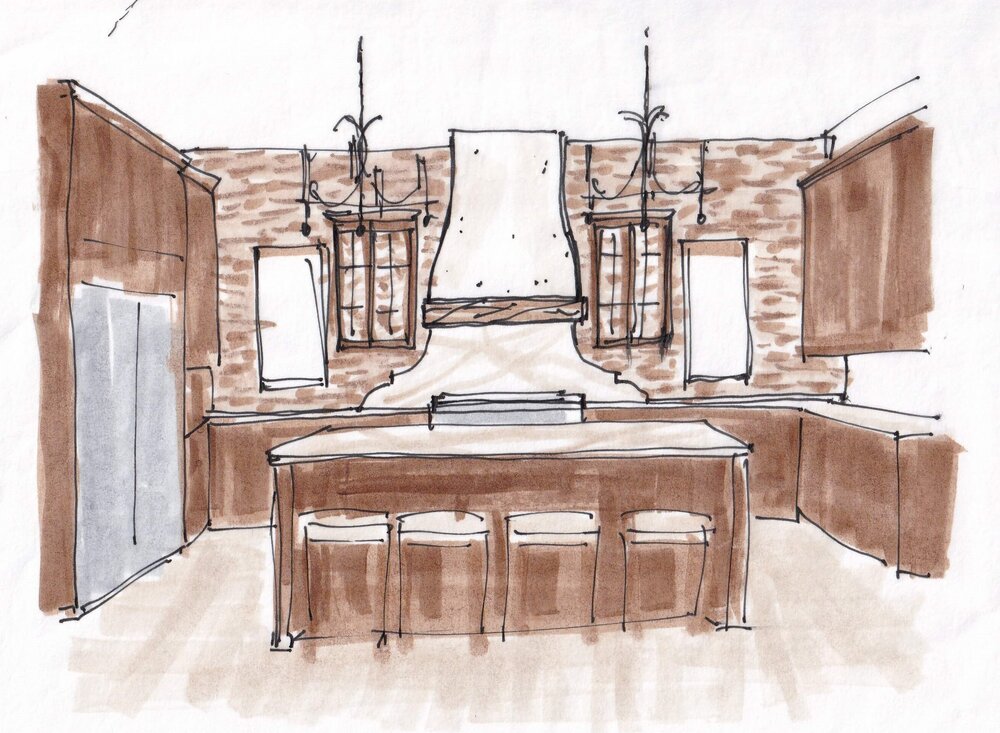
Lighten and brighten this Tuscan style kitchen with a new plaster hood and white marble counters and backsplash.
I don't know how the brick and those upper glass cabinets are installed there, it looks like there is brick behind the cabinets. I imagine they were installed and then the brick filled in inside the cabinets. It’s likely a thin brick product.
If so, it would be hard to move them, but I think they would look better just a bit higher on the wall. Maybe 6" or 8" even. They are just so close to lining up with the windows at the top, it is almost too close. I feel like they need some breathing room.
An option on that would be to remove the existing crown, add a 4" or so piece of wood to the top of the cabinet and a slightly taller crown, to give them some height there. That wood would have to be stained to match, so that might be difficult to do. Just tossing out some options here for you.
TV Wall in Tuscan Great Room
4) What do I put to the left of the tv niche and behind the tv in that niche to soften the huge black eyesore?
I would love to see the brick that you have in the kitchen down there in the niche. You can do wood as an option, but having these two ends reflect one another would be really nice.
If you did wood, you could either panel it in a grid or do something like 3" x 12" herringbone wood, in walnut, to match your wood kitchen cabinets.
A tall mirror beside that niche would be nice, it would sort of reflect the living room and feel like another hallway is opened up there.
Are you struggling with how to lighten and brighten your Tuscan style home?
You might find these posts a good read.
Subscribe to my blog for design insights, advice and inspiration sent twice weekly to your inbox. You'll get my FREE guide, “A Remodeling Secret That Will Give Your Kitchen A Totally New Look!”, when you sign up. The link pops up right here when you enter your email address below.Thank you! Here’s my FREE guide, “A Remodeling Secret That Will Give Your Kitchen A Totally New Look!”
