The Curved Trend Has Reached the Kitchen, and It’s Breaking Up Boxy-Looking Cabinets
We may earn revenue from the products available on this page and participate in affiliate programs.
From sofas to windows, curves have taken our homes by storm. And while some might say the former has been done to death or deem the latter impractical, it’s clear that rounded silhouettes aren’t going away anytime soon. Exhibit A: We’re starting to see curved shelving and cabinets pop up in kitchen renovations. Whether it be a tight galley space or an industrial loft, the main reason designers and architects are beginning to embrace softer edges is that they help eliminate that blockish, stock cabinet look. In open-concept spaces, especially, they ease what is otherwise an abrupt transition between the cooking zone and the living area. Here are three ways to bring a little contouring to your kitchen.
Dress Up a Utilitarian Space
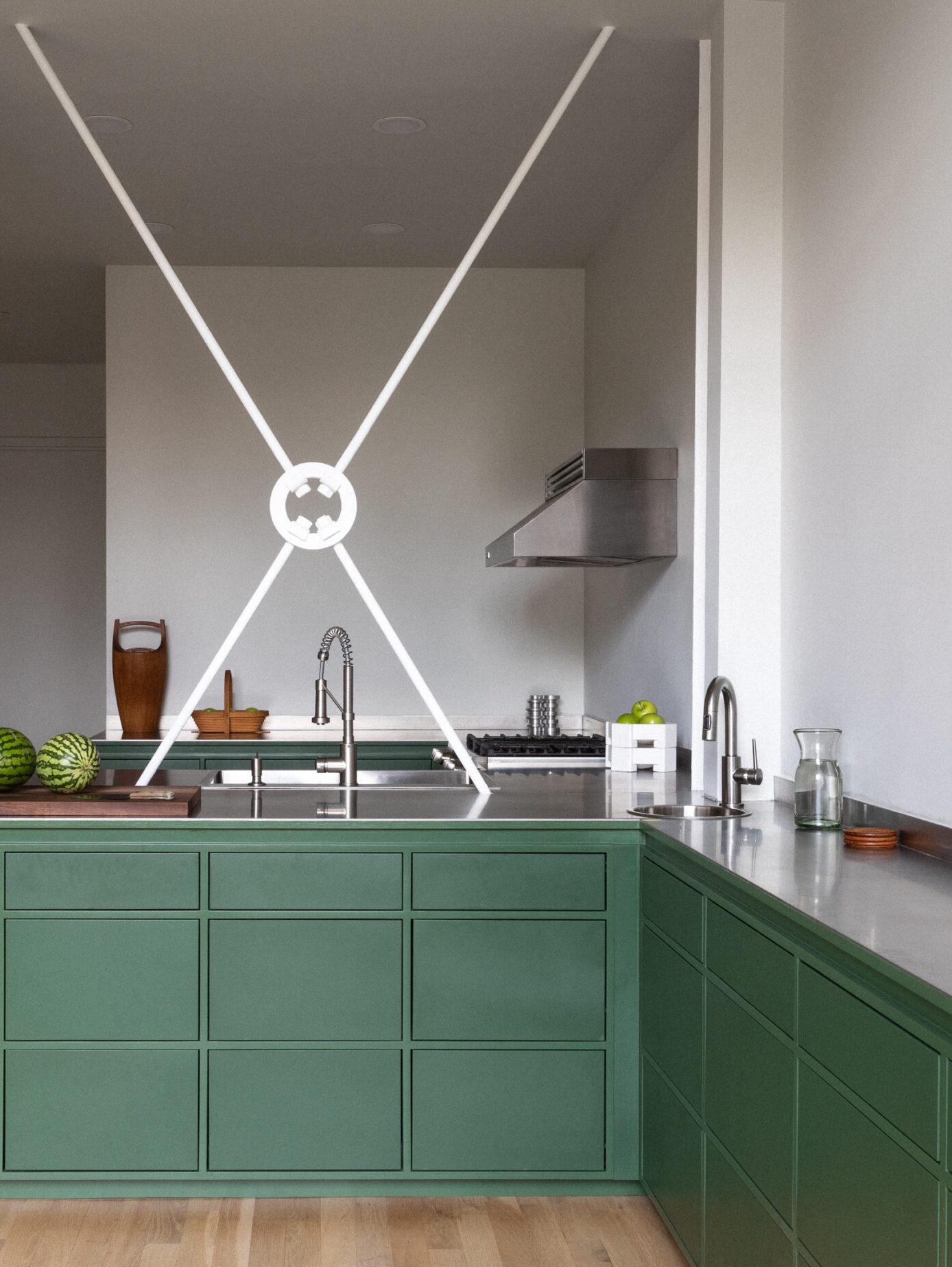
In this Clinton Hill, Brooklyn, duplex, Studio S II worked around a structural X beam by sticking only to lower drawers with push-to-open hardware. While Benjamin Moore’s Sweet Basil paint brought some life to the industrial space, the three sweeping open shelves on the very end offer an opportunity to introduce colorful cookbooks, delicate ceramics, and plants. “This curvature offsets the rectilinearity of the rest of the space and ties in with the circular hand sink and the center of the beam,” says Jeremy Silberberg, the company’s cofounder.
Make a Galley Less Boxy
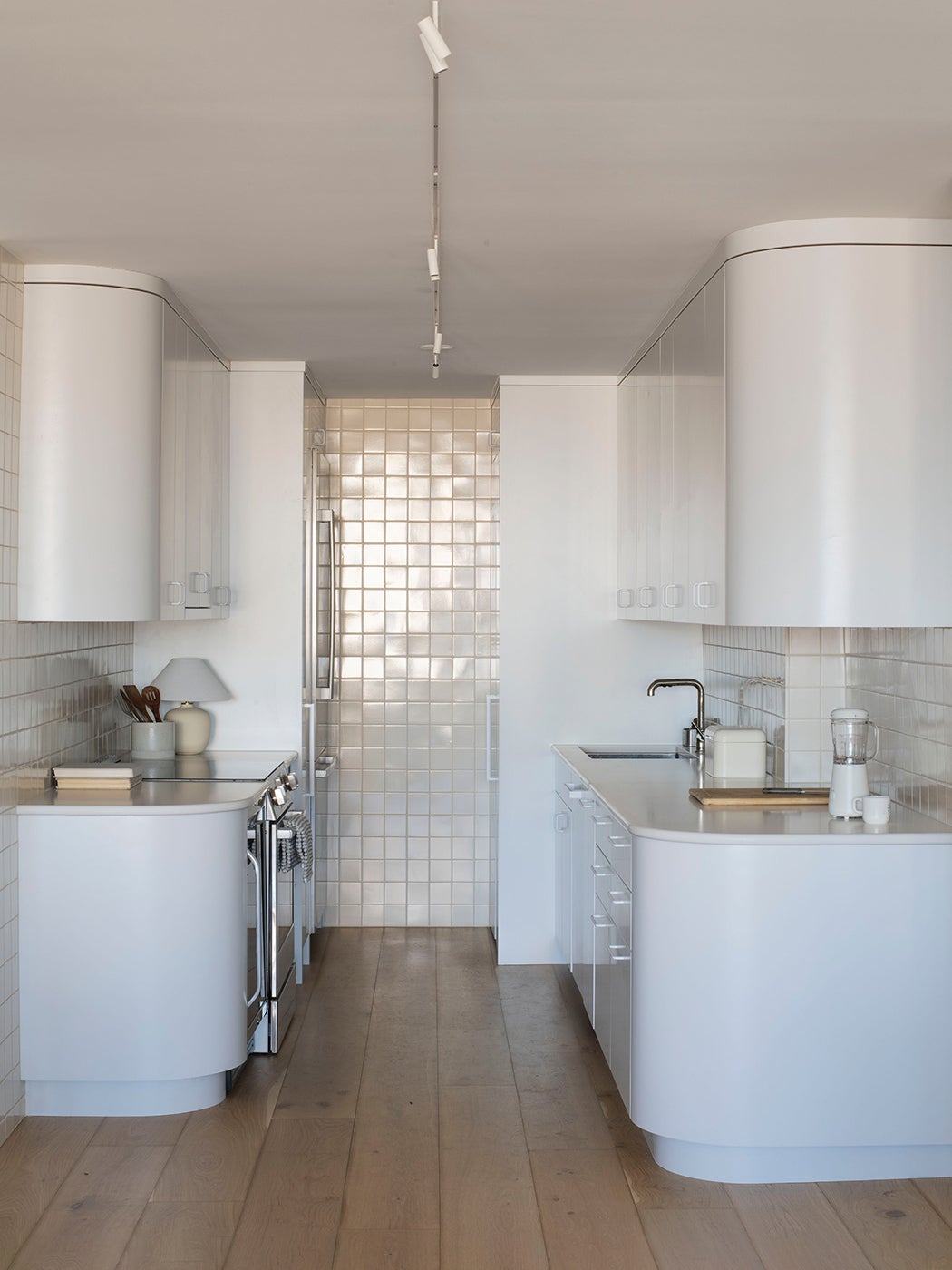
Designer Leslie Bristow Mather wanted the kitchen in this Chicago condo to feel as though it had always been there, so she looked to the apartment’s original architect, Ludwig Mies van der Rohe, for inspiration. His Farnsworth House (1955) and Haus Lange (circa 1930) inspired the galley space’s retro feel, which can be credited to the allover square tiles and rounded cupboards, painted in Benjamin Moore’s Decorator’s White. “We knew there were going to be these volumes that projected out into the main living space, and I wanted that termination to be soft and easy,” says Mather.
Don’t Overlook Blunt Corners
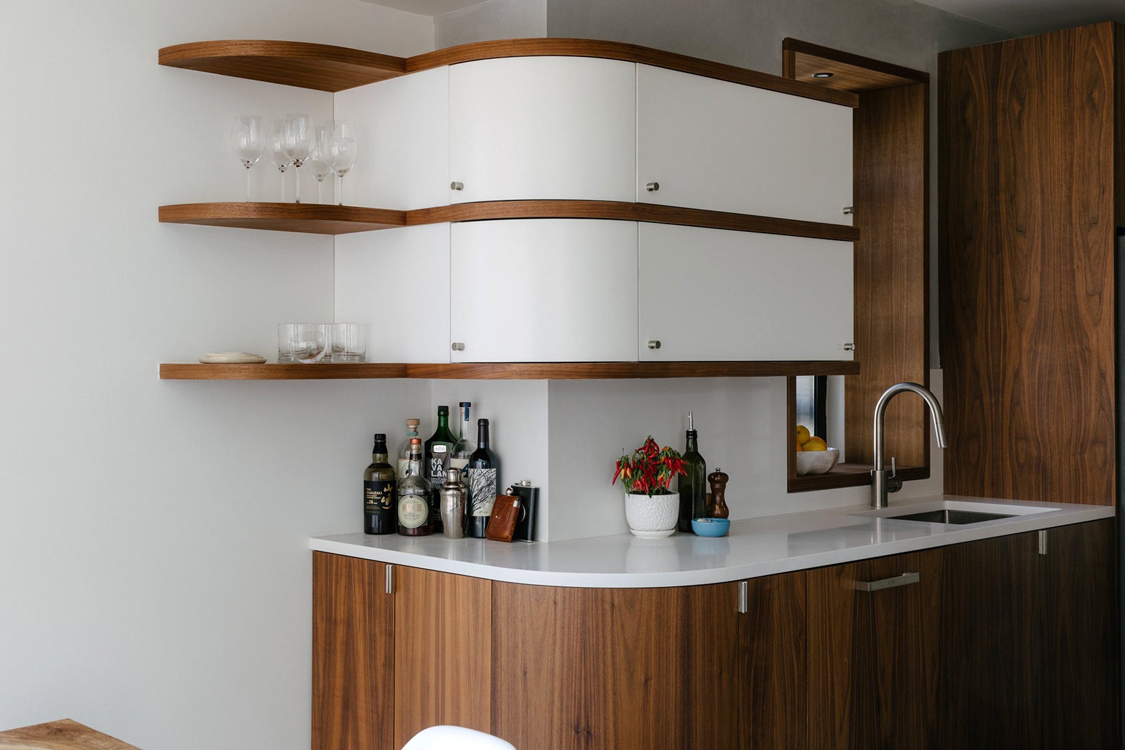
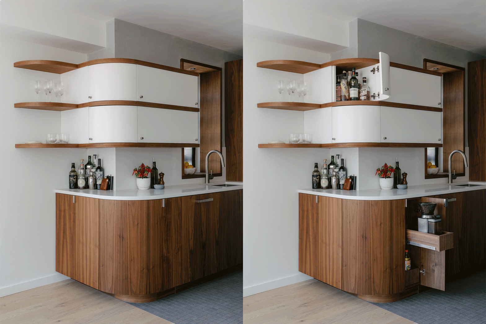
Second to collecting books, the couple who lives in this Upper East Side apartment has a strong passion for entertaining. The existing walls enclosing the kitchen made it feel cavelike, so architect Idan Naor focused on opening it up and then invited a “fluid motion” through the space with walnut upper cabinets and shelving that turn a sharp corner into a smooth bend. Not wasting any space, he incorporated doors into the design so the owners can fill the extra-deep nooks with all their cocktail-making essentials.
The post The Curved Trend Has Reached the Kitchen, and It’s Breaking Up Boxy-Looking Cabinets appeared first on domino.


